Too many design handoffs are treated like a relay race. The designers hand off the baton to the developers and then go home because they consider their part of the race done. This can create uncertainty, which means developers have to make assumptions about how things should work and look.
Many of these assumptions will be inaccurate, leading to frustration, mismatched expectations, and wasted time. The bigger the project, the more these problems manifest.
But design handoffs shouldn’t be like relay races. In fact, they shouldn’t really be “handoffs.” The very name suggests that the designers should now be “hands-off.”
DesignOps depends on a healthy workflow between designers and developers. How they work together cannot be an afterthought. It is one of the foundational requirements for a successful web project.
How do we ensure the process is painless? Let’s go over some pain points developers experience, and then we’ll discuss solutions along with the two things that support these solutions: documentation and communication.
Front-end pain points
These pain points all have one big thing in common: they introduce uncertainty. When developers have to guess anything about intention or desired outcome, it causes delays. First, they need to decide what to do. Second, what they decide might be inadequate or wrong.
Lack of consistency
Lack of consistency is the biggest pain point. This is where a component in the design mocks has multiple versions in various mocks or doesn’t match the documentation. Take font size, for example. Lots of things go through a developer’s mind when they come across this mismatch:
- Is it a mistake? Everyone is human.
- Is it a pattern? Should it be extracted to a mixin or utility class that has this additional option?
- Should a one-off be created? Just override it this one time.
- Should the design be modified to fit the documentation or vice versa?
Common places where inconsistencies crop up:
- Typography — if the heading in the newsletter component is very similar to the heading in the card component — should they be the same or different?
- Spacing — the horizontal gutter in the carousel component is 21px. Should we normalize this to 20px? What about the spacing below the menu, which is 18px. Should this be normalized? Should it be abstracted to a variable?
- Inconsistencies between mobile and desktop mockups — the button is offset from the form element by 25px at desktop and by 20px at mobile. Is this is a mistake? If so, which value should be chosen?
These seem like small problems, but like a pebble in your shoe, they can cause inordinate discomfort. As they multiply, they can act as a ball and chain and slow down the entire development process.
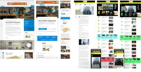
Design mocks have optimal content
Sometimes, design mocks create this utopian vision where everyone’s name is a similar length. They make assumptions about the content and might not account for the variety of life. In the real world, lots of stuff can get thrown at a website.
For example, what should happen if the text is longer than that shown in the mock?
What might go through a developer's mind when the content breaks out of its prescribed bounds?
- Should this conform to the grid? Can it wrap?
- Should the CMS enforce a character limit?
- Should it be clamp with JavaScript? Add an ellipsis?
There might not be a right or wrong answer. But what if there is a similar component that a different developer is working on, and they choose a different answer? It might cause discrepancies in the design.
Or worse, what if this is ignored and it gets all the way to production?
Multiple, and sometimes unknown, font providers

Fonts can come from a lot of different places. A design mock might dictate several different fonts, and for each one, a responsible developer will ask these questions:
- What license do we have for this font?
- Is there a cost to use this font, and do we pass that cost on to the client?
- How can this font be hosted? Is there a CSS file, or is there a way we can host the files ourselves?
All of these affect font optimizations and performance. Having to hunt down the answers to these questions over and over again can waste a lot of time.
Lack of documentation
When someone is presented with just “mockups,” that’s a lot of information at once that might not have context. It can feel like you are drowning. Where do you start?
This might not be a big deal if you are creating a single landing page. But what if you are implementing an entire design system for CMS with hundreds of components? Things get complex very quickly.
When presented with a complex design that has no documentation, responsible developers will need to create the documentation themselves.
This means:
- An inventory of all the components.
- An inventory of all typography styles.
- An inventory of spacing. Is there a grid? If so, what should it look like?
Which means spreadsheets. Lots of spreadsheets.
This takes time. And if you really hate spreadsheets, it takes blood, sweat, and tears. Factor in 2-3 days for small sites and 1-2 weeks for larger sites. Inevitably, it won’t be right the first time, which means later refactoring.
Documentation is not optional, especially if you are part of a larger front-end developer team. But even if you are solo, you need to create it to validate assumptions, communicate properly with designers, and have something to pass off if/when you roll off the project.
Mocks that do not meet WCAG AA accessibility guidelines
Lullabot creates accessible websites, but there are situations where we work with designers who give us mockups that do not meet WCAG AA guidelines.
- The color palette doesn’t have sufficient contrast between text and background color.
- WCAG AA guidelines state that text must have a 4.5:1 contrast ratio or be larger than 19px and bold with a 3:1 contrast ratio.
- Icons, button borders, etc., must have a 3:1 contrast ratio.
- Links that are only indicated by the color. Best accessibility practices dictate that links should also have a non-color indicator for people that are color blind or have other visual impairments.
- Focus states that only change color. Once again, we need to think of how color-blind people will use the website.
Solutions - easing the pain
Creating consistency
This starts with team size. The larger the team, the more opportunity for inconsistency to creep in. Every little change has to be communicated to every other member of the design team. We have found that 1-2 dedicated designers are good for medium-sized projects when creating a design system. It allows faster workflows, communication, and iterations.
If a team cannot be fed by two pizzas, then that team is too large.
What are ways a design team can work in order to create consistency?
Naming systems
Designers have to name many things: typography, colors, components that appear in the design itself, and more. This is the first step toward clear communication.
The naming system should be clear for everyone on the team, from the designers to the developers to the project managers to the stakeholders. Ideally, this naming system is part of, or helps define, a ubiquitous language. When you call something a “hero,” does everyone understand what that is?
This means designers cannot be the final arbiter of what things are named. A naming system is about communicating properly, and creating a naming system should involve communication with the larger team. Be sure to involve a front-end developer because they might want to extend the system into the CSS.
Creating a naming system should start before the visual design itself. You don’t want to be renaming things at the last minute.
Naming things is hard. It can help to have some guidelines to start the conversation. You might try BEM naming, which names things based on where they are and what they do. For example, btn-primary-blue.
Grid systems - consistency in spacing
These should also be started before the visual design. These define your horizontal spacing (columns) and vertical rhythm (rows). Overall, you are defining the rhythm and proportion for your design, which helps implementation and answers many questions before they need to be asked.
As part of the grid system, you’ll also want to define the width and max-width. How far will the grid extend before it stops extending? How will it change at certain breakpoints?
Type systems
Set up your basic styles before starting the visual design. This means styles that you know you are going to use, like body copy and headers. These are easy to update as the project continues, so don’t assume they are set in stone. It will evolve as the design evolves.
But you need someplace to start.
For help with setting up a type system, use Modular Scale. It allows you to start with a base font and create a ratio for how it increases and decreases. This scale also helps determine line heights.
Creating components/symbols, styles, and shared libraries
Now that you have these systems set up, you need a way to share them. All UX programs (Figma, Sketch, Adobe, etc.) have a similar way to share these things, though they might use different terminology. Figma, for example, uses the term components. Sketch and Adobe use symbols.
Components and symbols are reusable elements. You can create an element and add it to a symbol/component library, which other members of your team can access. These can be dragged and dropped onto a page.
These become the central source of truth. If you need navigation on your mockup, grab it from the component library and place it on the page. They can be changed all at once, no matter how many places they appear. You can also create overrides if there is a one-off need. For example, maybe the hero for the About page doesn’t need a CTA.
Here is a video showing the creation of a one-off using Figma, pulling in different components.
Styles are combinations of colors and typography that can be reused. Front-end developers can access a style library and see all the typography being used.
Shared libraries can be shared across documents. Brining in a library brings in all components, styles, colors, typography. These can be accessed by other designers and developers.
Figma allows revision notifications after a library is updated. After updates are published, anyone using the library can pull in the update. This makes it easy to keep things consistent from page to page, document to document. The following video shows the sharing of a library and then pushing a revision.
Documentation
Style guide
The main deliverable for documentation is a style guide. It should be seen as the holy design bible for the design system. Style guides can range in complexity, from intricate to simplistic. It can be hosted as an interactive website, or it could be a Google doc.
What should be in a style guide?
- Grid system and spacing
- Colors
- Type system
- Design principles, resources, and personas that we gathered during the discovery phase
The last item is important if you are handing the style guide off to a client who may be extending the design system in the future. You can browse an example style guide here.
Patterns
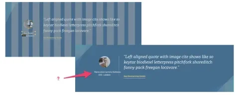
Patterns are different ways components can look on a page—variations based on context. For example, a Hero component could have 4 different color options.
- Colors
- Existence (or number) of CTAs
- Typography
This video shows the different patterns of a hero component.
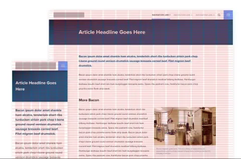
Functionality
Show how the navigation should work or what hover effect should take place for a button. The best way to do this is to create a prototype. If you are not handy with code, find examples on Codepen that match what you want to do.
You can also create basic prototypes in Invision/Figma, and for functionality that cannot be modeled, leave detailed comments.
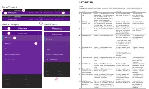
The more traditional way to document functionality is with a functionality spec document. The design is marked with numbers, and each number has a corresponding row in a spreadsheet. These still work, and you can see an example below.
Accessibility
Learn and know accessibility, including WCAG AA criteria and best practices.
For designers, accessibility shouldn’t be an afterthought. It should be worked into the overall design process from the very beginning. This will help save time and rework later down the line and make developers and stakeholders happy.
All user interfaces, marketing websites, components, etc., should be inclusive and able to be used by everyone.
Not sure where to start? First, review the WCAG Guidelines.
There’s a lot to learn, and bookmarking them can be a handy way to quickly bring them up if you need to check the accessibility guidelines of something you’re designing. There are also browser plugins and design tools that can help guide you throughout the design process. Below are just a few that we’ve used in the past.
- Contrast - MacOS app that checks WCAG color ratios
- Stark - Figma and Sketch plugin for WCAG ratios and color blindness simulation
- AXE: Browser plugin that tests for accessibility
If you’re working on a complex component and not sure the best way to make it more accessible, collaborate with a front-end or back-end developer on the team to brainstorm ideas. They can often help prototype an idea to be tested for accessibility and give feedback throughout the process.
Communication
Traditional design handoffs, especially when working with an external design agency, can be like throwing a package over the fence and walking off. Communication is vital. It is the lifeblood of any successful design handoff.
Documentation is necessary but usually not sufficient. Even with great documentation, questions arise, and clarifications are needed. Documentation makes future communication easier and more efficient. Don’t expect it to eliminate it.
Communication needs to happen during the design process and during the development process.
Have regular check-ins to make sure things make sense or if things are doable. Bringing developers in during design reviews - even during the wireframe process - will make the eventual handoff much smoother. Be open to more questions as they pop up.
When to push back
It’s important to know when developers should push back against design decisions, or at least get more clarity on the “why.”
Some examples that should trigger some additional communication:
- Accessibility (especially in regards to contrast ratio)
- Similar components - can we have just one component instead?
- Similar functionality can be provided in Drupal with almost no effort, and it gets us 80% there. Is doing something custom worth the cost or compromise?
- Minor design element that may impact the timeline. It doesn’t impact core functionality but could involve a lot of development hours.
All of these are opportunities to improve the design and increase the chances of a successful project.
Tools
Accomplishing successful design handoffs is not a technology problem but a process and people problem. But there are tools that can help.
We’ve already talked about taking advantage of all the capabilities of UX tools like Figma, Invision, and Adobe. These allow front-end developers to access design values: color, type, spacing, etc.
And they don’t have to use the program something was designed in.
There are also services that allow design/developer collaboration across any design platform, like Zeplin, Zeroheight, and avocode. Zeroheight works great for smaller projects where a pattern library isn't being created.
For documentation, we use two tools based on how the documentation will be used.
- Dropbox Paper - Used for more informal documentation. Copying and pasting CSS values, for example.
- Google Docs - Used for formal documentation like official style guides that clients will see.
Conclusion
Design handoffs don’t have to be painful. They don’t have to be where communication breaks down. Instead, they can be opportunities to foster better relationships between design and development, which leads to an improved final product.
No DesignOps process is complete without a healthy workflow between designers and developers. Ensure consistency, maintain good documentation, and keep communication lines open and flexible.
If you have any questions about design systems and how our designers and developers work together, please reach out.