Similar to many other creative mediums, music depends on rhythm. Rhythm indicates the presence of a strong, regular, repeated pattern. It’s the constraint and consistency in tempo that creates a foundation for expression and creativity.
Though some masterful musicians switch tempo mid-song to build drama and interest, all artists benefit from beginning with one simple rhythmic scale upon which all other repeated patterns are built. In user interface design, we also want to create a sense of rhythm and proportional consistency in the same way that the “beat” works for a composition of music.
Proportion done well creates rhythm and a sense of harmony or unity in a composition or design. When scale is in harmony, it’s in proportion. A lack of scale creates competition between elements and leaves the reader to determine their own entry point into your composition.
Steven Bradley
Proportional design is an approach for achieving greater visual consistency within your design system. The concept allows designers to create a proportional scale which then informs sizing and rhythm decisions for every element that lives on a webpage.
There are many ways to create a proportional system. Here I’ve outlined the framework that our team has used successfully and refined over time on many different project types.
In this approach to proportional design, the entire scale is informed by the body font size, otherwise known as the base font size. The base font size and ratio for the typography scale advise the sizing of all other elements on the page, including columns, rows, vertical rhythm, images, backgrounds — really any component that a designer can influence.
In other words, we’ll have mathematical reasoning and consistency for the whole shebang. The opposite of this approach would mean scaling all type, images and other elements willy nilly. Perhaps your approach is somewhere between, as mine was for many years. Most designers can size any elements on a web page “by feel” very well with many years of visual design experience.
I’ve come to realize that allowing every decision to live within a proportional system actually saves time when you consider the entire design process and the long term scalability of the system. This approach also takes your visual design work to the next level in a way that leaves onlookers knowing that your designs are a cut above, though they may not realize exactly why. Steven Bradley with Vanseo design outlines the importance of size, scale, and proportion well here.
The mathematical sciences particularly exhibit order, symmetry and limitation; and these are the greatest forms of the beautiful.
Aristotle
The benefits of designing with a proportional system
- Experience a next-level beautiful and professional feel in your design work. Proportion is beauty!
- Within the constraint and focus of a scaled system, I think you’ll find that inspired ideas come more quickly.
- Stop spending time guessing spacing and snap elements into perfect placement the first time you add them to your artboard.
- Developers have less guesswork and are empowered to add undefined future styles to style guides within a mathematical framework.
- Supports consistency for large design systems that can grow over time.
- Creates consistency when multiple designers are working on the same project simultaneously.
A Framework for Proportional Design
Below I’ve outlined our team’s approach to building a proportional system as an example. This approach has evolved through experience working on a variety of project types and sizes and will continue to evolve as we find ways to simplify and streamline.
Step 1: Create a type scale
Your type scale decisions will influence the system moving forward. Once you get the hang of how element sizes interconnect, you always change up the type system and test variations.
An easy way to quickly determine a scale for your typographic system is to use a tool like modularscale.com. This site allows you to choose a base font size, which you can think of as your body font size on desktop screens.
Next, choose the ratio at which the entire type scale is determined. For this example, I’m choosing a base font of 18px and using a ratio of 1.125.
💡 Tips:
- The smaller the ratio, the more sizing options you’ll have to work within your scale.
- Using pixels as your base size measurement will allow you to translate the scale easily to other elements within Sketch.
- Use the “ms” labels to refer to your size options in documentation (choose sass toggle menu in order to view “ms” labels).
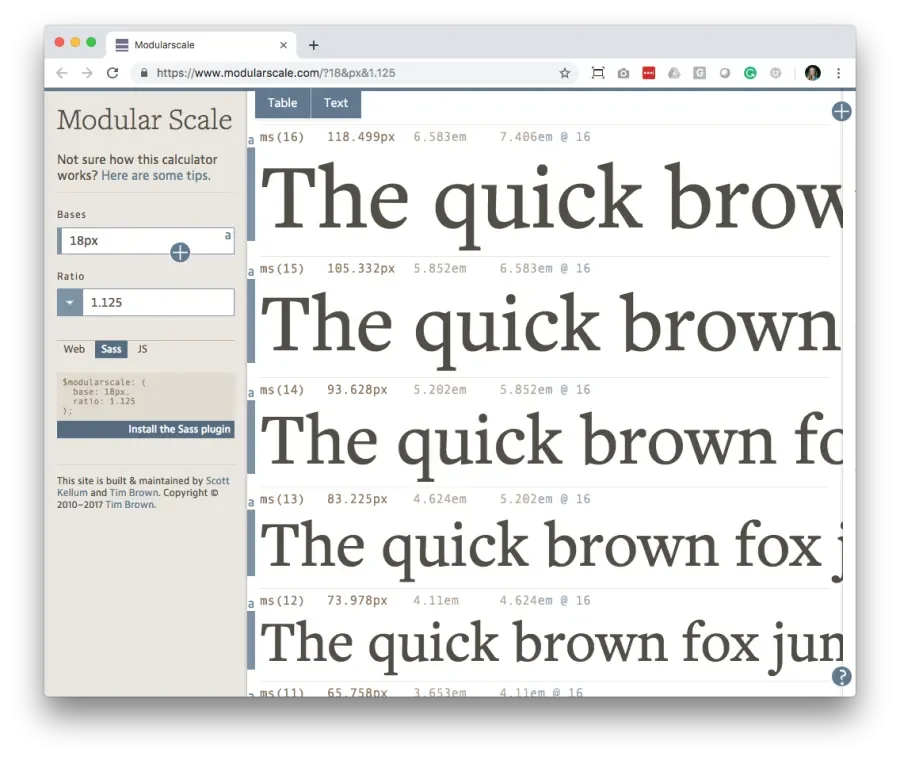
A type scale created on modularscale.com
Type scale…done! Modularscale.com has defined all type size options that you will use for your future design.
Example Documentation

Ratio for type scale: 1.25

Desktop, tablet and mobile body size: 18px
Step 2: Create artboards in Sketch for desktop, tablet, and mobile
Open a new document in Sketch and place an artboard for desktop, tablet, and mobile. The total width is up to your discretion. Consider using the total width recommendations defined in the default Sketch artboards.
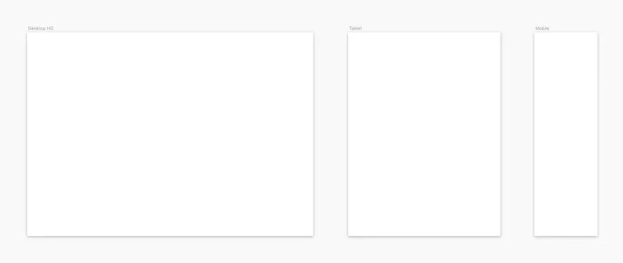
Desktop: 1440px

Tablet: 768px

Mobile: 320px
Step 3: Define your vertical rhythm unit size
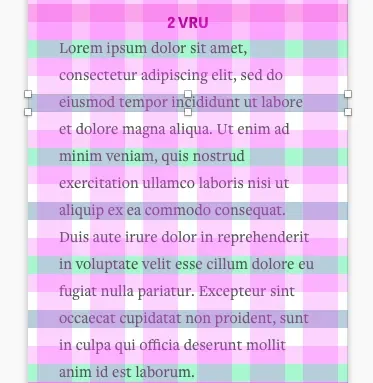
Vertical rhythm means that you’ve established a pattern for vertical spacing. The primary driver for vertical rhythm within the design system is simply consistency. This consistency can help guide the user’s eye down the page and through the interface, and the repetition can help avoid a cluttered feel. At Lullabot, we like to call each row and row gutter a “vertical rhythm unit” (or VRU).
We’ve found it helpful to set your VRU in proportion to your base font size. In this case, I’ve kept the VRU size the same as the base font size (18px). VRU sizing is kept the same across resolutions.
VRU's in Action
Sometimes smaller elements require tighter spacing (e.g. the space inside a button). Don’t be afraid to use a fraction of a VRU (e.g. .5 VRU's of space above and below button text). It helps to keep it in easy proportions like halves. There may need to be some wiggle room within the rules and that’s ok.
Example VRU Spacing for Content Elements
- Distinct sections need more spacing to denote the context change (e.g. 12 VRU's of space)
- Related sections need less space (e.g. 6 VRU's of space)
- Headings ms(5) and larger: 1 VRU of space between them and other content elements
- Headings ms(4) and smaller: .5 VRU's of space between them and other content elements
- Paragraph copy at the base ms(0) size: 1 VRU of space between them and other content elements
- Paragraph copy at sizes ms(-1) and smaller: .5 VRU's of space between them and other content elements
- Primary CTA’s (at standard size): 1 VRU of space between them and other content elements
- Secondary CTA’s (or smaller sized): .5 VRU's of space between them and other content elements
Example Documentation

Ratio for type scale: 1.125

Desktop body size: 18px

VRU size for desktop, tablet and mobile: 18px
Step 4: Align your layout settings with your VRU size
Select each artboard and adjust the layout settings (view → layout settings).
Desktop
- Choose a column gutter width that is in proportion to your body font size (18px in this case).
- Let Sketch calculate the column width based on your total width (1440px in this case).
- Your row gutter height will be the same as your column gutter width. Set your row height to “1x the gutter height”.
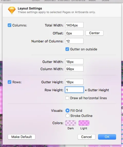
Desktop Layout Settings

Note that the total width (1404px) is 36px less than the total width of the artboard (1440px) to allow for 18px outer grid margins. Sketch automatically calculates outer grid margins as half the width of the gutter width. Modifying the total width is a workaround to adjust that measurement.
💡 Tip:
- Many HTML and CSS frameworks use 12 columns as standard. This nice even number allows for enough flexibility within the design and allows you access to the highest amount of column variations (e.g. two cols, three cols, four cols, six cols).
Tablet
- Reducing the number of columns on smaller screens is usually helpful for ease of design consistency. Here I’ve reduced the columns from 12 to 8.
- Note that the column gutter width and row gutter height match the body font size.
- Note that the total width (732px) is 36px less than the total width of the artboard (768px) to allow for 18px outer grid margins.
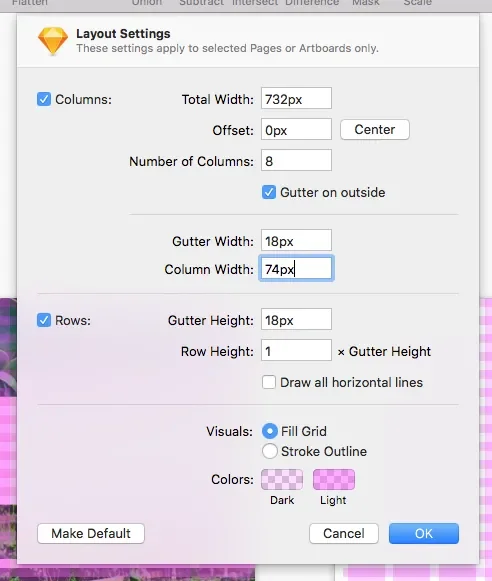
Tablet Layout Settings

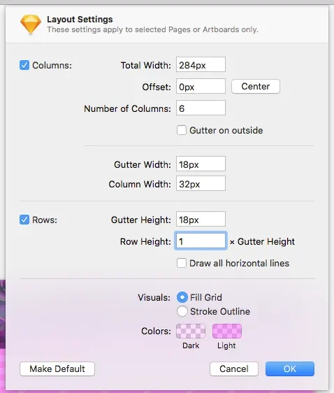
Mobile
- The number of columns has been reduced from 8 to 6. Once more, the column gutter width and row gutter height match the body font size.
- Note that the total width (284px) is 36px less than the total width of the artboard (320px) to allow for 18px outer grid margins.

Step 5: Determining line-height for type
In this example, we’ve sized our body font to 18px.
Use simple VRU multiples (half-steps keep it simple e.g. .5 VRU, 1 VRU, 1.5 VRU, 2 VRU, 3 VRU, etc.) for line-heights.
We’ll use 2 VRU's as the multiplier for the line-height on desktop (36px). When the row height and row gutter heights are using the same scale as the body line-height, it’s easy to quickly align type to a perfect position.
Vertical rhythm is simply a guide and not a religion, and therefore we also employ incremental leading when necessary to maintain the proper feel within varied type sizes. For example, on mobile, we’re reducing the line-height to 27px (1.5 VRU), which aligns the copy on every third line.
Example Documentation

Ratio for type scale: 1.125

Desktop, tablet and mobile body size: 18px

Desktop body line-height: 36px (2 VRU)

Tablet body line-height: 36px (2 VRU)

Mobile body line-height: 27 (1.5 VRU)

VRU size for desktop, tablet and mobile: 18px


Column gutter width for desktop, tablet and mobile: 18px (1 VRU)

Row gutter height for desktop, tablet and mobile: 18px (1 VRU)
Since this is a responsive site, the size of various styles (e.g. a primary heading, subheading, body copy, etc.) grows upward from smaller mobile screens to larger laptop and desktop screens. Despite the shift in sizing, we use the same Modular Scale across all responsive screen sizes (e.g. Body Copy may display at ms(-3) or 14.047px on a smaller mobile screen and at ms(0) or 20px on a larger screen).
Final type documentation can be expressed as:
font / weight / size / line-height in VRU’s / letter spacing / transform
Heading A (Page Heading):
Mobile: Tablet Gothic / Bold / ms(1) / 1 VRU
Desktop: Tablet Gothic / Bold / ms(8) / 1.5 VRU’s
Heading B (Content Heading 1):
Mobile: Tablet Gothic / Regular / ms(2) / 1 VRU / -0.3px
Desktop: Tablet Gothic / Regular / ms(6) / 1.5 VRU’s / -0.3px
Heading C (Content Heading 3):
Mobile: Tablet Gothic / Bold / ms(1) / 1 VRU
Desktop: Tablet Gothic / Bold / ms(2) / .75 VRU’s
In Summary
Nice work! Now that you have a proportional system to work within, test sizing with various elements as you layout additional pages. Your system will take shape over time.
Every design system has unique expressions. Your work can be a balance of art and science. Using a scale as a fundamental base provides a simple constraint that we’ve found ultimately leads to greater creativity. Happy designing!

Use your horizontal and vertical rhythm patterns for sizing and spacing in all remaining elements.