Olivero is a new front-end theme for Drupal 9, meant to be included in Drupal core as the default. Several Lullabots took an initial idea and, on a tight timeline, designed and developed an MVP of the new theme so it could receive feedback from the wider Drupal community.
We are familiar with typical design projects, where we help design something specific for a single client for a specific purpose. But what happens when this specificity goes out the window?
When designing a theme for an open-source CMS, one that anyone can use for any kind of site, that familiar specificity disappears. Defining the audience and the stakeholders for a project like this is tricky, and some solutions can create new problems.
In other words, here be dragons. And picture that phrase in bold, elaborate type.
In many ways, designing a new core theme for Drupal represents the worst-case scenario for a design process. This does not mean the experience was negative or bad. It simply means there were many unknown unknowns. Many intersections where the project could fail. No clear stakeholders to provide things like clear goals and direct feedback. These challenges can introduce chaos into a design project.
But it is at the margins where the most learning and growth take place. The more difficult the problem, the more creative the problem-solvers need to be. New experiences forged in these circumstances can help bring new insight to more typical, day-to-day scenarios.
So how did we navigate this scenario? And what lessons did we learn along the way?
The first stakeholders
You have to start somewhere, and in this case, we started with ourselves. Members of our team saw a need for a new theme for Drupal. In his keynote at DrupalCon Seattle, Dries Buytaert shared how experts still love Drupal. Beginners…not so much.
We know through research that at least some of that negative sentiment is due to a dated out-of-the-box experience. The default theme, Bartik, is now ten years old. This is quite an accomplishment. Creating something that lasts for ten years, especially in technology, is commendable. Nevertheless, there are needs not being met.
To get started, we needed to approximate some stakeholders, and so we, as users and practitioners of Drupal, became the first stakeholders. We also needed to establish some high-level goals to define what we were hoping to accomplish.
- An updated modern design. The new theme needed to feel current. Our hope was that it could last for five years.
- Functionality that supports new features. The new theme needed to support new Drupal functionality like secondary navigation, embedded media, and Layout Builder.
- WCAG AA Conformance. The new theme needed to pass Drupal’s stringent accessibility standards, with things like proper contrast, large enough typography, proper focus states, and more.
We could not remain the only stakeholders forever, of course, but you have to start somewhere.
What are we designing?
We also needed to establish a scope of the project and define what would be required for an MVP and what were just nice-to-haves.
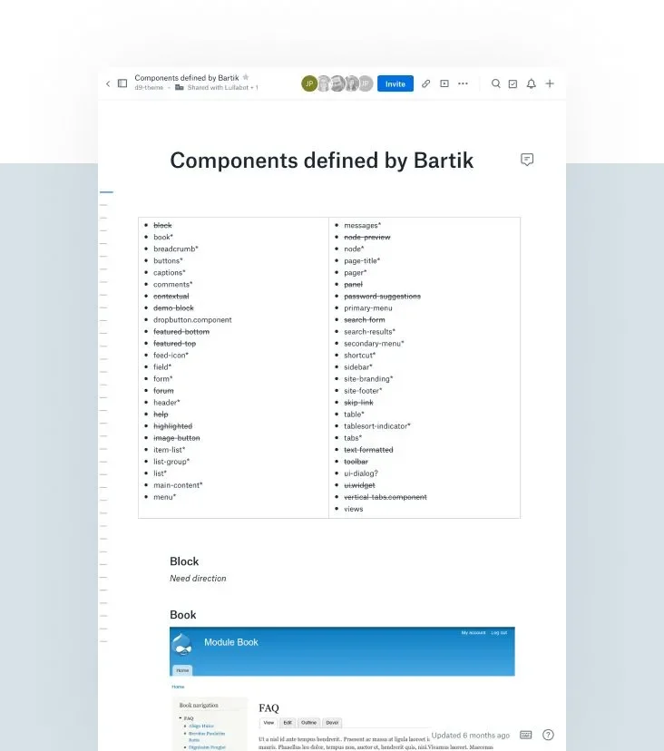
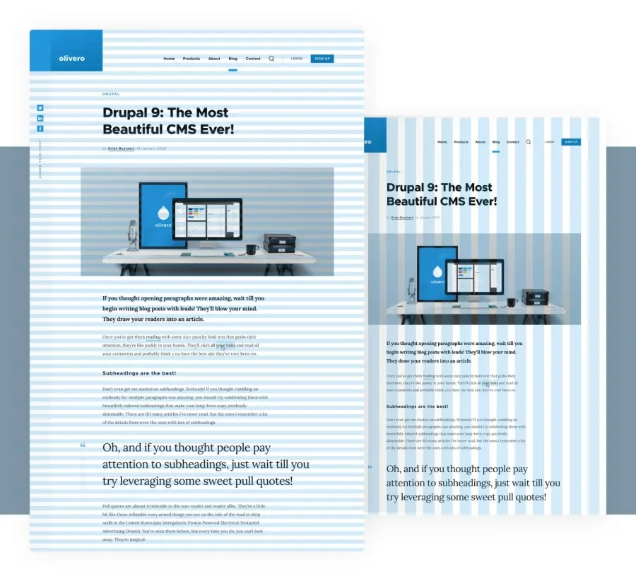
We used Bartik as a base to prime the process. Working closely with our development team, we compiled a list of all theme components in Bartik and how they could appear, complete with examples and screenshots. This helped bring an ephemeral idea down to the ground and give it some weight. Something we could point to and look at.
Once we had this list in a good spot, we created quick wireframes to review with the developers to ensure we had captured all the important bits.
Defining the audience
Who is the audience for this product? This is one of the fundamental questions for any design project and it is usually not that difficult to answer. When designing an open-source CMS theme, or something that allows lots of flexibility, defining your audience becomes a challenge.
There is a narrow path we tried to walk in answering this question, and on either side, we saw potential pitfalls.
Don’t try to include everything for everyone
In these kinds of projects, there can be a strong temptation to include everything. There are so many potential users, and Drupal can do so much. We want to please everyone!
It’s not something we could accomplish, even if we wanted to. The needs are too varied. Trying to include everything for anyone would result in something that’s unwieldy or unusable for everyone.
We needed focus and intent.
Don’t design for the average
This is sometimes known as the “average man problem.” In the late 1940s, the US military realized a large number of pilots kept losing control of their planes, and this problem showed up across different types of aircraft. Too many planes were crashing.
For three decades, the design of cockpits conformed to the size of the average man. They first tried to update the averages, just in case the average man had gotten bigger, but they discovered something more important. There was no such thing as an “average man.”
Not a single pilot fit within the most important dimensions of a cockpit, and so most cockpits had been designed for someone who literally did not exist.
This eventually led to adjustable yokes, seats, pedals, etc. The book, The End of Average, describes the details, and an episode of the 99% Invisible podcast also covered this topic.
If we couldn’t design for the average user, who could we design for? What would we need to make adjustable?
Establishing design principles to measure against
First, we defined some design principles that helped describe what success would look like in a memorable way. These principles also needed to hold true as we learned more about our audience and stakeholders, so they needed to be flexible and high-level.
The principles we settled on:
- Simple - Avoid unnecessary visual elements, colors, effects, and complexity.
- Modern - Take advantage of modern browser capabilities and interaction patterns, like the Intersection Observer API.
- Focused - Embrace high contrast and color saturation for drawing attention to what’s important. Design defaults for the 80% audience.
- Flexible - Provide options and overrides for varied needs and preferences.
What can we say about our audience and their sites?
There is an ocean of things that you just cannot know about people who will use this theme, and yet another ocean that could hold all of the different sites they could try to build. But there were a few things that we felt were safe to assume about our audience and what they would build.
- Includes beginners - People new to Drupal. The default theme gets used by people kicking the tires.
- Limited resources - Both time and expertise. Probably no programming or design skills. If you do have these skills, you are probably making a custom theme.
- More limited content models - The base content types would be doing a lot of heavy lifting, so the theme needed to serve the base content types really well.
- Varied content - Despite a simple content model, things like title and label lengths, as well as the number of menu items, can vary widely.
Defining our stakeholders
We couldn’t remain our only stakeholders forever. That was good enough for the initial push and motivation, but we couldn’t assume to speak for the whole community. We at least needed a better approximation to start building initial consensus, but out of the thousands of potential stakeholders, many of whom are passionate about Drupal and its direction, how did we narrow the choice?
We started asking these questions:
- Who will provide feedback, when, and how?
- What kind of feedback are we looking for?
- What does approval look like? Who will approve which designs, and how?
Establishing a proxy group
To reign in the numbers and get some focus, we established a proxy group. This group included various Drupal core maintainers as well as our team of designers and developers. We wanted to do as much due diligence to weed out potential problems and refine our assumptions before putting it in front of the larger community so that eventual community feedback would be more focused.
This group led to a lot of changes in the designs, even after some of the development work had begun.
Some of the things that changed:
- Initially, we had a style for uppercase labeling, used for things like RSS feed labels and share labeling. Because of localization and other varied uses, it was not possible to guarantee conciseness.
- Color palettes as we tested for accessibility.
- Form states were refined and refined for visual clarity and accessibility while maintaining the language of the design.
Expanding our stakeholders
Eventually, we needed to engage the community for feedback, so we did some work to define what type of feedback we were looking for, along with a timeline. Making it completely open-ended could open the floodgates and drown us in too much noise.
We published an overview of our journey and our guidelines for feedback and then continued the refinement process.
The community feedback did not feel like an overwhelming onslaught, which felt like a success and validation of our process up to this point. They provided great insights and helped catch a few things that we missed, but the work we had done with the proxy group had been effective.
Developing the visual approach
What should the new theme look like? This was the first question to answer. To do that, we facilitated discussion and aggregated the results of those discussions.
Finding the voice and tone
The proxy group consisted of stakeholders located in multiple timezones who already had full days. In a normal design project, our stakeholders typically prioritize their involvement because, at some level, it falls within their day-to-day responsibilities. This project, however, was outside of all of our stakeholders' immediate responsibilities.
We needed a less time-consuming, but high-impact exercise for our proxy group to do on their own time without a specific due date.
A spectrum analysis, which involves a list of sliding scales, going from one adjective to the other, worked well. Though each adjective had a positive connotation, each pair of adjectives conflicted (formal vs. casual, warm vs. cool), and forcing people to choose helped initiate some really good discussions. The “why” is more important than the actual selection, and everyone reserved the right to change their mind.
We usually do this exercise in person, but given the unique scenario and stakeholder makeup, that was impossible. Instead, we used Invision’s comment functionality to create the actual points on the scales, which made it easy to ask follow-up questions.
Here are the results of the exercise:
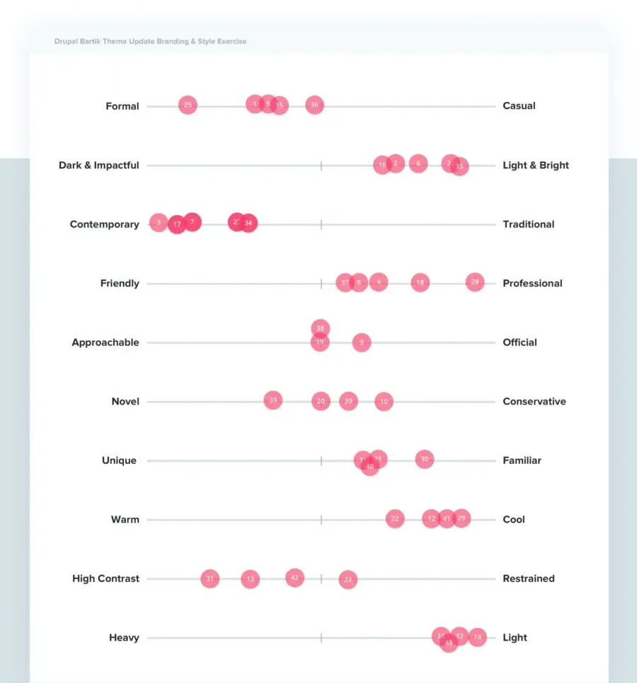
This exercise delivered the voice and tone we should aim for:
- Formal
- Light & Bright
- Contemporary
- Professional
- Approachable
- Novel
- Cool
- Familiar
- High Contrast
Visual exploration
Our team uses Zoom Mocks for our projects, an alternative to style tiles, to explore different visual approaches. To use this paradigm, you choose a wireframe, then zoom in on a section of that wireframe to get into specifics. When you settle on a direction, you move to a different section of the wireframe and gradually build out the context. Styled elements become part of that wireframe.
We were not looking for an official sign off of “yes” for a particular style, as that would have required a larger feedback loop. Our timeline did not allow for that. It also would have required more involvement from our stakeholder proxy group. Instead, we depended on more directional feedback (“looks good so far”), understanding that the design would evolve and change as the system extended to other pages and components.
Typography challenges
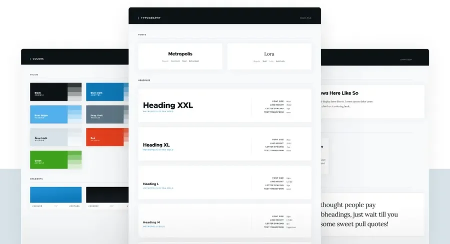
Finding suitable type for the theme presented a challenge of its own. We wanted both a serif and a sans-serif font face, and the chosen fonts had to meet the following requirements:
- Be widely available.
- Utilize the SIL Open Font License to be compatible with Drupal’s packaging requirements.
- Have a wide variety of font weights to fit various contexts (while being careful not to go overboard for performance reasons.)
In the end, we chose Metropolis for our san-serif font and Lora for our serif font.
Creating the design system
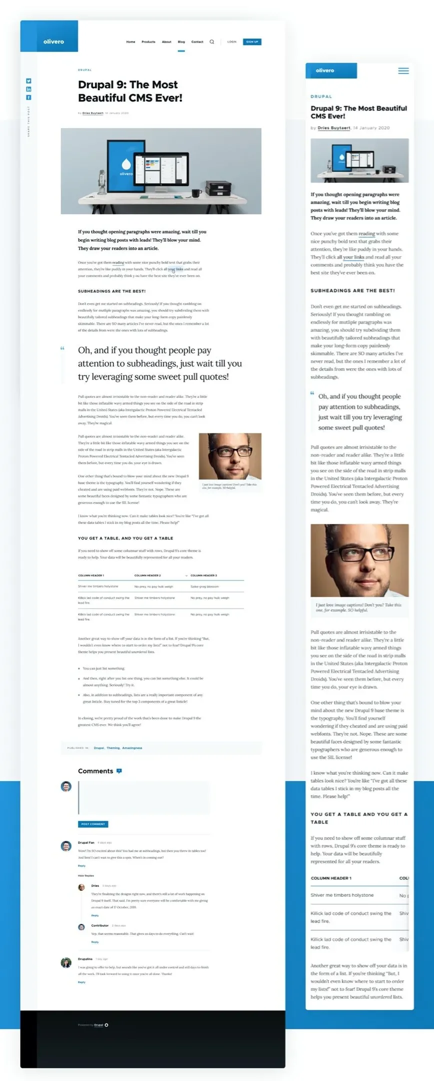
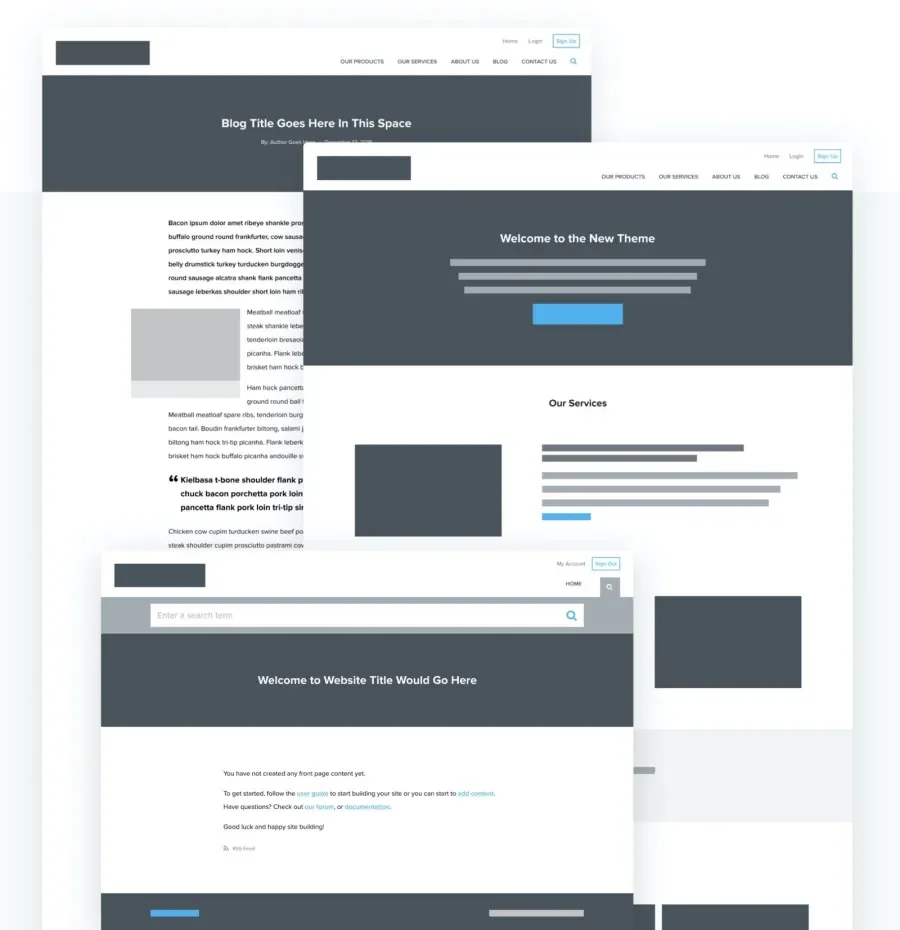
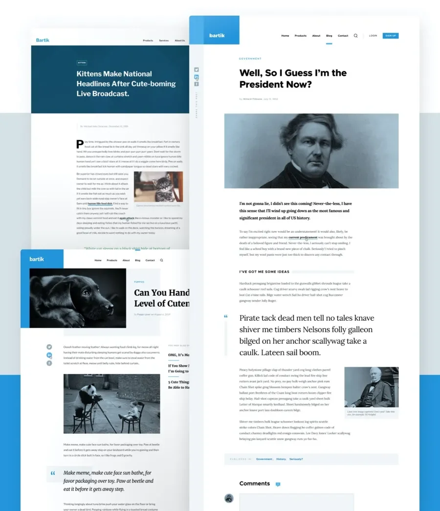
This is where the rubber started to hit the road. To begin creating the design system, we started with the out-of-the-box landing page and the article page, which we assumed would be the worst-case scenarios from the least amount of content to the most content.
For the article page, we created a hypothetical blog article announcing the new theme, and this allowed us to work out the more complex patterns of the design system. We refined typography usage: headers, quotation copy, body copy, and captions. Other patterns received attention as well, like tables, lists, and comments. This allowed us to see how everything worked together in a common context.
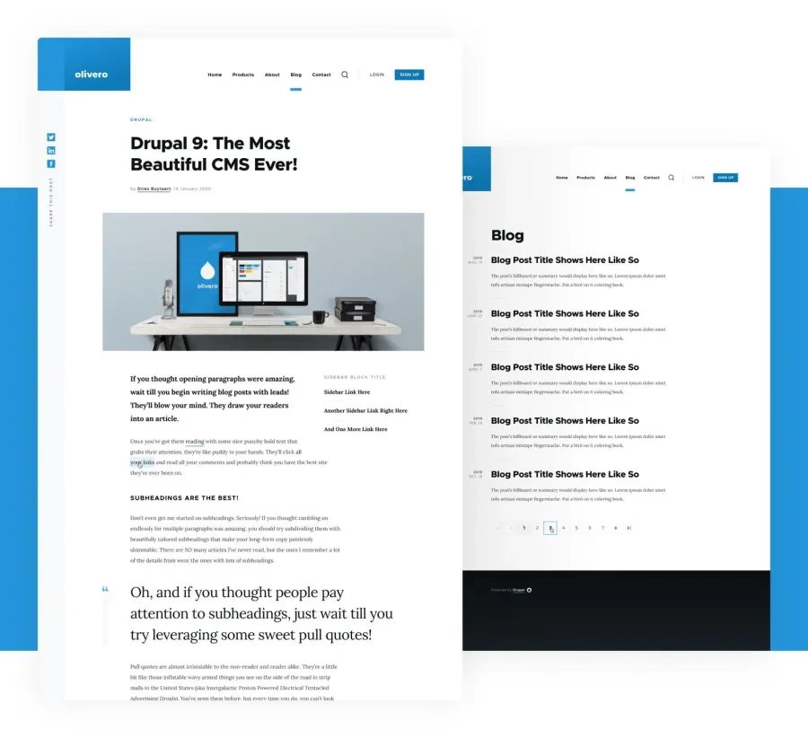
After that, we moved on to secondary navigation, the search bar, and the branding area. The navigation, in particular, had to be flexible, as it was one of those elements that epitomized potential chaos. There are no inherent limits to the number of items you can add to a Drupal menu, nor inherent limits to the length of the text of a single menu item. We could make no assumptions on content in this area.
To solve this problem and make it easier to bring the navigation down to tablet and mobile screen sizes, we wrapped the entire element in a hamburger element after it hit a max-width. Doing this kept things clean and orderly regardless of the number of items crammed into the main navigation.
To accommodate Layout Builder and the various ways content is placed on a page, we made sure to establish good spacing and vertical rhythm., which dovetailed nicely with the responsive grid system. Altogether, they helped create a balanced and predictable flow on the page, one that scales well based on the content available.
To the future
Olivero is still a work in progress. As more people use it and feedback comes in, the theme continues to evolve, which is great. Olivero is a theme for the community, and it has a broad target audience that is itself shifting and evolving.
Designing for this large and varied audience proved a challenge, but a fun one. We are proud of the solutions we created, and we feel like we hit all of our initial goals while remaining true to our design principles. The theme is simple and modern, provides good flexibility, and meets our high standards for accessibility.
Finding some order in the chaos allowed us to use the design expertise and services we bring to more typical projects and to use them in creative ways. We hope our contribution serves the Drupal community well for years to come, and we look forward to the future of Olivero.