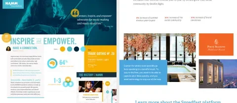
At Lullabot, our design team is constantly looking for ways to improve our process for collaborating and communicating ideas. Lately, we’ve been experimenting with ways our team can explore styles more efficiently, using a leaner process that allows us to produce and iterate more quickly. When it comes to establishing visual style efficiently, two popular approaches are style tiles and element collages. These approaches provide a much-needed exploration phase prior to diving into full page mocks, but we’ve found that each has shortcomings, as well. They often result in beautiful artifacts that don't necessarily map nicely to the actual components and holistic layout for the page types we're designing.
When we've created style tiles in the past, we’ve often spent a significant amount of time reworking and modifying the approved styles they helped produce in order to fit to real components and page layouts. We initially addressed this by including an assortment of actual components from the design system in our style tiles (something more akin to element collages), but even this can lead to arrangements and layouts that won't exist within the final site, again leading to re-work as we translate style tiles into final mocks.
Designing components in random assortments and layouts (element collages do this essentially) can also lead to design decisions that miss the finer points of visual hierarchy that occurs when components appear in their actual layouts. Visual weight, color, etc. can take on new meaning due to what's right up against a given component.
As we evaluated these challenges within our process, our fundamental desire was to find a way to ensure that our design decisions were being made based on actual page elements and components in real-world context. The result of this process has been a new hybrid approach that we call “Zoom mocks”.
Zoom Mocks To The Rescue
Zoom mocks are styled elements from part of a wireframe. We take a portion of one of our wireframes, and we zoom in on it (e.g. the top 600px of an article). We then explore style for actual components that live in their actual contextual layouts. This approach helps us solve several of the problems mentioned above that our team was running into with traditional style tiles.
We’re approaching style in a much more efficient way that allows us to keep moving forward and work much quicker while designing. Because we’re referencing an already approved wireframe, we spend less time modifying a template or creating a layout to a style tile or element collage. Components are styled in context to the page, which helps bridge the gap between style exploration and designing page mocks. Zooming into a page and testing style on actual positioned components helps avoid rework when translating those styles to other page types and elements. Using wireframes as a starting point also helps us evaluate all the various components and identify the differences so we can try to design for them early in the process.
How Do We Create A Zoom Mock?
Before starting any of the style work, we make sure that we have all of our questions answered from the client regarding their brand, so we can accurately connect their vision and brand to the style of the site. Since we’re trying to make informed decisions based on actual components and their positioning on the page, we begin the style exploration process after wireframes have been approved by the client. We then evaluate the wireframes to determine which components we should focus on during the style exploration phase. Components are often chosen based on their complexity, priority, and how often that pattern will appear throughout the site. When exploring style, we keep the components within the context of the page and zoom in, purposely cropping elements off the page. During the process, this helps us make more concrete style decisions that take into account positioning and hierarchy. It also helps us ensure that conversation with the client stays focused on style and not layout.
When reviewing the zoom mock with the client, we ask them if the style is going in the right direction. If they give us the thumbs up, we’ll continue to expand the canvas of the zoom mock, applying style to other elements on the page. This allows us to continuously refine the zoom mock as it expands to include other components that appear on the page. Gradually, the zoom mock turns into a fully designed page, which creates a smooth transition for us into the design phase. If the client gives us the thumb down, we’ll refine the style of the zoom mock until the client feels comfortable with the direction that the style is moving.
The zoom mock approach to style tiles has been a real improvement to the style exploration process for our team. As we continue to refine our process, I’m excited to see how we can help our team work together more efficiently and to share our experiences with the design community.


