I often get asked why we use Sketch over Photoshop when it comes to designing for the web. The simple answer is that it’s the right tool for our team. However, the story behind it is much more complicated. The tools that designers use continue to change as the web evolves. The evolution of tools has accelerated, especially since the introduction of responsive design. As the web continues to change, so does the process for designers. I seem to stumble across a new tool or process idea every week! But, the tools themselves are only a small part of the design process. Below are a few ways in which the evolution of the web has impacted our design process and toolset.
Responsive Design
Before the first smartphone was released and Ethan Marcotte published his first article on responsive design, we designed on a fixed-width canvas. Our designs didn’t have to have a flexible width (though designers still argued about it) because most users browsed the web on their desktops or laptops. The computer screen was seen as a fixed box where the majority had a resolution of 800-1024px wide. Designers in those days urged one another to design wider fixed layouts.
The release of the smartphone and tablet changed that. Now the screen could be any variable of numerous widths, heights, and resolution.
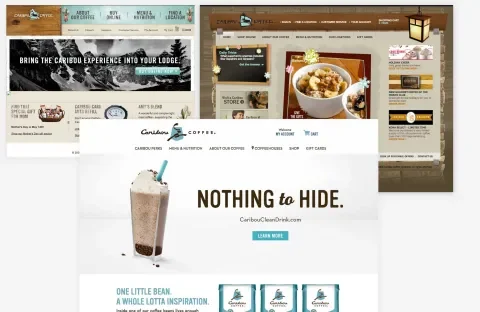
As designers and developers dove into creating optimal responsive experiences for the web, the visual design began to evolve and simplify. We quickly found out that loading an experience heavy on bevel and emboss, drop shadows, textures, and numerous raster graphics created a crappy experience for the users on cellular internet connections because of the additional load time. Designs began evolving from skeuomorphic to flat, stripping away unnecessary design to speed up load times.
As the web landscape was changing, designers found themselves in need of more efficient tools to help envision and test a scalable design. Tools like Sketch and Figma included responsive presets and allowed for multiple art boards and also provided ways to quickly scale up or down components. The tools themselves became simpler, ditching unnecessary features and enabling designers to create and export assets based on real CSS values. There are still major gaps in the new tools that have been released, but overall, they’ve helped improve the process.
User-centric Design
The growth of and interest in user experience design has also had a dramatic impact on the way web designers approach their work. Designers are looking more towards users for feedback to help shape design solutions for a site or product. A user-research based approach to design, along with the popularity of design sprints, has designers needing to work more iteratively in order to test and revise designs.
Designers often prototype in order to test ideas on actual users. For designers whose strength is not in front-end development, this can be a time-consuming process. Additionally, having a development team to prototype ideas with and for you isn’t always feasible due to time and budget constraints. Here’s where prototyping tools such as Adobe Experience Design, Invision, Flinto, and Principle step in to fill that gap. They allow designers to quickly prototype an idea to test it with real users and get feedback from clients and the project team. Very little coding is needed to complete these sorts of prototypes, and some also integrate nicely with Sketch and Adobe Photoshop to save time when importing and exporting.
Our design team often uses a combination of Sketch and Invision to prototype and test simple ideas. When we need to produce more complicated prototypes of things like animations our team has experimented with other tools like Principle and Flinto to help visualize our ideas in action. Many of the most common interactions, transitions, animations etc. can be relatively quickly prototyped for user testing and feedback without writing a single line of code.
It's worth noting that most design teams work differently, and while one may leverage tools like the ones previously mentioned for prototyping, others may prototype nearly everything "in the browser" using basic HTML, CSS and JavaScript or frameworks like Bootstrap and Foundation as starting points. Our team tries to always work in the most efficient way possible, especially when producing artifacts that are, in the end, disposable. There are things that we prototype with some basic HTML and CSS, but many things that we're able to test more quickly using tools that require no writing of code.
Collaboration
By asking people for their input early in the process, you help them feel invested in the outcome.
- Jake Knapp, Sprint: How to Solve Big Problems and Test New Ideas in Just 5 Days
Design and development teams have evolved to become more cross-functional and collaborative. Many designers and developers are also individually becoming more cross-functional with designers learning the basics of HTML, CSS and Javascript to prototype ideas and developers with an eye and heart for user experience beginning to participate in that process and adopt methods.
Before responsive design and the popularity of agile, most teams tended to be separated in their own silo. Design worked in one space, development in another. Designs were often created and approved with little input from developers, and developers tended to develop the site with little input from designers. This approach often led to miscommunication and misunderstanding.
Luckily, as web technology and processes began to accelerate, teams began to see the benefits of working more closely together. Today, designers, developers, clients, basically anyone involved in the project are often brainstorming and participating in the entire process from start to finish. Teams are working together much earlier in the process to help solve problems and test solutions. However, teams today can also be co-located across the world, making team collaboration more difficult.
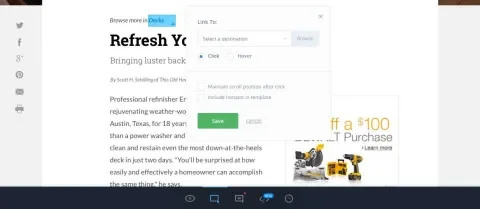
Design tools have evolved to help communicate ideas to the client and team. Programs like Invision, Marvel, UXPin and others not only help designers prototype ideas, but also allow the team and clients to leave feedback by way of comments or notes. They can review and comment on a prototype from anywhere, using any device.
For design teams that are collaborating on a single project, several design programs have introduced shared libraries where global assets in a project can be kept up to date. Designers just need to install the library for that project and voilà! They’ll have all of the updated project assets to use in their design. Updating and sharing a component is as easy as adding it to the shared library where others can access it. This added feature really helps our team ensure designs are consistent by using the most updated versions of colors, type styles, elements and components.
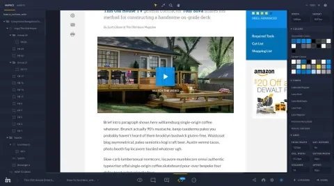
Several design programs have also added features to help bridge the gap between design and front-end development. Some now allow for the export of styles as CSS or even Sass. Several programs like Zeplin, Invision (via the Craft Plugin and Inspect feature) and Avocode convert designs to CSS, allowing developers to get the styling information they need without opening a native design file. Assessing colors, typography, spacing, and even exporting raster and vector assets can all be done using one of the above programs. They also play well with Adobe Photoshop and Sketch files by directly syncing with those programs and eliminating the need to export designs and then individually upload them.
Tools Are Only Part of the Process
Design tools have come a long way since the beginning of responsive design. They’ve evolved to help teams solve new problems and enable teams to communicate more efficiently. But, as designers, we need to know that tools will only get you so far. As John Maeda said, “Skill in the digital age is confused with mastery of digital tools, masking the importance of understanding materials and mastering the elements of form.” Know the problems that need to be solved, the goals needed to be accomplished, and find the best solution that speaks to the user. Don't get too focused on the tools.
Finally, every team is different and so is their toolset. Just keep in mind that you should pick the toolset that fits your team’s process the best. What may work for one, may not work for another.


