For Lullabot's first sponsored contribution, we've been focused on improving Drupal's main navigation. We decided on this direction for two reasons. First, it's one of the most visually impactful areas of the Admin UI. Second, its redesign will support other active initiatives to improve Drupal's Admin UI.
Since our last update, we've been focused on a redesign of Drupal's main navigation, or "the toolbar." It's one of the most visually impactful changes to the Drupal Admin UI, and when it's completed, it will complement other efforts like the Dashboard and Field UX initiatives. Our overarching goal is to improve the usability, accessibility, and design of the navigation system to provide a better user experience for site builders and content editors.
We based our initial designs and prototypes on the research of competitors, industry standards, and previous UX studies on the topic. We also gathered insights from the admin theme Gin, which helped us validate several hypotheses. At a high level, this suggested a left/top/top layout as being the easiest to scale and scan.
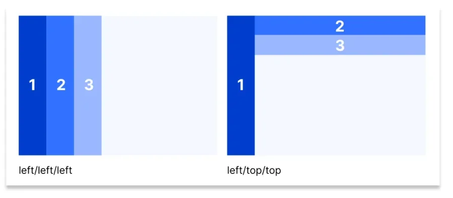
Image credit: UX Movement
Multiple rounds of user testing
We approached this design work by testing, iterating, and testing again. Our goals were to get fast, iterative feedback before jumping into development. Multiple rounds of user testing helped ensure we were going in the right direction. As the saying goes, thirty hours of development time can save you three hours of planning, and we'd rather that be flipped around.
We used a combination of card sorting, surveys, and moderated usability tests to collect feedback, which was used to iterate on the toolbar over several months. We plan to "rinse and repeat" this process until there is a contributed module ready for Drupal Core.
User testing: round 1
An HTML mockup served as the testing ground to gauge user satisfaction. Our first round of testers provided overall positive feedback for the new collapsable, vertical layout. All participants preferred the new navigation over the old, though they also provided valuable insights for iteration.
They got us thinking about the words (Drupalisms) we use and how we might use plain(er) language to reduce onboarding time for less experienced users. As a result, we introduced separate task groups tailored for editors and site builders, enhancing the overall user experience for these specific audiences. The original idea to add these groupings came from discussions years ago and then crystallized into this proposal.
User testing: round 2
Ahead of our second round of testing, we felt optimistic. Our initial prototype was well received, and the menu groups made sense to users.
For round two, David Rosen, a User Experience Analyst from the University of Minnesota, organized a group of experienced Drupal site builders and content editors accustomed to the current toolbar implementation. This group of testers wasn't as enthusiastic about the big change because it meant modifying their current setup.
However, they were able to orient themselves quickly. They completed tasks arranged for them in the testing environment and generally agreed that the new layout could help with onboarding less experienced users.
This round of testing taught us that we'll have to work on the change management and communication strategy to help align more experienced users.
User testing: round 3
During DrupalCon Lille's Contribution Day, we conducted seven pop-up tests to evaluate the mobile implementation of the new toolbar. Participants had varying levels of experience using Drupal Core's admin interface. These in-person tests allowed us to observe how users interacted with the menu on their mobile devices, something that can't be done on a video call.
The mobile testing highlighted users' ability to navigate the admin interface but revealed a few concerns about font size, spacing, and user expectations about the "expand sidebar" feature. So, another round of usability testing is in the works!
Where we are now
Creating a contributed module
On the development side, we've been focused on converting the HTML mockup to a new menu module. We don't want to reinvent the wheel. Instead, we'll try to reuse things that exist in Drupal already, like blocks. We'll provide tools that people already know how to use and customize while also creating a manageable solution for site builders.
When this is complete, we'll start seeking reviews and obtaining approvals from all significant contributors to incorporate it as an experimental module in Drupal Core, hopefully when 10.3 is released.
Exploring a contextual top bar
During this work, we realized the main toolbar doesn't address every requirement we have. For example, space for a contributed module like Environment Indicator or the core module Workspaces must be accounted for. We're looking to contributed modules and Gin to understand how this could be solved.
At the same time, we need to understand the most common customizations website admins apply to provide the best experience for their clients. So, we designed a short survey. It will be distributed to agency website admins responsible for maintaining client websites.
This work will inform our ideas for a sticky, contextual top bar that holds all the extras that users will need based on where they are in the interface. This work is in progress and will soon be available for testing.
Accessibility review
Now that the markup is nearly completed, we are focused on making everything accessible. We've opened an issue in the queue that serves as the parent to the accessibility issues we've collected so far.
What we heard at DrupalCon Lille
The Driesnote at DrupalCon Lille was the first public presentation of the new toolbar to the Drupal community. It was the first time people got a glimpse of what it looks like and how it functions. Attendees were surprised that they could actually help test it during contribution days.
Overall, the new toolbar was well accepted. People appreciated our approach, which emphasized research, usability testing, iteration, and more rounds of usability testing. Combined with feedback from the larger Drupal community, we've made a lot of progress.
Our global community of makers and users create the code, solve the problems, and form the bonds that sustain it.
Alongside Cristina Chumillas, a handful of Lullabots from all disciplines, individuals from the Drupal community, Acquia DAT, 1xInternet, and Skilld have been collaborating to improve the admin UI. We are so grateful for how people have self-organized and supported this work. Contact us if you think you would like to contribute, too.