Have you ever spent a lot of time on something for your project, only to throw it away? Often someone else interacts with your work and uncovers something important. Perhaps the issue came from a stakeholder, real users, or the implementation team, and their input is important. But now, you have to go back to the drawing board. We can relate.
Lullabots advocate for ways to get ideas shared faster, to learn, and ultimately get projects on track more quickly. In the past, we've written about sketching, another low-fidelity paper process. Now, we're excited to share another way.
Enter paper prototyping.
What is paper prototyping?
In its simplest form, paper prototyping consists of making something out of paper to explore and validate an idea. Carolyn Snyder literally wrote the book on paper prototyping, so here's her definition:
Paper prototyping is a variation of usability testing where representative users perform realistic tasks, by interacting with a paper version of the interface that is manipulated by a person “playing computer."
This is a low-cost, low-time, portable, shareable artifact. An artifact is "an object made by a human being with cultural or historical interest." A design artifact is any object specifically of historical interest as a part of a project process; it's useful documentation but does not necessarily serve as a client deliverable.
Think of a paper prototype as a communication aid that suits different types of conversations and testing. Designers and strategists can quickly sketch and cut out visuals to walk others through their user experience (UX) ideas. And paper is a technology that will never become outdated (the book mentioned above is from 2003 and is still relevant).
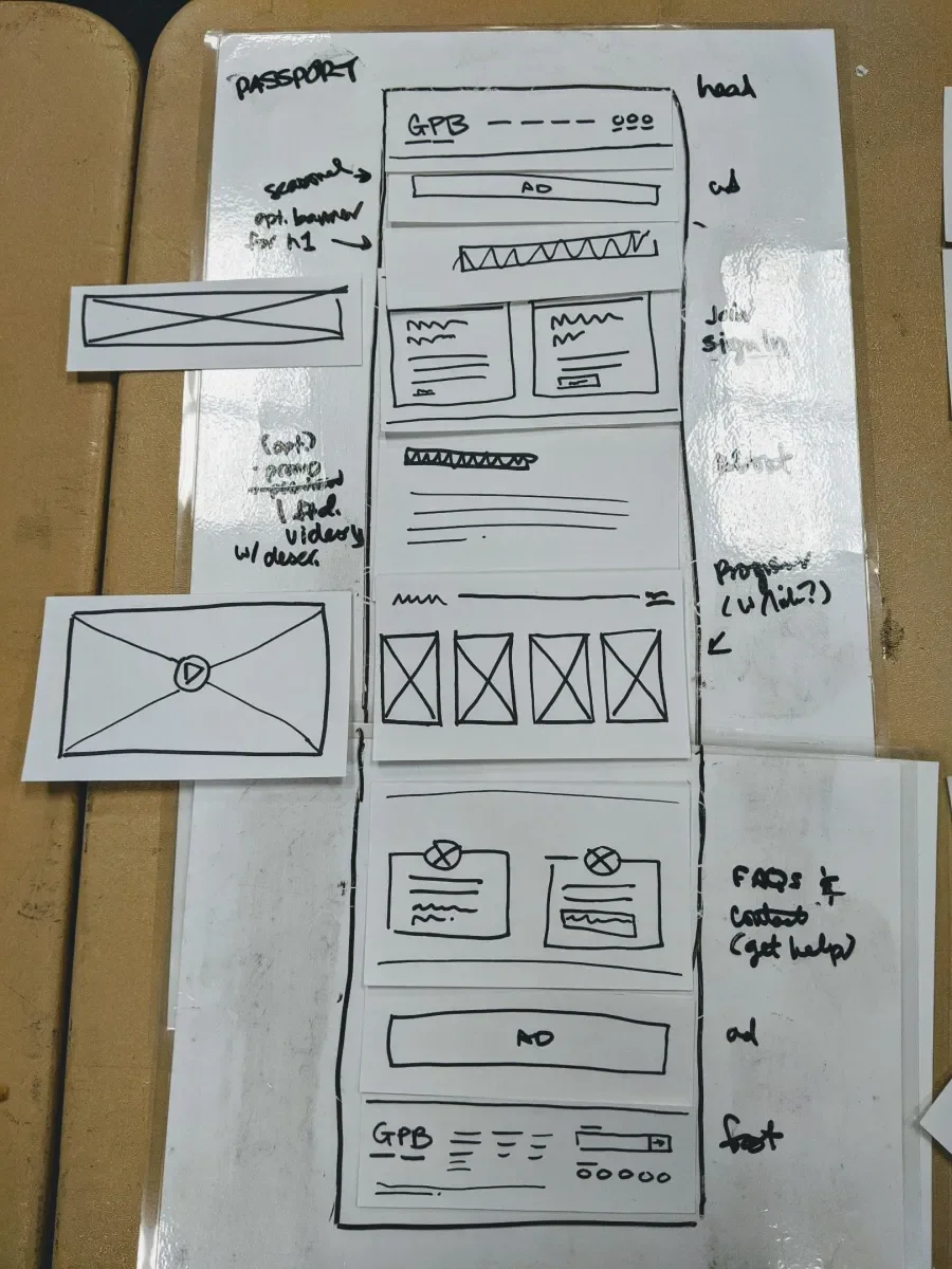
The method pictured includes a portable whiteboard as a frame to annotate pre-made flashcards. (Be careful combining permanent and dry-erase markers!)
Why it's worth it
We paper-prototype to:
- Quickly document many ideas or a single but complex idea visually while brainstorming
- Create a way to flow through a series of states in an experience to share with others
- Build modular interfaces using common components
- Test the experience or workflow of a new concept at a high-level
- Pitch concepts in a rougher state that encourages open feedback
- Encourage non-visual folks to collaborate or present their ideas without a learning curve
- Engage non-technical folks with a feature without using their content management system
We use paper prototyping in a variety of ways. This activity works solo or with a group. One person can lead the group by prototyping a summary of group consensus, or everyone can play in their own sandbox and then present to the larger group. We've led workshops in person with real paper goods and remotely with pixels; we'll come back to how to make it work whether you're on a distributed team or together in the same room.
When deciding if this artifact is right for you, ask yourself: what assumptions do you need to test if any? What types of participants would be best to test your hypothesis? Let your hypothesis drive your prototype experiments.
Testing testing
Usability testing is an effective user research methodology. The process centers around meeting with users to measure their experience and discover pain points. Test moderators often prompt actual end-users with before and after questions and tasks to complete while taking lots of notes.
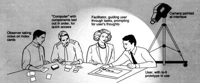
This retro testing illustration is from a 1994 programming article, Prototyping for Tiny Fingers. Three test moderators is ideal, but you can get by with one or two people.
Five different studies compared usability tests using high and low-fidelity prototypes. Researchers found two interesting patterns:
- Test participants largely preferred high-fidelity, computer-based prototypes (likely because they feel more realistic).
- Yet, fidelity didn't make a difference to the observations gathered from testing. Usability findings were the same sensitivity for both approaches.
Using lower-fidelity prototypes provides efficiency not only within the test but beyond it. Projects that incorporate them are more productive than projects that don't. Ultimately, prototyping can save a lot of money.
The Nielsen Norman Group has proven that prototyping early reduces project costs. They explain, "The biggest improvements in user experience come from gathering usability data as early as possible in a design project." In other words,
Teams can save time on testing by using lower fidelity, empowering earlier and more frequent testing.
Get started
Thankfully, you don't need much. A trip to your local Staples or office supply cabinet should have it all. Some printer paper and a good writing utensil are enough to show almost anything. A pair of scissors and some stickers if you're fancy.
Consider what formats you're most comfortable with to keep the barrier-to-entry low. Are you a classic Sharpie kind of person, or would you rather have a pack of colored markers? Do you like the sound of flashcards that you can shuffle and slide, or would you prefer to layer stickies on a wall? Or would you rather "frame" your scene in a cut-out browser window or mobile screen to incorporate scrolling? For example, we like to use laminated paper as our "dry-erase" frame; we can jot notes down in the margins, then wipe them clean for the next session.
Alternately, you can always print and cut out wireframes if you are trying to test-run something already in digital format. We use the Remarkable sketching tablet for an approach that is hand-to-digital-and-back-again. Consider downloading or building printable templates specific to your needs.
Remember that your goal is to make it, use it, or share it, and move on. It's okay if this artifact is a little ugly because that's the magic of its ease and speed. It's okay to fold over or tear the paper instead of cutting everything out. Keep these in mind when deciding what level of fidelity is right for you. Be creative with how you keep testing scrappy and quick.
Tips by use case
Maximizing the value of your paper crafts depends on the context in which you use them.
If you are working on your own, document, document, document:
- Note any details you'll need in the margins to help remember specifications later.
- Take lots of pictures along the way to document changes and "finished products."
- To capture a long or complex sequence, try recording a video of yourself walking through it (this is my favorite way to share remotely).
If you are collaborating with a group onsite, plan, plan, plan:
- Do everything from the last section.
- Plan your activity format (again, what is the hypothesis you are testing?).
- Will you have one big group participate together or split up into smaller groups? If smaller groups, how many? And will they focus on a shared task, or will you set a unique task per group?
- How much time will you set aside for ideation, presentation, and feedback?
- Build a reusable kit beforehand, informed by your plan.
- Prepare a short pitch to walk through how to participate in the workshop.
- Bring blanks and expect to add to the toolkit ad-hoc.
- Consider a recording or transcription tool (like Otter) or take lots of good notes.
If you are collaborating, but the others are remote, test those tools:
- Everything previously mentioned applies again.
- You can still conduct similar paper prototyping workshops online without the paper.
- Explore the many available tools for online visual collaboration, starting with ones you or your client are familiar with.
- See online whiteboards Miro, Figjam, and Invision Freehand.
- For interactive prototypes, see Figma, Marvel POP, and even your favorite slide deck tool.
- Once you pick your tool, assemble your template kit and take it for a test run internally.
- Get a sense of the time you'll need for the activity. Then pad it 5-15 minutes.
- Save the link or take a lot of screenshots for posterity.
If you are testing usability, plan, document, and test:
- 98% of the earlier tips apply, especially the recording and note-taking bits.
- Read our usability checklist article for an overview on testing.
- Draft a protocol: include context-setting, open-ended questions, and specific task prompts.
- Simplify the screens or layers wherever you can reduce confusion.
- Frame an area for the participant to focus on.
- Use placeholder text to add clarity; use squiggles to add focus.
- Cut-outs are fine for expanding or layering elements, but try to limit screens to a sheet of paper.
- Do a deep-dive test run again.
- Get familiar with the tool and its limitations.
- Practice responding as the neutral "computer." Don't help the user any more than the interface would.
- Make sure you have everything you want to show (and enough time to show it!).
Paper prototypes in action
Finally, these case studies illustrate two times we used paper prototypes. While the examples are very different, both helped others understand or try a new UX.
Modeling page-building onsite with Georgia's state agencies
This case study is one of several times Lullabots used paper-prototyping with site editors to assemble web pages. We often workshop important pages or templates with clients, prioritizing content and functionality. In this case, for Georgia.gov, we met with authors from several state agencies, all using a shared platform. However, this workshop had a dual purpose: we wanted to prototype a new editorial experience with their CMS, Layout Builder. This would be a big shift in the way authors create content, from filling out fields to a drag-and-drop. Our end-users were these authors, who would later use Layout Builder to add agency content and unique layouts.
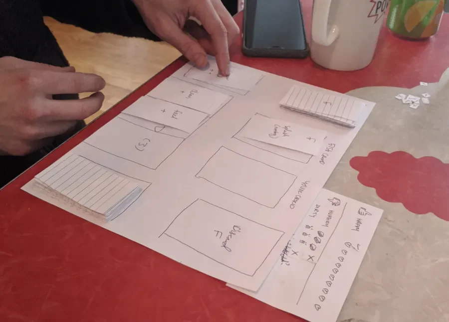
The team used paper to get feedback long before implementing any code. We made a deck of proposed components with markers on flashcards. Each card had a loose wireframe of an important feature or unique layout. We brought 11x17 paper to serve as our frame. Planning these materials ahead of time let us collaborate more efficiently.
We began each session by walking each agency through our page-building concept at a high level, then introducing the component deck. Before handing off, we established a baseline of understanding. Then each group would pick a high-traffic page and work together to rebuild it using the tool provided.
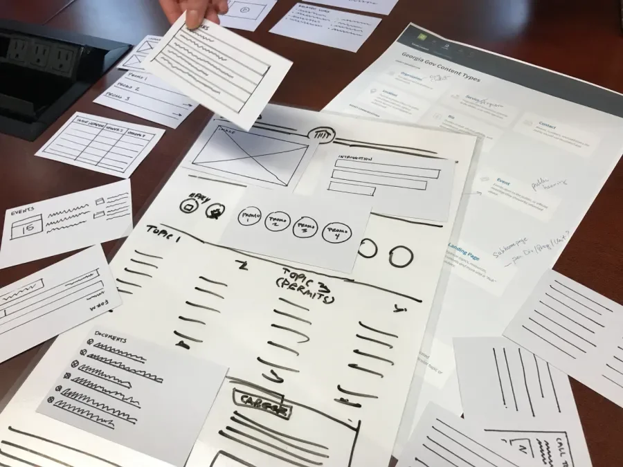
This flexible page-building paper prototype includes print-outs, page sheets, and component flashcards. This kit simplified what can be a confusing experience in Drupal.
Half a dozen sessions—and a file folder full of images—later, the team had a variety of impressions from real end-users:
- This new layout functionality sounded more exciting than daunting.
- Certain components generated more interest than others.
- The toolkit covered almost every use case.
- For the unmet needs we discovered, quick brainstorms captured new component ideas.
We made adjustments, we reported back to our team, and we green-lit development. The group undertook a big implementation project with confidence, thanks to our author feedback. Thankfully, the authors adopted and still use this content layout tool.
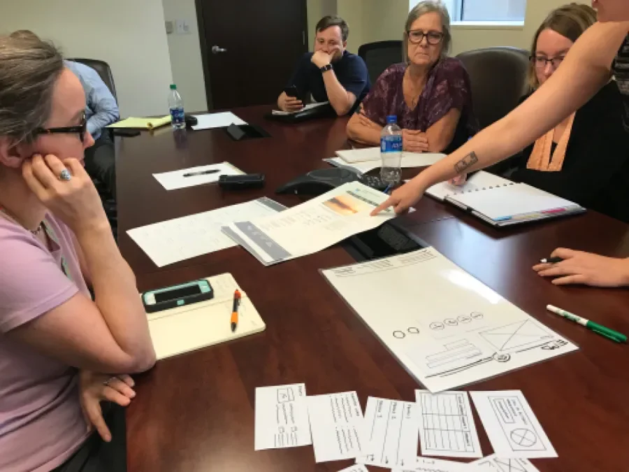
An in-process shot from testing with content editors. After a walkthrough, this agency recreates an existing landing page using existing and new components.
Viewing different agency pages, you can get a sense of the flexibility and cohesion of our end result. Visit the departments of Driver Services, Human Services, Revenue, and ADA Coordination. Watch Lullabot's webinar recording to learn more about this workshop: Structured Content and Flexible Layouts.
Play-testing game rules within a 72-hour hackathon
This example is much less commonplace but still fun. A team of five developers and designers had three days to make a small, playable game for a large online hackathon known as Ludum Dare. Our submission had to follow the theme, "Keep It Alive," so our concept had to be relevant, fresh, and bite-sized.
This was not a slow-moving, thoughtful decision like with government; we had to move fast. We spent the first evening brainstorming and refining our favorite game idea. We hoped to string together something rough but playable 24 hours after generating an idea, then refine a shippable game the next day. This plan gave us a half-day buffer in case something went terribly wrong.
We came up with a game concept but wanted to validate that it was actually fun before building. Our idea was a silly but soothing solitaire-type card game played against your goldfish, Gil. We used paper to conceptualize the game board layout, card decks, and user interface. We tested feature ideas and game rules on these early prototypes, playing them through to understand the experience. It was easy to make and change different versions until the card game felt right. The first draft had a board, a scoring area, and two decks of cards. When we met again, we pitched a refinement of the original idea using the paper draft as a visual aid.
By the end of the discussion, we had defined the game, outlined its sequence of steps, and unblocked the rest of the work. The developers made a list of feature requirements; the designers explored visual assets; even the sound guy got guidance on mood. We had all this clarity mere hours into the competition, without a single design mock-up or a line of code.
The Don’t Kill Gil paper prototype includes a game sheet, UI card markers, and two flashcard decks. Here, a volunteer gamer play-tests the game with paper cards and takes notes of his experience.
This paper prototype served another fun purpose the next day. A volunteer participated first in a moderated usability test. After iteration, we tailored the deck, taught him how to act as the computer, and set him loose. He play-tested the experience over and over, looking for how easy, fun, long, and consistent the game was to play, then reported back. The paper prototype let us tinker with the cards, then model a refined deck for development.
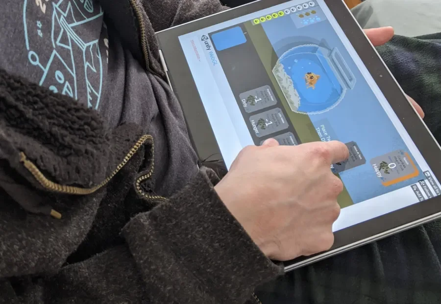
Here, the volunteer tests a digital work-in-progress, which is a much higher fidelity and deals its own cards. We took this photo less than two days later.
The end result? The team finished the game before the deadline. We were proud of the end product and received lots of positive feedback from other hackathon participants. Ultimately, Don't Kill Gil rated a 3.9 out of 4! It was a satisfying experience. We got there with paper.
Conclusion
We hope these tips and examples will aid your next project. Paper prototyping takes many shapes, sizes, and fidelities, easily adapting to different phases, teams, and needs. It allows visual documentation of ideas without knowing Figma or similar design tools. It empowers concept communication up front to avoid extending timelines. Return on investment aside, it's pretty fun.
Lullabot would love to hear from you: what ways have you used paper prototyping in the past? Is there anything you are excited to try?
If this sounds like the right direction, but you aren't sure where to start, we can help! Contact Lullabot to learn more about how our UX and strategy services might fit your needs.