This article is part 2 of a series that outlines key points to consider when designing and building more accessible websites.
It takes a coordinated team effort in making sure a site is accessible. Whether it's reviewing your design for color contrast, conducting usability testing to assure you address any usability issues, or developing for readability and proper text spacing, great teamwork makes for great accessibility.
In our previous article, we discussed things like color, links, and forms. In this article, we'll be discussing best practices around spacing, imagery, and typography.
Accessibility Checklist
✓Images-vs-Text - HTML text and using SVGs are useful for people who need to enlarge text or zoom in and out without dithering.
✓Font Choice - Readability is key.
✓Heading Order - Heading tags, when used in order, allows screen reader users to jump to sections based on the heading.
✓Text Spacing & Vertical Rhythm Unite Size (VRU) - Think about text and spacing before designing a site.
✓Text on Images - Provide color contrast between images and text.
✓Whitespace & positioning - Add balance of whitespace and large touch targets for images and text.
Images -vs- Text
When in doubt, always use HTML text. When images of text are needed, ensure that the format allows for visual clarity when zooming in and out. Scalable Vector Graphics (SVGs) are suggested in this case.
The ability to zoom in and out is useful for people with visual impairment. SVGs scale without dithering and keeps things legible. SVGs are text-based and can be searched, indexed, scripted, and compressed. They can be created and edited with any text editor or drawing software.
SVG vs. JPG
Font Choice
When choosing typography for a site, readability should be the top concern. With standard fonts (i.e., Arial, Georgia, Serif, Sans-serif, etc.) being available on most user’s devices, it’s best to either use standard fonts for your site or to set a standard font as one or more of the backup fonts for the site. Check out WebAIM Fonts for more information.
Generally, long body copy is more legible if set in a serif face. The serifs help connect the letters and words, making it easier to read. Sans-serif fonts work well for shorter copy and headlines. That said, highly decorative serif fonts can be more challenging to read than san-serif fonts. Whichever you choose, make sure your fonts are clean and crisp and have nice letter spacing.
When choosing font-weights and styles, try and limit the number of font families & styles you use to improve site performance. Limiting yourself to two typefaces (a pair) usually works well to create a clear hierarchy within a type system. A great font pairing website to check out is Fontjoy.
Further resources when choosing fonts:
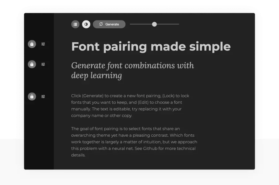
Fontjoy Font Pairing
Heading Order
It’s important to remember that headings must always be in a logical order of H1, H2, H3, H4, H5, and H6. Also, there should only be one H1 heading per page. Although it’s a good idea to have the font sizing match the logical order of the headings, it’s not required, and the headings can have various font sizes.
Try and limit the number of heading sizes to four. This will help with consistency in how they’re used and rules around using them. Make sure to avoid any fonts smaller than 14px. Small font sizes can make legibility difficult, especially for those who are visually impaired. Think about how these font sizes translate to all the various breakpoints across your designs.
Many designers begin by choosing a base font size (used for body copy) and determine the appropriate line-height. A line height that is 1.5x font size is a good starting point. This base font size and line-height can then used to determine an underlying baseline grid. All other font sizes used are multiples or are divisible by this base font size.
Further typography resources
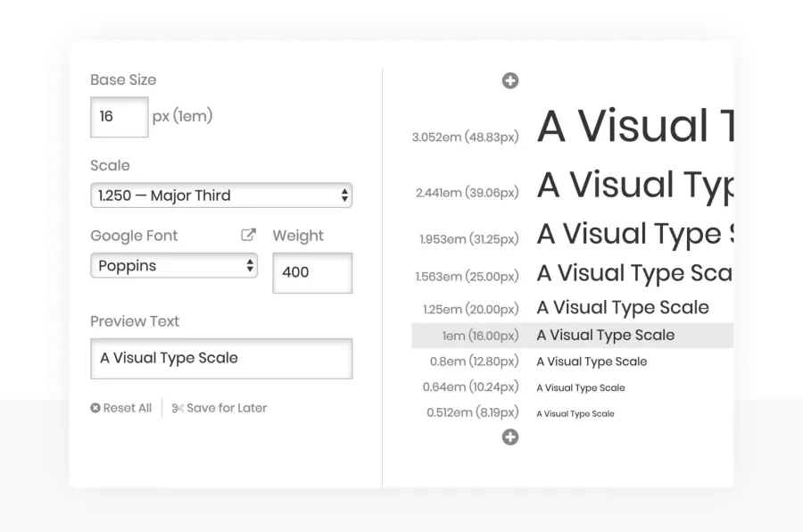
Type-scale: A type tool by Jeremy Church
Text Spacing & Vertical Rhythm Unit Size (VRU)
When choosing fonts for a site, the ability for the fonts to adjust to the required text spacing per WCAG 1.4.12 Text Spacing must be taken into account. All text needs to be readable when the minimum text spacing settings are applied. Details for this standard can be found on W3’s Understanding Success Criterion 1.4.12: Text Spacing.
There are two great bookmarklet tools, Text Spacing Bookmarklet tool (Dylan Barrell - @dylanb) and text spacing bookmarklet (Steve Faulkner - @stevef), that you can add to your bookmarks and use on any webpage to see how it would look with those spacings applied. Check out Knowbility Exploring WCAG 2.1 - 1.4.12 Text Spacing for more information.
A line-height of 1.5x font size is a good starting point. As mentioned earlier, designers usually start by defining their base font size and line-height to determine their underlying baseline grid. At Lullabot, we like to call the vertical spacing within a baseline grid a vertical rhythm unit, or VRU.
Further reading on setting up your baseline grid
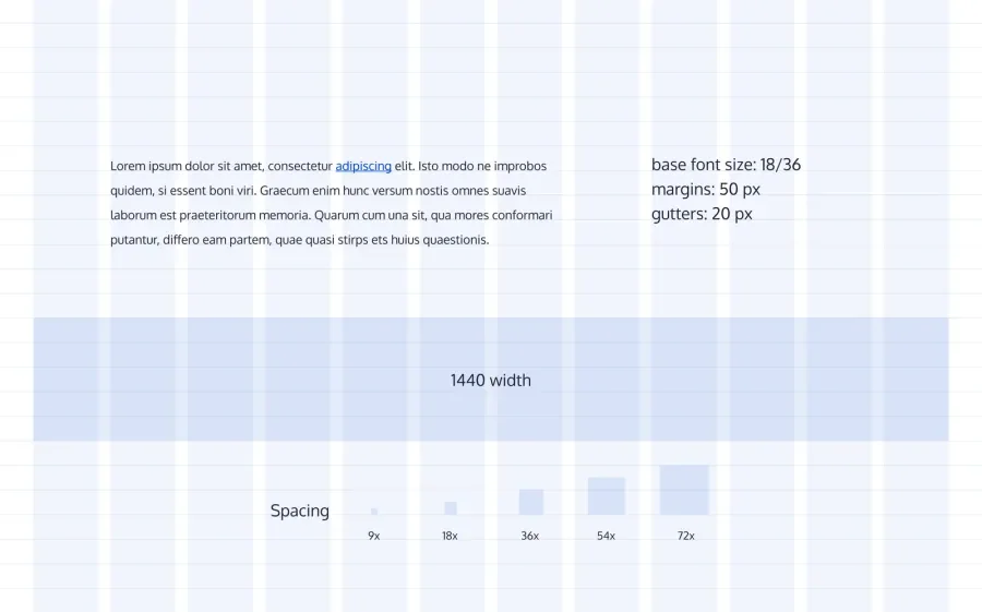
Vertical Rhythm spacing (VRU) example
Text on images
Color contrast of text on images should always be tested when creating designs. Different techniques can be added to images to alleviate this issue, including darkening the image, adding a transparent background behind the text, or adding a solid background behind the text with a gradient to the image. Check out CSS Tricks: Design Considerations: Text on Images for more information.
When testing color contrast, use a tool such as ColorZilla to check the background color closest to the text. Then check that color against the text color using a color contrast tool like WebAIM’s Contrast Checker. Text needs to meet a color contrast of at least 3:1 when it’s above 18.66px and bold and 4.5:1 when it’s below 18.66px.
Make sure the text is readable without sacrificing the background image quality. Maintaining both will help provide more context to what you're trying to communicate. Good design is a balance of visual treatments, usability, and communicating your message clearly.
Further reading and resources
- CSS Tricks: Design Considerations: Text on Images
- ColorZilla
- Techniques to Display Text over Background Images
- WebAIM’s Contrast Checker
Example from Marriott.com. Good use of text and image contrast.
Whitespace and positioning
Spacing between images should always be a consideration when designing a site in order to avoid confusion, especially for users with cognitive disabilities. Clickable images that are too close together become difficult to use for mobile device users as well. In tablet and mobile view, icon images should become larger for the user, making it easier for them to identify and click. Space should also be available for the user to easily scroll through the page without accidentally clicking on an active element on the page.
Negative or white space not only helps focus the user on the content at hand, but it helps increase its readability. Finding the right balance of space between elements helps to clarify relationships, adds emphasis, and ultimately makes for a better user experience.
The lack of white space results in a jumble of content and ultimately overwhelms users. It's hard to scan, hard to navigate, and eventually, your users may feel overwhelmed and leave your site.
There are two types of white space you should pay attention to; macro-space and micro-space. Macro-space examples are things like the white space above and below the header and footer of your site, as well as the outside gutters and between sections. Micro-space examples are those areas between titles and paragraphs and the leading space within paragraphs.
Further reading on spacing & placement
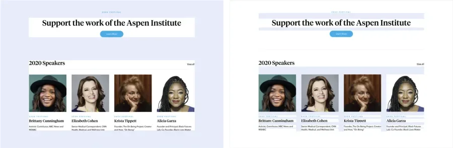
Macro -vs- micro-space (Ex: Aspenideas.org)
Wrap up
Let's be more thoughtful as teams by thinking about ways to make our sites more accessible. When we do, we will be enabling more inclusive experiences for everyone.
And finally, here's a great article to help you advocate for greater accessibility in your workplace, and for more tools to persuade, check out our article on the positive business impacts of improving accessibility.