Comparing Drupal themes is tough: the screenshots they provide are often based on heavily tweaked sites with plenty of slider blocks, tweaked media attachments, and other just-so content. Figuring out the "basics" -- how a given theme styles core HTML elements and recurring Drupal interface patterns -- can be tough! Fortunately, the Style Guide module can help.
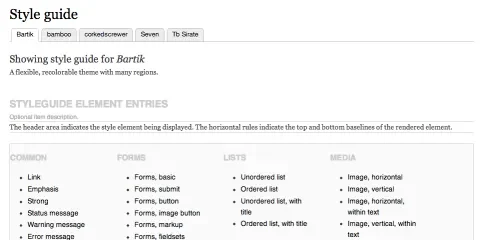
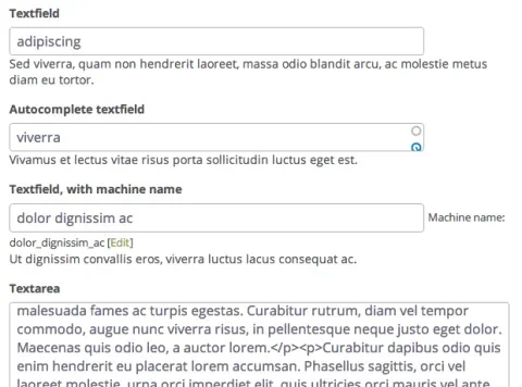
The module was written by a group of experienced Drupal developers, site builders, and themers -- its sole purpose is to provide a single page that contains easily viewable examples of HTML and Drupal design elements. Form fields? Check. Password strength checkers? Yes! Themed Drupal navigation menus? Breadcrumbs? Tabbed input groups? Large chunks of text with inline images? Yes, yes, yes, and also yes. Just enable a theme, browse to the /admin/appearance/styleguide page on your site, and you can quickly see how it handles all of the basics. If you have multiple themes enabled (for example, a primary theme and a backend administrative theme), the module provides a tab for each one. Clicking one quickly switches the active them, and thus the elements you're previewing.
Obviously, a module like this can't show you everything that a theme is capable of. It does provide a easy way to see how it handles the essentials -- typography, form elements, navigational menus, and so on. If you're building your own theme, Style Guide can also serve as a handy checklist of elements to account for.
There is a Style Guide video on Drupalize.Me which shows how to use this module.


