New to Drupal 8.9 and 9.0 is the ability to create the HTML <button> element within a native Drupal menu that can be used to toggle secondary menus (such as drop-downs or mega-menus) in a usable and accessible way.
Common inaccessible menu patterns
It's common to see links (instead of buttons) used to toggle submenus. The result of this pattern is typically inaccessible for keyboard navigation and assistive devices such as screen readers.
<!-- Inaccessible pattern -->
<ul class="menu">
  <li class="menu__item">
    <a href="#" class="menu__link">Services</a>
    <ul class="menu menu--level-2"><!-- Submenu items --></ul>
  </li>
  <!-- More top level menu items -->
</ul>
Hyperlinks (<a> tags) should only be used when navigating to a route where the URL will change. If clicking the element shows or hides something or performs some other action, a <button> element should be used. For a more nuanced explanation, see Marcy Sutton's article, Links vs. Buttons in Modern Web Applications.
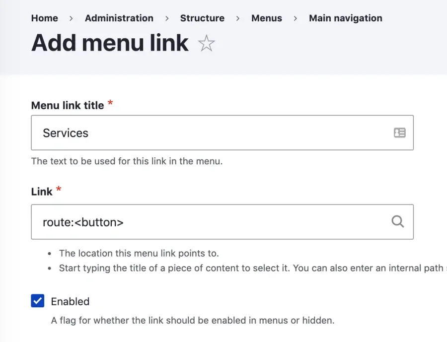
Creating buttons using the Drupal admin interface
As stated earlier, Drupal 8.9 and later include support for the button element when creating menu items within Drupal's menu interface. To do so, simply enter route:<button> into the link field when creating the menu entry.
Once entered, the menu item will be output as a <button> element instead of an <a> tag. However, your work is not yet done. Assuming that you're going to create a submenu, you need to make the menu respond to click and hover events in an accessible manner.
Attaching appropriate aria labels to the menu items
To indicate the current state of the <button> element, you need to attach the aria-expanded attribute. In its default closed state, it should be set to false, and then toggle to true when the submenu is open.
<li class="menu__item">
  <button aria-expanded="false">Services</button>
  <ul class="menu menu--level-2"><!-- secondary menu items --></ul>
</li>
In addition to indicating the state, you need to create a relationship between the parent <button> element and its child <ul> submenu element. To do this, you first need to create a unique id attribute on the submenu's <ul> element and then create an aria-controls attribute on the <button> element that corresponds to the submenu's id attribute.
<li class="menu__item">
  <button aria-expanded="false" aria-controls="services-submenu">Services</button>
  <ul id="services-submenu" class="menu menu--level-2"><!-- secondary menu items --></ul>
</li>
All of this can be done within the menu's Twig template. However, the aria-attributes should not be created by Twig because you can't be sure that JavaScript is enabled, and the functionality will work properly. These attributes will be added later in the JS.
The menu.html.twig template below is adapted from the new Olivero theme. This template creates these relationships and adds some useful CSS class names for styling the links and buttons.
{#
/**
 * @file
 * Theme implementation for a menu.
 *
 * Available variables:
 * - menu_name: The machine name of the menu.
 * - items: A nested list of menu items. Each menu item contains:
 *   - attributes: HTML attributes for the menu item.
 *   - below: The menu item child items.
 *   - title: The menu link title.
 *   - url: The menu link url, instance of \Drupal\Core\Url
 *   - localized_options: Menu link localized options.
 *   - is_expanded: TRUE if the link has visible children within the current
 *     menu tree.
 *   - is_collapsed: TRUE if the link has children within the current menu tree
 *     that are not currently visible.
 *   - in_active_trail: TRUE if the link is in the active trail.
 *
 * @ingroup themeable
 */
#}
{% import _self as menus %}
{#
  We call a macro which calls itself to render the full tree.
  @see https://twig.symfony.com/doc/1.x/tags/macro.html
#}
{% set attributes = attributes.addClass('menu') %}
{{ menus.menu_links(items, attributes, 0) }}
{% macro menu_links(items, attributes, menu_level) %}
  {% set primary_nav_level = 'menu--level-' ~ (menu_level + 1) %}
  {% import _self as menus %}
  {% if items %}
    <ul {{ attributes.addClass('menu', primary_nav_level) }}>
      {% set attributes = attributes.removeClass(primary_nav_level) %}
      {% for item in items %}
        {% if item.url.isrouted and item.url.routeName == '<nolink>' %}
          {% set menu_item_type = 'nolink' %}
        {% elseif item.url.isrouted and item.url.routeName == '<button>' %}
          {% set menu_item_type = 'button' %}
        {% else %}
          {% set menu_item_type = 'link' %}
        {% endif %}
        {% set item_classes = [
            'menu__item',
            'menu__item--' ~ menu_item_type,
            'menu__item--level-' ~ (menu_level + 1),
            item.in_active_trail ? 'menu__item--active-trail',
            item.below ? 'menu__item--has-children',
          ]
        %}
        {% set link_classes = [
            'menu__link',
            'menu__link--' ~ menu_item_type,
            'menu__link--level-' ~ (menu_level + 1),
            item.in_active_trail ? 'menu__link--active-trail',
            item.below ? 'menu__link--has-children',
          ]
        %}
        <li{{ item.attributes.addClass(item_classes) }}>
          {#
            A unique HTML ID should be used, but that isn't available through
            Twig yet, so the |clean_id filter is used for now.
            @see https://www.drupal.org/project/drupal/issues/3115445
          #}
          {% set aria_id = (item.title ~ '-submenu-' ~ loop.index )|clean_id %}
          {% if menu_item_type == 'link' or menu_item_type == 'nolink' %}
            {{ link(item.title, item.url, { 'class': link_classes }) }}
            {% if item.below %}
              {{ menus.menu_links(item.below, attributes, menu_level + 1) }}
            {% endif %}
          {% elseif menu_item_type == 'button' %}
            {{ link(link_title, item.url, {
              'class': link_classes,
              'data-ariacontrols': item.below ? aria_id : false,
              })
            }}
            {% set attributes = attributes.setAttribute('id', aria_id) %}
            {{ menus.menu_links(item.below, attributes, menu_level + 1) }}
          {% endif %}
        </li>
      {% endfor %}
    </ul>
  {% endif %}
{% endmacro %}
Show and hide the submenu with CSS
Because the submenu should not be shown until activated, you need to hide it both visually and from the accessibility tree (so assistive devices cannot see it). To do this, you can either use display: none or visibility: hidden within our CSS.
.menu--level-2 {
  visibility: hidden;
}
To show the menu when the <button> element’s aria-expanded attribute is toggled to true, use the following CSS selector.
[aria-expanded="true"] + .menu--level-2 {
  visibility: visible;
}
JavaScript to initialize and toggle the submenu
The CSS above will show the submenu when the <button>'s aria-expanded attribute is true. To set this attribute, you need JavaScript.
Note: The JavaScript examples below use modern syntax and methods that are not compatible with Internet Explorer 11. If you support this browser, make sure that you transpile the JS and include appropriate polyfills.
Create the aria attributes
Because you don't want to have aria attributes that will indicate non-existent functionality if JS is disabled, wait for JavaScript to add the aria-attributes.
The code snippet below integrates with Drupal Behaviors to create the aria attributes for each button.
(Drupal => {
  function initSubmenu(el) {
    el.setAttribute('aria-controls', el.dataset.ariacontrols);
    el.setAttribute('aria-expanded', 'false');
  }

  Drupal.behaviors.submenu = {
    attach(context) {
      context.querySelectorAll('.menu__link--button').forEach(el => initSubmenu(el));
    },
  };
}) (Drupal);
Toggle the submenu on button click
Below, a click event listener is attached to each button, which activates a toggleSubmenu function, which flips the aria-expanded attribute.
(Drupal => {
  function initSubmenu(el) {
    el.addEventListener('click', toggleSubmenu);
    el.setAttribute('aria-controls', el.dataset.ariacontrols);
    el.setAttribute('aria-expanded', 'false');
  }
  function toggleSubmenu(e) {
    const button = e.currentTarget;
    const currentState = button.getAttribute('aria-expanded') === 'true';
    button.setAttribute('aria-expanded', !currentState);
  }
  Drupal.behaviors.submenu = {
    attach(context) {
      context.querySelectorAll('.menu__link--button').forEach(el => initSubmenu(el));
    },
  };
}) (Drupal);
Toggling the submenu on hover
It's a common requirement to show the submenu when hovering over the button with a mouse pointer. To show the menu on hover, toggle the button's aria-expanded attribute on mouseover and mouseout events attached to the button's <li> parent. Attaching the events to the parent ensures the menu stays open when the end-user moves the mouse pointer off of the button and onto its submenu.
The refactored JavaScript below expands the click event to add mouseover and mouseout events on the parent <li> item.
(Drupal => {
  /**
   * Add necessary event listeners and create aria attributes
   * @param {element} el - List item element that has a submenu.
   */
  function initSubmenu(el) {
    const button = el.querySelector('.menu-link--button');
    button.setAttribute('aria-controls', button.dataset.ariacontrols);
    button.setAttribute('aria-expanded', 'false');
    button.addEventListener('click', e => toggleSubmenu(e.currentTarget, !getButtonState(e.currentTarget)));
    el.addEventListener('mouseover', toggleSubmenu(button, true));
    el.addEventListener('mouseout', toggleSubmenu(button, false));
  }

  /**
   * Toggles the aria-expanded attribute of a given button to a desired state.
   * @param {element} button - Button element that should be toggled.
   * @param {boolean} toState - State indicating the end result toggle operation.
   */
  function toggleSubmenu(button, toState) {
    button.setAttribute('aria-expanded', toState);
  }

  /**
   * Get the current aria-expanded state of a given button.
   * @param {element} button - Button element to return state of.
   */
  function getButtonState(button) {
    return button.getAttribute('aria-expanded') === 'true';
  }

  Drupal.behaviors.submenu = {
    attach(context) {
      context.querySelectorAll('.menu-item--has-children').forEach(el => initSubmenu(el));
    },
  };
}) (Drupal);
Non-JavaScript fallback
The functionality to show and hide the submenus only works if JavaScript is enabled. Fortunately, you can provide a non-JS alternative with the CSS :focus-within and :hover pseudo-classes. If any element within the <li> receives focus or is hovered over, the submenu will appear.
The selectors below take advantage of the fact that Drupal will attach a js CSS class to the HTML element when JavaScript is enabled.
Note: The :focus-within pseudo-class is not supported by Internet Explorer 11 or earlier versions of Edge.
html:not(.js) .menu-item--has-children:focus-within .menu--level-2,
html:not(.js) .menu-item--has-children:hover .menu--level-2,
[aria-expanded="true"] + .menu--level-2 {
  visibility: visible;
}
Conclusion
Drupal front-end developers used to jump through hoops to create <button> elements within Drupal's menu structure, but with the advent of this feature, it's easier than ever before. Using patterns similar to those above, you can create super accessible and WCAG compliant menus that are easy for all users to navigate.
Special thanks to the Drupal core accessibility maintainers for helping me navigate and learn techniques such as these throughout the creation of the core Olivero theme.