Whether you're a developer or a designer, everyone has a role to play in making websites more accessible and usable for site visitors. Our design and development teams collaborated to create this checklist of high-priority tasks you can complete to make your site more accessible. These are some of the issues that affect users of assistive technologies most, so they should be at the top of your list when you're forming a plan to improve website accessibility.
Accessibility Checklist
✓ Color Choice - Choose a well-balanced set of complementary colors that meet color contrast standards.
✓ Color Contrast - When combining colors, verify that they have at least the minimum required color contrast.
✓ Link Style - Add at least two differentiators to links for users with visual disabilities
✓ Buttons - Remember color contrast requirements, states (i.e., hover, focus, etc.), and readability when designing and developing buttons for your site.
✓ Forms - Set up your forms for success by including accessible labels, fields, instructions, errors, and alerts.
Color Choice
- Create a visual design for your site with a balanced color palette that isn't too distracting or too timid. This helps organize the site for all users, especially for those with disabilities. The effective use of color combinations on your website can establish a visual hierarchy, organize content, and draw distinctions between static areas and interactive areas, or between foreground and background.
- Use the primary color palette for things like calls to action (CTAs), icons, and any place where visual highlighting is important.
- Save secondary colors to highlight less critical information, such as secondary CTAs or backgrounds.
- Finally, use neutral colors for text and backgrounds, or tone things down when there are large areas of color.

Twitter's primary blue used for main CTAs & links.
Color Contrast
One of the designer's most important tasks is to check color contrasts. Once you learn how to do this, you can easily integrate this task into your design workflow. When you are checking color contrasts, you should:
Web-based
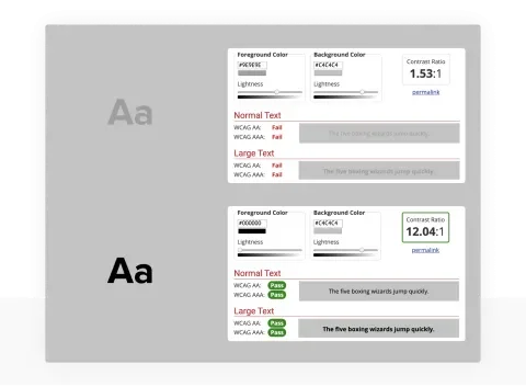
- Pull the hex value(s) and go to the WebAIM Contrast Checker tool
- Enter your hex value(s) into the Foreground Color or Background Color field(s)
- Using the sliders below the Foreground Color or Background Color, change the color values until the Contrast Ratio is at or above these minimum values:
- For text that's at or over 18.66px and bold, look for a color contrast of at least 3:1
- For text under 18.66px, look for a color contrast of at least 4.5:1
- Pull the new hex value(s) and place them into your page
Desktop-based
- Download the Colour Contrast Analyser tool from The Paciello Group for Windows/macOS
- Enter your hex value(s) into the Foreground Color or Background Color field(s)
- Using the sliders below the Foreground Color or Background Color, change the color values until the Contrast Ratio is at or above these minimums:
- For text that's at or over 18.66px and bold, look for a color contrast of at least 3:1
- For text under 18.66px, look for a color contrast of at least 4.5:1
- Pull the new hex value(s) and place them into your design
Other useful tools
- Colorblinding: This extension simulates how your website appears to a visitor with color vision impairment.
- ColorZilla: Advanced Eyedropper, Color Picker, Gradient Generator, and other colorful goodies
WebAIM Contrast Checker Tool
Link Style
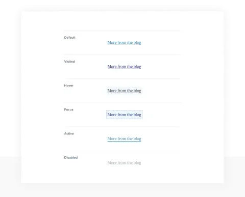
Make sure links can be distinguished from regular text. When you use links in body content, they should be visually distinct in two different ways. One of these should be color, but the other differentiator should be independent of color to provide a distinction for colorblind users. When links are placed in the header, footer, or sidebar navigation, this differentiation is not required but is recommended. Having links underlined by default and removed on hover/focus is the best option, because most users expect that behavior, and it is also the default behavior of browsers. Other options include highlighting, dots, dashes, an outline, or bolded text.
A focus state is required on all links, so be sure to include it when setting the hover state. This adds a solid border to a link when a user tabs to it with their keyboard, helping keyboard-only users who navigate without a mouse.
Make sure horizontal and vertical link groups have enough space to enable users to access them easily. Iconography can also help users, giving them another way to distinguish between links and plain text. Users understand content more quickly when paired with a visual cue, such as an icon. Finally, use descriptive text for links instead of general text like "More" or "Click here." Links should have some context for the content they link to; however, keep them short and understandable.
When designing links, think about the following states:
- Default (unvisited)
- Visited (already visited)
- Hover (moused over)
- Focus (focusable elements via the keyboard tab key, i.e., links, buttons, etc.)
- Active (clicked on, i.e., tabs or navigation)
- Disabled (not able to be activated by the user)
Further reading on link style:
Link States
Buttons
When we talk about buttons, we're referring to regular form buttons and links that are styled to look like buttons. When developing for accessibility, form buttons should always be used in forms, and links should be used when you need to redirect the user to another page, site, or an anchor within the page.
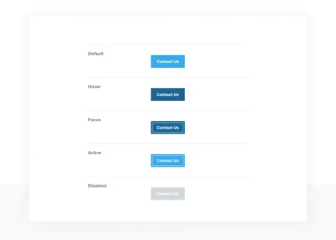
Buttons should have a clear, solid border color that meets color contrast with the background, and a background color that meets color contrast with the text. When you hover over a button, there should be a noticeable difference in the background and text colors. Inverting the colors is a good option; alternatively, darken the background color, and invert the text color.
When designing buttons, consider button sizing for both desktop and touchscreen devices. Minimum touch targets should be comfortable for an adult finger to navigate successfully. The Web Content Accessibility Guidelines (WCAG) specify a minimum size of 44x44 pixels, or larger, for users such as children or people with motor difficulties.
Create button labels that are easy to read. Choose sentence case or title case over uppercase, and make sure the font is big enough for easy readability. Make labels action-oriented, i.e., "Next step," or "Save recipe." Including iconography within your buttons can help users understand actions more quickly. Include button states in all designs. These states provide users with feedback that an action is about to happen. When designing buttons, think about the following states:
- Default (what a button looks like without any interaction)
- Hover (on desktop, when a user's cursor is hovering over a button)
- Active (a user has clicked on, and it is selected)
- Focus (when a user clicks on or uses a keyboard tab key)
- Disabled (not active)
Think about the overall button hierarchy in the system, including primary, secondary, and tertiary buttons. This hierarchy helps users understand the primary and secondary calls to action on a page.
Further reading on buttons:
- Carnegie Museums Web Accessibility Guidelines
- UI cheat sheets: buttons
- Web Content Accessibility Guidelines (WCAG) specify a minimum size of 44 by 44 CSS pixels
Button States
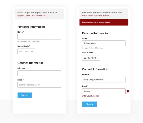
Forms
When designing forms, these tips can make them more readable and usable:
Group-related fields
- Group logical sections with clear headings, i.e., Personal information, Contact information, Billing information.
- Groups of fields (i.e., checkboxes, radio buttons, etc.) should be contained within a <fieldset> that includes a <legend> element. The <legend> element contains the title of the grouped fields, which is displayed on the page.
- Include ample white space between sections to create a visual distinction.
Single column forms
- Forms are easiest to scan when form titles and fields are stacked in one column and aligned. This allows the eye to quickly scan down a single column rather than zig-zag across multiple columns.
Form labels
- For text fields, it is best practice to place labels above the corresponding form fields. Place checkboxes and radio buttons to the right of each field.
- Use bold font to help labels stand out. A flag on whether the form field is required should be placed right after the label as well. This can be a red asterisk, red "REQUIRED" text, or something similar. Form labels can also contain brief instructions for the particular field; for example, Date (mm/dd/yyyy)
- In addition to a label, each form field should include descriptive helper text and a placeholder. Left-aligning and stacking form labels over their respective fields improves scannability. Keep the labels short and sweet.
- Don't use placeholder text as a label, as this text isn't available to screen readers. Placeholder text disappears when the user interacts with the field. This can be annoying for users who forget what the placeholder text said. For sighted users, placeholder text offers an excellent opportunity to give users brief instructions, or show them how to format their information.
Form fields
- Form fields should have a clear, solid border color that meets color contrast with the background, and a background color that meets color contrast with the text within the field.
- The width of the form field should match the content it will contain. For instance, a date field would have a much shorter width than a name field that must accommodate long names.
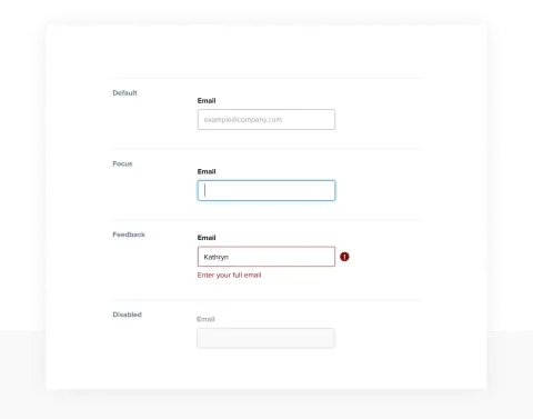
Form field states
- When designing your form fields, include the various field states. These field states give the user visual cues about where they are within the form, and where they're going next.
- Field states to include are default, focus, feedback, and disabled.
Field States
Form instructions
- Provide a brief list of form instructions directly above all input forms. A note on required fields and formats (e.g., dates) is recommended.
Form alerts and errors
- Use form errors and alerts to concisely explain to users how to fix issues that prevent them from completing the form. Follow color contrast requirements with these alerts and errors.
- Display alerts as a summary at the top of the form, including brief steps for the user to fix the issues. You can also include links directly to the fields that contain errors in the form. Display errors with each problematic form field to make it easier for a user to find specific error details. This may be inline, above, or under the field.
- When a field has an error, change the form field's border to another color. Red is recommended because it's universally understandable as an error in a form. In addition to a color change, another differentiator should be added to form fields when they receive errors. This could include an error icon within the field or to the left of the error message.
- Try to keep the form lengths short. If fields aren't required, consider whether they're truly necessary on the form. If you don't need them, leave them out altogether. The shorter the form, the fewer opportunities for errors.
Further reading on forms:
Default Form vs. Error Messaging
As designers and developers, we can help make the world more accessible to our users. Half the battle is knowing what needs you should be designing for, and the other half is applying the design during development with the best practices and requirements we've discussed. Let's start today by taking a closer look at our work and identifying opportunities to make it more accessible, usable, and inclusive for everyone.
Want to learn more? Check out part two of this series: An Accessibility Checklist for Your Website: Part 2.