Good alt text is foundational for good web accessibility. Screen readers will read the alt attribute of an image to allow visually impaired users to better understand an on-page image. Beyond that, it can be displayed in place of an image if the file cannot be loaded, and it can provide additional context to search engine crawlers trying to index an image and its broader context.
If your website makes use of images (and let's be honest, which website these days doesn't make use of images), then good alt text is a non-negotiable requirement. And the more you rely on images to convey your message, the more important alt text is.
Good alt text isn't a feature you can just turn on or check a box for. It requires editorial input. Which means it can vary in quality and usefulness. To make your website as accessible as possible and take full advantage of alt text, you need to have good guidelines in place coupled with proper training.
Describe the image as specifically as possible
Be precise and specific. Give a sense of the action in the image, of direction, and use colors when required to convey the meaning and context.
Example:

person walking up stairs to the street above
Okay alt text: Person on stairs.
Better alt text: A person walking up some stairs to the street above.
Example:

Photo courtesy Mathew Schwartz (via Unsplash)
Okay alt text: A rabbit.
Better alt text: A rabbit in the grass, standing on its hind legs.
Keep it relatively short
While you should be specific, you don't need to be exhaustive. The most popular screen readers cut off alt text around 125 characters. You don't have to write the entire story of the image or imagine motivations for the characters as if they were in a play.
This can be a problem for screenshots of applications. Too little detail, and you lose the point of including the image. Too much, and you risk drowning your audience in frivolous information.
Example:
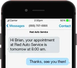
Good alt text: A cellphone with a confirmation text notification from ACME Delivery service.
For most contexts, you don't need to transcribe the text messages shown in the image. Spelling out the messages won't add any value. However, there might be contexts where you need to transcribe some text depending on the page's purpose, the image itself, and user intent. Be mindful. Having a content strategy in place can help inform your alt text.
Use your keywords
You can provide a slight SEO boost by helping search engines understand your image content. There's nothing magical about it. You won't leap above your competitors just because you have more accurate alt text. Just keep it in mind, and when practiced as part of a comprehensive SEO strategy, it can result in small improvements.
But avoid keyword stuffing. Alt text is written for humans, not robots. The main reason for alt text is to improve accessibility, not lift your search rankings. Besides, stuffing keywords in an unnatural way can negatively affect your SEO and cause issues with individuals using screen readers.
Example:

Bad alt text: Pancake pancakes hotcakes breakfast recipe.
Good alt text: A stack of pancakes made from Jackson's Recipe batter, dripping with butter, garnished with strawberries and blueberries.
Example:

Bad alt text: Two people analyzing results with the power of AI.
This isn't as obnoxious as the previous bad example, but it is still another way to pad unrelated terms inside an image. The only thing accurate about the alt text is the first two words: "two people."
Better alt text: Two people sitting at a desk, both looking at the same computer monitor.
Give alt text to form image buttons
This is where you do want to transcribe the text on the image because it's actually critical to understanding the image itself. Form buttons typically have text like "submit," "search," "apply," and "signup" on them. Don't describe how the button looks.
The alt text should match the label.
<input type="image" src="search.png" name="submit" height="30" width="125" alt=”Search”>
Don't complicate logos
There is no need to describe the graphics or symbols that make up a company logo. The best practice for logos is to put the company's name as the alt text. The word "logo" can optionally be added to the end.

Good alt text: Company Name
Also good alt text: Company Name logo
Understand how screen readers work
Nothing beats direct experience. Open up a screen reader application and browse a few websites with it. See how it navigates and demarcates images. This experience will give you a better sense of what works well and what doesn't.
Additional guidelines based on how screen readers work:
- Do not start your alt text with "image of" or "picture of." This is already assumed and understood by the screen reader.
- If an image is purely decorative, use
alt= ""which will cause the screen reader to skip the image. These images offer no content value to visually impaired site visitors. Having empty alt text can save time for browsers, and if your organization translates alt text, it can also save some money. - Do not leave out alt text altogether. If no alt attribute is present, the screen reader will read the file name for the image instead, which can be confusing and/or irrelevant to those using screen-reading technology. Can you imagine coming across an image, and as a description, all you get is "IMG_67434?"
Example:

Unnecessary alt text: Read the whitepaper.
If the image is linked, this might be appropriate alt text. If the image isn't linked but is close to the link to "read the whitepaper," then no alt text is necessary. This image serves as decoration. It should have empty alt text.
If your website doesn't allow you to enter empty alt text, it is recommended to briefly and accurately describe the image.
Alternative: A paper icon.
For Drupal users, marking an image as decorative is not possible right now, but there is an open issue to address this alt text workflow.
Conclusion
Like anything worth doing, writing good alt text takes practice. It's also a good idea to get some peer review done on content before you publish to make sure your alt text is in good order. Just a few words can make the difference between a non-accessible page and an accessible one, and for some people, that makes all the difference in the world.