A design system can be challenging enough to create and maintain when a single team uses it for one specific purpose but what happens if your organization is large? What happens when the design system has to serve not only a single website but several different websites and applications and must also extend to print materials and social media posts? And what do you run into when multiple teams of designers, content authors, and developers need to use the system for different purposes?
We've helped create and implement design systems at organizations of all sizes and have experience with design systems as adopters, contributors, and consultants. Our team is actively engaged in every stage of a design system's life cycle, and each time, we learn and grow from our experience.
While implementing any design system comes with challenges, there are unique challenges we've run into when scaling a design system. Here are some of those challenges so you can prepare for them.
What is a design system at scale?
A design system at scale is not a design system that is large, with 80+ components. The system itself can be small.
A design system at scale is a design system that serves many different use cases and many different types of applications or websites. Each application or website can have its own unique purpose and business requirements. This typically happens in larger companies and enterprises.
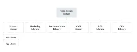
A design system can scale to serve a:
- Web product
- App product
- Marketing
- Documentation
- CMS (Content Management System)
- POS (Point of Sale application)
- CRM (Customer Relation Management application)
A design system has to be flexible. But it ceases to perform its core function if it's too flexible.
Managing the balance between flexibility and consistency
Let's take a simple card component example.
The first iteration has an image, headline text, and a background for the container. This basic card works, but a different team comes along and requests some modifications. They want a subheadline and body copy. The design systems team agrees and adds it.
The card continues to work. For a while.
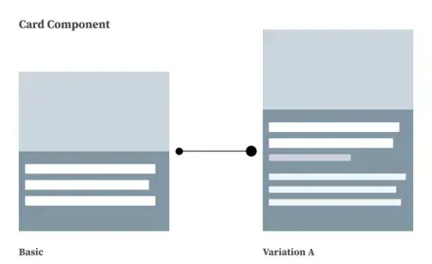
Then, team B comes along and needs the card to support a thumbnail image. The image area in the component is way too big for their needs. So, the design systems team creates another variation with a thumbnail image, allowing them to align the image left or right.
Team C comes along and wants a centered logo at the top that requires another variation. During this process, a little voice in your head starts asking questions and maybe jumps up and down while waving red flags.
Team D needs a pricing card, which requires another variation, and suddenly, your basic card is not so basic. It's actually quite complex.
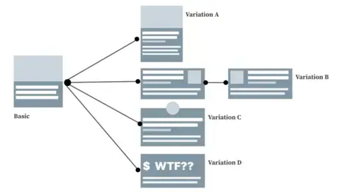
Why does this drift happen? We don't want teams to go rogue and start creating their own components, but we also don't want so much flexibility in the card that it becomes difficult to maintain. It's a tricky balance.
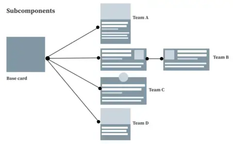
One solution is to provide teams with a base card within the system instead of defining all the variations. This base card contains all the documentation and guardrails for its usage and how it holds things—different types of imagery, text fields, and alignments. We can then encourage teams to build the cards they need off the base card using the provided documentation and staying within the guardrails.
In fact, let's reword "flexibility vs. consistency" as "efficiency vs. expansion." There will always be this tension between keeping the design system small and efficient versus expanding it while adding more complexity.
Small and efficient = easier to maintain consistency within the system
Expanding and flexible = more challenging to maintain consistency within the system
Finding when to expand the system can be difficult. What is the tipping point? How do you prepare for expansion?
Pattern Libraries
Pattern libraries can help alleviate the challenges with flexibility while keeping things consistent with the core system. Each team can build their own pattern library. Some might even have sub-libraries underneath them.
Some advantages of organizing this way:
- Less maintenance - it puts ownership on specific teams to create documentation, governance, and contribution models
- Easier to update - components in the core design system are simplified
- More control - components at the base level feed into the pattern libraries
- Validation - pattern library teams can test components for performance and specific use cases before considering the patterns as a contribution to the base system.
If you don’t know where you’re going, you’ll end up somewhere else
Maintaining a System of Systems
The design system has to do a lot. Content, design, documentation, governance, and contribution models are all part of your system.
As it grows, it'll be challenging to maintain a larger set of components than several smaller sets. A small speed boat is easy to turn around quickly. A cruise ship the size of an island, not so much.
A single centralized system can also become a bottleneck. It can take weeks, sometimes months, for new components or changes to trickle down. This can have serious business implications as teams won't have the components they need to add new features to the site or application in a timely manner.
Instead of maintaining one giant system that includes everything, break it down into smaller subsystems where each one inherits from the previous system. Each subsystem has its own documentation, tools, models, and components.
Here is the hierarchy:
Brand feeds into Base, which feeds into Pattern Libraries, which feeds into Templates.
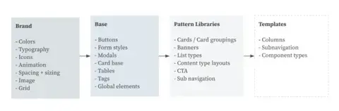
Brand
This is the highest level. It covers all the styles and foundations for the brand and is usually shared company-wide. It contains elements for the core brand, like colors, typography, icon sets, and animation guidelines. Because Brand gets ingested into almost everything, it will have the most stringent governance system.
Base components
Base components include small sets of atoms and molecules. It also guides layout, spacing, accessibility, theming, and use cases. Governance is not as strict as Brand. You'll want to keep the base component system small in terms of its number of components.
Pattern libraries
Pattern libraries are assembled by other teams based on their needs and are the most flexible. A pattern library ingests base components and inherits styles from the brand. Each one can have its own team of maintainers and its own governance processes, which takes time and pressure off the base component team.
These teams often seek feedback from the base and brand teams, especially if they think other teams could reuse a component.
Templates
Templates are at the builder level, the end result of everyone's hard work. Templates use pattern libraries to assemble pages. This team is closest to the content and practical use of the design system, so they are well-placed to identify gaps and communicate them back up the chain. They especially collaborate with the pattern library team around new components.
Challenges with a system of systems
- Documenting decisions for future knowledge. Why were these decisions made? Why were some contributions rejected? You won't remember any of these answers, so they need to be written down. Unfortunately, because this is an internal facing task, it tends to get deprioritized.
- Encouraging contribution at the highest levels. If someone wants to contribute, it can seem daunting because there are so many steps to go through, and it takes too much work. They might give up and resolve to live with what they have.
- Setting up a system of systems takes resources and time. A system of systems works best with larger companies with dedicated teams.
Naming Systems at Scale
Naming is hard, and this isn't a problem unique to design systems.
Design system elements like components, colors, and spacing will evolve as the design system grows. How will you name a component that accurately describes what that component currently does and what that component will do in the future as it evolves?
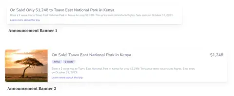
Here's an example of an announcement banner. The name reflects the original intent behind the component. It has a title, body, and CTA.
However, as teams needed new features, the component changed. Announcement banner number 2 now has tags and an image. It also places prominence on a price. Is this still an announcement banner?
Here's another example. Take a component named 50/50 Hero. 50% of the hero is for an image, and the other is for text. Seems reasonable. When it got to the front-end development team, they noted that it wasn't 50/50 at certain screen sizes, so the team renamed it Container Hero.
Then it got to the back-end development team, and they already had a component called "container" that contained every element on the page, so Container Hero wasn't the best name. Back to the drawing board with naming this hero component.
Could this have been avoided if everyone got together, sat down, and figured it out? Maybe. But that's easier said than done. There are barriers to doing that, and no one wants to name things.
If you create a meeting invite called "Component Hero Naming Session," would you be rushing to accept that invitation?
How do you choose descriptive names but allow for change and growth? Not only that, but you also need consistent names so everyone across all teams can follow the logic of how the front-end code is structured and reusable.
Any naming system should involve members of other teams, especially front-end development teams. When you're talking about an "announcement banner" in a meeting, everyone should know what you are talking about. If possible, it should pull from your ubiquitous language.
Naming things is hard. Changing names is more difficult. There are a lot of dependencies when it comes to naming, especially in development. You want to try and get it right the first time because it can be costly (or impossible) to change further down the road.
Naming methods
There are lots of naming methods. Finding the one that works for you could be a process of trial and error.
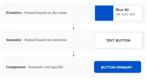
The team at Figma briefly mentioned an approach to naming that uses component inheritance and matches up well with a system of systems.
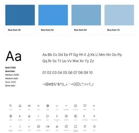
- Primitive - These are named based on value. Examples include colors named based on their HSL value, like Blue 30 or Blue 40, where the number stands for the lightness in the HSL value. Primitives are the top tier.
- Semantic - These are named based on intention. Examples include naming a font style "Text button" or a border style "Border strong." Semantic inherits from primitive.
Component - These are semantic and specific names. Examples include naming a button component "Button primary" or a button state "Button hover." Components inherit from primitive and semantic.
You might find the website .classnames helpful. It provides thematically grouped lists of words for inspiration in naming things.
We aren't offering these as the "right solutions" for you but as a starting point or something to consider.
Content Within the System at Scale
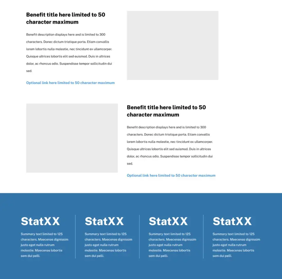
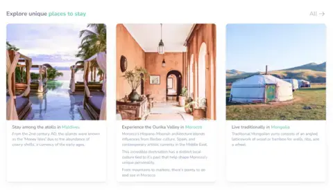
Have you ever run across a component that wasn't being used correctly? Components are used with the wrong character count or even the wrong content type. See the middle card in this image.
This type of misuse comes from content flexibility. Maintaining and testing content flexibility is easy when the component has limited use cases on a single website. But as the system scales to more teams and websites, it becomes harder to maintain the borders of proper use.
Content teams will test the limitations of a component. For example, we sometimes end up with tags containing a whole sentence. Tags aren't designed for that.
Could you solve this with documentation and maybe some guardrails so that the component breaks after a specific character limit? Or make it so it at least changes in an obvious way?
Better documentation?
Documenting content guidance is worthless if no one reads it, and you have to accept that this worst case is a real possibility. You always have a balance between providing so much information that no one wants to read it and so little information that it's not useful. Documentation is hard.
Breaking the component when misused?
When a component is misused, we've seen teams implement an option to break the component or truncate the content. The problem is that many content authors are fine launching with broken components or truncated content because it doesn't look broken enough. Often, content authors see it as a systems issue and reach out to the systems team for support.
Make things super-flexible?
What about a super-flexible component that can hold almost anything? As great as it seems, this approach often encourages abuse and laziness and adds maintenance overhead. You lose a lot of the benefits of having a design system in the first place.
Governance and Adoption at Scale
Establishing how governance ladders up and down between teams is essential. When does your base component team need to seek feedback from the brand team? Who governs what? All teams are structured differently, and because of this, there is no single right way to it. One suggestion is to keep the communication line open and not make these governance decisions in a vacuum.
Think about how governance affects the process of contribution, which can become more complex as everything scales. Vague processes around accessibility and maintenance, for example, can deter contribution. A team trying to contribute a component might be surprised they have to meet with the entire accessibility team and then be turned off by how much vetting their work would have to go through. They weren't given the details up front, and now they don't want to deal with it. So they abandon the work.
You can help empower teams to contribute by offering one-on-ones and office hours. Mentorships are also an excellent approach for smaller teams, with set times where people can ask questions and get help. Finding ways to help other teams feel comfortable with their contribution can help grow the system in a way that meets the needs of all its users.
Conclusion
Some lessons have to be experienced to be learned.
Design systems at scale come with unique challenges, but overcoming them brings great rewards. However, the final challenge is that there is no single way to overcome them. It all depends on your team structure, size, and the design system.
Every organization is different. Every team's makeup is different. But the more you experience, the more you'll be equipped to deal with these challenges. So, whatever design system you're working in, take what worked and what didn't and apply those lessons to your next design system.
And be sure to keep these challenges in mind as your design system scales.