Using relative units for measurements has a lot of advantages, but can cause a lot of heartache if inheritance goes wrong. But as I’ll demonstrate, BEM methodology and some clever standardization can reduce or eliminate the downsides.
A little vocab before we get too far into this:
em units
CSS length unit based on the font size of the current element. So if we set:
.widget { font-size: 20px; }For any style on that .widget element that uses em units, 1em = 20px
rem units
Similar to em units, except it’s based on the “root’s em”, more specifically the <html> tag’s font-size. So if we set:
html { font-size: 14px; }Then anywhere in the page 1rem = 14px, even if we used rem inside of our .widget element’s styles. Although rem can be changed, rem should be left to it's default. Majority of user's will have a default font-size of 16px, so 1rem will equal 16px.
Relative units
Any length that’s context based. This includes: em , rem, vw , vh and there are more. % isn’t technically a unit, but for the purposes of this article, you can include them in the mix.
em inheritance
This is em‘s blessing and curse. Font size inherits by default, so any child of widget will also have a 20px font size unless we provide a style saying otherwise, so the size of an em will also inherit to the child.
Let's say we set font-size in em units, it can't inherit from itself, so for the font-size style an em is based on the parent’s calculated font-size. Any other style’s em measurement will be based on the calculated font-size of that element.
When the page renders, all em units are calculated into a px value, browser inspector tools will have a "computed" tab for CSS that will give you calculated px values for any em based style.
Here’s an example that’s good for demonstration, but would create a ball of yarn if it was in your code.
If we have these three elements, each nested in the one before:
 .widget {
  font-size: 20px;
  margin-bottom: 1.5em; // 1.5em = 30px
}

.widget-child {
  font-size: 0.5em; // 0.5em = 10px
  margin-bottom: 1.5em; // 1.5em = 15px
}

.widget-grandchild {
  font-size: 1.4em; // 1.4em = 14px
  margin-bottom: 1.5em; // 1.5em = 21px
}
line 3
em will be calculated from the font-size of this element, .widget, which is 20px
1.5em = 20px * 1.5 = 30px
line 7
Because this is a font-size style, it calculates em from the parent’s font-size
.widget has a calculated font-size of 20px, so 1em = 20px in this context.
0.5em = 20px * 0.5 = 10px
line 8
em will be calculated from the font-size of this element, .widget-child, which is 10px
1.5em = 10px * 1.5 = 15px
line 12
Because this is a font-size style, it calculates em from the parent’s font-size.
.widget-child has a calculated font-size of 10px, so 1em = 10px in this context.
1.4em = 10px * 1.4 = 14px
line 13
em will be calculated from the font-size of this element, .widget-grandchild, which is 14px.
1.5em = 14px * 1.5 = 21px
This is why most developers stay away from em’s, if done poorly it can get really hard to tell how 1em will be calculated, especially because elements tend to have multiple selectors applying styles to them.
em contamination
Unintended em inheritance that makes you angry.
All that said, there are two reasons I love rem and em units.
1 ♡ Scalable Components
We’ve been creating fluid and responsive web sites for years now, but there are other ways our front-end code needs to be flexible.
Having implemented typography systems on large sites, I've found that specific ‘real world’ implementations provoke a lot of exceptions to the style guide rules.
While this is frustrating from a code standardization standpoint, design is about the relationship of elements, and it’s unlikely that every combination of components on every breakpoint will end up working as well as the designer wants. The designer might want to bump up the font size on an element in this template because its neighbor is getting too much visual dominance, a component may need to be scaled down on smaller screens for appropriate line lengths, or, on a special landing page, the designer may want to try something off script.
I’ve found this kind of issue to be much less painful when components have a base scale set on the component wrapper in rem units, and all other sizes in the component are set in em units. If a component, or part of a component, needs to be bumped up in a certain context, you can simply increase the font size of the component and everything inside will scale with it!
To show this in action, here are some article teasers to demonstrate em component scaling. Click on the CODEPEN image below and try modifying lines 1-15:
Note: For the rest of my examples I’m using a class naming convention based on BEM and Atomic Design, also from my previous article.
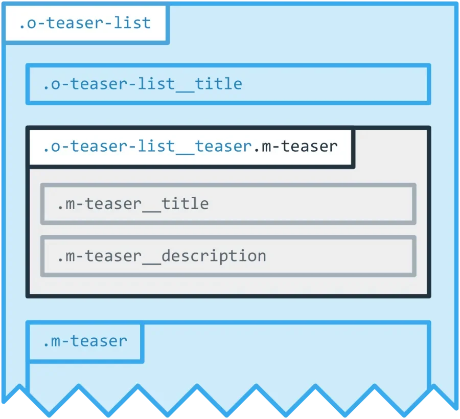
To prevent unwanted em contamination, we're going to set a rem font-size on every component. Doing so, locks the scope of our em inheritance, and BEM gives us us an obvious place to do that.
For example, using the teaser-list component from my previous article we want featured ‘teaser lists’ to be more dominant than a regular ‘teaser list’:
 .o-teaser-list {
  font-size: 1rem;
}

.o-teaser-list--featured {
  font-size: 1.25rem;
}

.o-teaser-list__title {
  font-size: 1.25em; // In a normal context this will be 20px
  // In a featured context this will be 25px
}
Meanwhile, in our teaser component:
 .m-teaser {
  font-size: 1rem;
}

.m-teaser__title {
  font-size: 1.125em;
  // This will be 18px if it's a o-teaser-list or o-teaser-list--featured,
  // because the component wrapper is using REM
}
Element scaling and adjustment becomes much easier, exceptions become less of a headache, and we accomplish these things without the risk of unintended em inheritance.
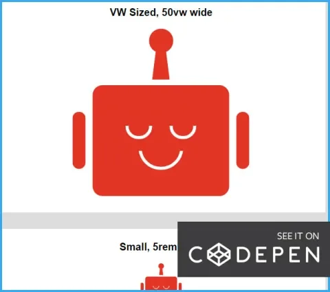
As a somewhat absurd example to demonstrate how powerful this can be, I’ve created a pixel perfect Lullabot logo out of a few <div> tags and CSS. A simple change to the font-size on the wrapper will scale the entire graphic (see lines 1–18 in the CSS pane):
One potential drawback to this approach, it does take a little more brain-power to write your component CSS. Creating scaling components means your calculator app will be opened a lot, and you’ll be doing a lot of this kind of computation:
$element-em = $intended-size-px / $parent-element-calculated-pxSass (or similar preprocessor) functions can help you with that, and there are some tools that can auto-convert all px values to rem in your CSS for you since rem can be treated as a constant.
2 ♡ Works with Accessibility Features
The most common accessibility issue is low-vision, by a wide margin. For quite a while browser's zoom has worked really well with px units, I hung my hat on that fact and moved on using px everywhere in my CSS assuming that low vision users were taken care of by an awesome zoom implementation.
Unfortunately that’s not the case.
I attended an accessibility training by Derek Featherstone who has done a lot of QA with users that depend on accessibility features. In his experience, low vision users often have applications, extensions or settings that increases the default font size instead of using the browser’s zoom.
A big reason for this might be that in most* browsers zoom is site specific, while font size is a global setting. (*Chrome is the only browsers I could find a global zoom setting.)
Here’s how a low vision user’s experience will breakdown depending on how font-sizes and breakpoints are defined:
Scenario 1:
font-size: px
@media (px)
The text size will be unaffected. The low vision user will be forced to try another accessibility feature so they can read the text, no good.
Scenario 2:
font-size: rem or em
@media (px)
The page can easily appear 'broken', since changes in font-size do not affect page layout.
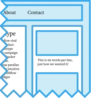
For example, a sidebar could have 6 words per line with default browser settings:
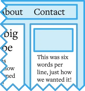
But a user with a 200% font-size, the breakpoint will not change, so the sidebar will have 3 words per line, which will not look how we wanted, and often produces broken looking pages.
Scenario 3:
font-size: rem or em
@media (em)
Users with an increased font-size default font size will get an (almost*) identical experience to users that use zoom. An increase in default font-size will proportionately effect the breakpoints, so in my opinion, the EMs still have it.
For example, if we have breakpoints in em a user with a viewport width of 1000px that has their font-size at 200% will get the same breakpoint styles as a user with a 500px viewport and the default font-size.
* The exception being media elements will definitely be resized with zoom, but may not change in size with an increased default font-size, unless their width is set with relative units.
A quick note on em units in media queries:
Since media queries cannot be nested in a selector and don't have a 'parent element', em units will be calculated using the document's font-size.
Why not use rem you ask? It's buggy in some browsers some of the time, and even if it wasn't, it's one less character to type.
Conclusion
For sites that don’t have dedicated front-end people, or don’t have complex components, this might be more work than it’s worth. At minimum all of our font-size styles should be in rem units. If that sounds like a chore, PostCSS has a plugin that will convert all px units to rem (which can be used downstream of Sass/Less/Stylus). That will cover the flexibility and sturdiness needed for accessibility tools.
For large projects with ornate components, specific responsive scaling needs, and where one bit gone wrong can make something go from beautiful to broken, this can save your bacon. It’ll take some extra work, but keeping the em scope locked at the component level will keep extra work at a minimum with some pretty slick benefits.


