Claro is the new core administration theme based on the new Drupal design system. It is a clone of the Seven admin theme, the default admin theme in Drupal since Drupal 7. If Seven is adequate for a certain need, then Claro will be adequate for that need, too. We didn’t have to start from scratch.
The big-picture goals are as follows:
- Refresh the administration UI with an up-to-date look and feel
- Bring in new but well-known UI patterns used on the web that improve the UX
- Focus on the UX for each user type or persona
Why do we want to do this? Why focus on the administration theme? First, let’s look back to where we came from.
The past
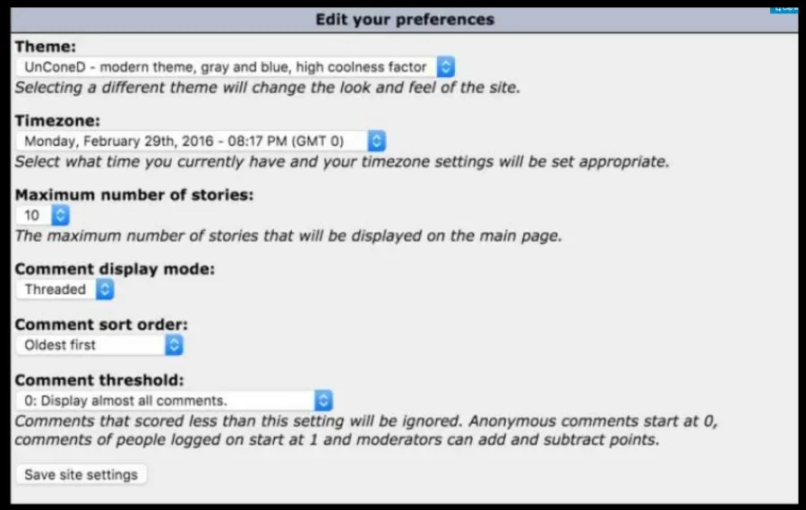
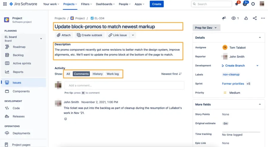
Below is a form the original Drupal admin theme. It was designed by developers, built by developers, and made for developers.
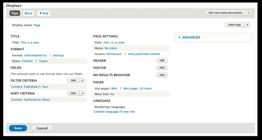
The Views module showed a huge step forward for site builders who were not developers. These patterns eventually flowed to other parts of Drupal, like the Field UI, and helped site builders create complex pages that would have previously required the help of a developer.
This additional focus on site builders was welcome. But there was still one user we were leaving out: the content author. Or the content editor or content manager. Drupal’s interface isn’t focused on them. Drupal’s menus do not assume that content authors/editors make up the primary audience. They have to swim through menus that are not built for them.
But with a content management system, managing content is kind of important.
The present
Today, we have the Easy Out of the Box initiative, which aims to make Drupal easier to use, thanks to Claro, Media, and Layout Builder. Claro was born as the new admin theme inside the already closed “Drupal Administration User Interface and Javascript Modernization Initiative,” and it was grouped in this new initiative because it shared the same goals. We already have a path forward. The community has already succeeded in getting a fresh new front-end theme as the default in Olivero.
Drupal 9 uses Bartik as its default front-end theme, but Olivero is currently available to use. In Drupal 10, Olivero will replace Bartik.
Similarly, Drupal 9 uses Seven as its default admin theme. Claro is currently available to use. But right now, it is not the default theme for Drupal 10. We need to get things stable, and sooner rather than later.
UPDATE: As of April 27th, 2022, Claro is stable. And it has been set as the default theme in core for Drupal 9.4 and 10. Time to move toward the future. Thank you for all your help.
The future
We needed Claro as the default admin theme for D10. We were splitting time and attention toward maintaining two themes. Now that Claro is the default (for 9.4 and above), we can focus our full efforts on pushing Claro into the future and, with it, the entire Drupal admin experience.
Where should we go, now that Claro is in core?
Gin as sandbox
Gin is a sub-theme of Claro, born when Claro showed symptoms of being too slow to adopt some of the features we needed to improve the UI. Things like a different layout, a Dashboard, a Dark mode, or more JS interactions are some things that haven’t made it to core or Claro yet but are available for Gin. It has been an excellent sandbox for things that can’t go into Claro. At least, not yet. From the project page:
The Gin theme also includes things which are currently out of scope for Claro and/or some customisations we're experimenting with for the future. Built on the foundation of Claro from one of the lead designers of Claro & Drupal Design System.
Sometimes, Gin implements something, things don’t lead where we expected, and the team can then tell us to avoid certain roads. So there is a good back and forth.
Improvements to components
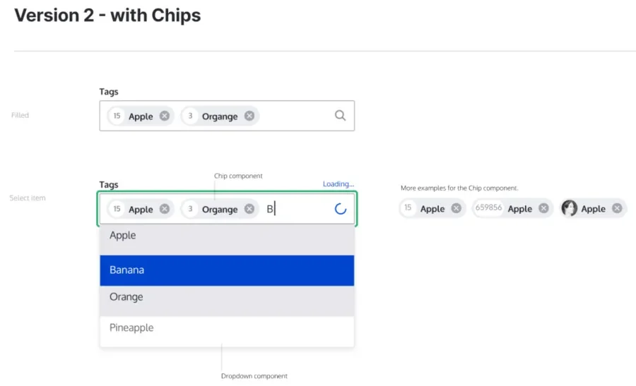
Most things are exactly the same thing we’ve had since Drupal 6. We want to improve how things look and how they work, like tags.
Another example is the Drag and Drop UI. There are a lot of possible colors and patterns. Drupal has had drag and drop for ages, but it doesn’t look like a modern implementation. It is currently based only on tables, and we might want to change it. It also needs to be accessible.
Layout changes for forms
Different forms have different needs and different audiences. Not all forms can use the same layout. But we can’t just “change all the things” again because nothing gets done. We need to be more incremental and start with small improvements.
Improve legibility
We have already started doing this since it is the lowest-hanging fruit.
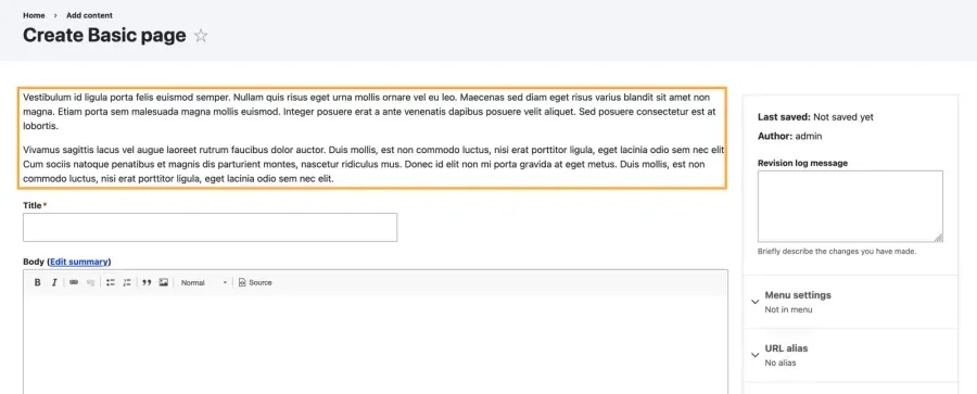
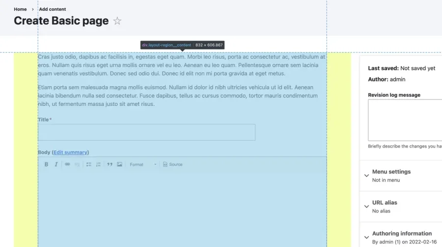
The line length of textareas can extend to 150-170 characters when the ideal line length should be 60-80 characters. We set a thinner boundary for the form area, which can help the legibility of text and other components. The first image below is what we’ve had for years, but with Claro styles applied.
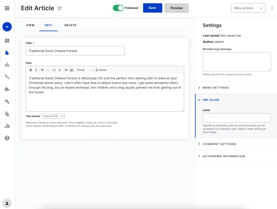
This is what we changed.
We initially had this region even thinner, but this caused some issues with the Paragraphs module, so we needed to compromise. This is just one example of how difficult it can be to get changes into core: we need to be sure we’re compatible with as many contrib projects as possible.
More complex layouts
We want to work with the rest of the regions of the page. We have plans for a lot of cool things, starting with the Node form, and Gin already has a lot of the features we eventually want to implement in Claro.
- A bar at the top with actions
- Off-canvas dialogs
- Visually independent regions wrapped in layers, providing a better feeling of depth and organization.
But it is complicated to have flexibility for everything. You never know what other people are going to throw into their forms. Vertical tabs. Paragraphs. There are so many options, so we need to take it one step at a time.
Improve and simplify forms
We want to approach sidebar content and behavior sensibly. Some elements can extend the sidebar way past the bottom of the page, leading to less-than-ideal experiences. What if we could move things to another tab in a way that did not require a full page load? What if we automatically saved the node? These changes would require heavier JS usage in several places.
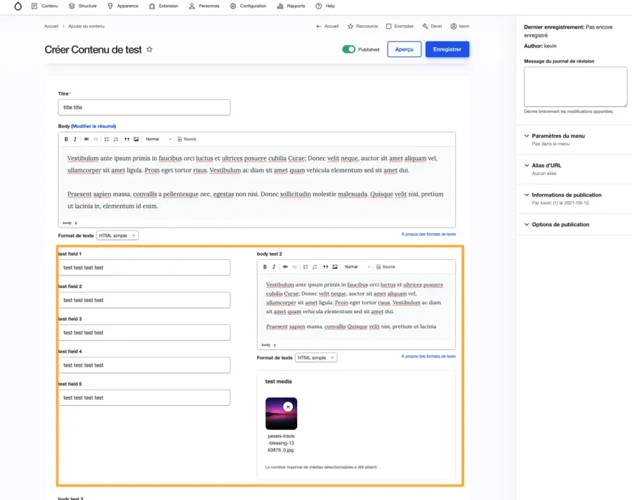
We also want the ability to add two columns where two things are in the same region, side by side.
Improve knowledge given to site builders
Most of the time, whoever builds the forms for editors are developers and developers use technology differently than site builders and content creators. Providing additional instructions can be helpful.
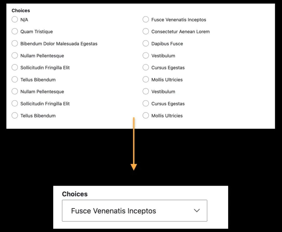
For example: who decides how many options before jumping into a select box from a radio widget?
UX people have this knowledge. Developers often don’t, even though they are building these forms. Sometimes, people don’t take the time to search on the internet for best practices, or maybe they don’t have the proper vocabulary to search effectively. Why not put some information and recommendations in the UI itself? We could also provide more information when creating a new field.
This could be a whole new initiative, different from the existing Help Topics Initiatives. This initiative would go field type by field type:
- Use existing UI.
- Independent commits per solution/item proposed, so not a big commit to core.
- Start with an initial UX and UI analysis.
More interactive UI (more javascript)
Not completely changing the UI with something like React, just enhancing it. If you look at JIRA and Github, there are some good patterns where you can make changes without switching pages. In Drupal, we are currently switching pages all the time.
Menus for content creators
One initiative related to this is the Decoupled Menus Initiative. It has aims, at least, for:
- A menu that is global and static
- A menu(s) that changes from page to page and might be different for different users
There is also a new “content creation” menu proposal. The current menu has an architecture for those building the site, like “Structure” and “Extend.” We need to group things for content creation and management and present a completely different menu for someone who is not a site builder.
Theme variations
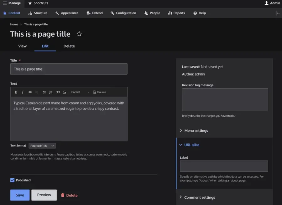
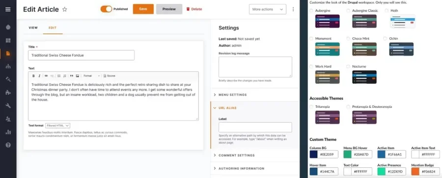
Everything has a dark mode now. Why not Drupal? Something like below is a possibility.
We also want options to change the colors of the interface. If your logo uses orange, you should be able to change your primary color in the theme or define your own palettes. One issue is proposing to replace the Color module with a solution that uses CSS variables, which is something Olivero already does.
We also want more UI customization—accent colors, spacing, etc. For example, some people might want smaller table cells so more rows are on a single screen. We can also improve accessibility b letting users choose their font size and toggle animations on and off.
Dashboard
Drupal 7 had a customizable dashboard, but it started as empty. To have a good dashboard, you need to know your target audience. What about a different dashboard per role? As you may have noticed, changing things per role is a big theme for the future of the administration UI initiative. Presenting the correct information to a user in an easy-to-digest way is one of the main goals.
What’s next?
Before we can get to all of this awesome stuff for the future, Claro needs to be stable. We need your help to get there. A new core theme requires a lot more coordination and work than some other types of modules. Yes, we need more developers. But we also need UX experts and designers, site builders, and more. We need a good cross-section of expertise to succeed.
Jump into the stable blocker issue and see where you can help! We’d love to have you.
UPDATE April 27th, 2022: Claro is now stable and is the default admin theme for Drupal 9.4 and Drupal 10!

