
Let’s be honest. Government websites and applications can be a pain to use. Have you ever tried to renew a license, apply for a benefit, or find out whether you qualify for something, only to hit a dead end? It’s frustrating, and it's often the result of the technology or process being used, not the people who use it. They don’t care that they can only renew their license online on a desktop with the latest browsers, or which department owns which part of the process. They just want to complete their task online without hitting a dead end. They want to feel accomplished and achieve their goal quickly. No one wants to interact with the government. But when they do, it can be hard, or even impossible, to accomplish their goals.
Building a people-centered structure depends on understanding who's using the site and what they're trying to accomplish. That's where budget and timeline start to matter.
Some projects come with the room to dig deep—months of discovery, dedicated research budgets, ongoing access to real users. Others come with tight deadlines and small budgets. This often means little to no time for research when a small team is expected to move fast. Both situations are common, and both can still produce a well-structured site if you know which tools to reach for.
We’ll walk through two scenarios that sit at opposite ends of that spectrum to show what "know your users" can look like no matter your budget and timeline, and why the underlying discipline doesn't actually change.
Creating archetypes
Before you can build a site around what people are trying to do, you need a working answer to a more basic question: Who, exactly, are these "people?" Creating archetypes helps answer this question. They’re broad user categories, grouped by their relationship to the site, that give a team a shared reference point for every downstream decision. A resident, a business owner, a public servant looking something up on behalf of someone else.
Archetypes are broader than personas when defining your audience and are useful when you don’t have time or budget for intensive user research. Personas get specific, layering in more granular detail nested under an archetype.
Archetypes are the coarser, higher-level structure the rest of the taxonomy hangs off. You need the archetype layer settled before the persona layer means anything. How you arrive at that layer looks completely different depending on what you have to work with.
On one project, the team had the benefit of a continuous, ongoing research practice: interviewing constituents during discovery for new and existing features, testing prototypes and wireframes through usability sessions, running tree tests and card sorts to validate how things should be organized, and tracking analytics benchmarks over time to see whether changes were actually landing. That's research in the fullest sense. Direct, repeated contact with the people the site serves.
Another project didn't have that luxury. With just over three months to redesign a full state site and development running in parallel with design, there was no budget for formal research. So the archetype work came out of structured stakeholder workshops instead. Sessions built around a simple set of questions:
-
Who is this for?
-
How do they get here?
-
What are they trying to do?
-
What does the agency need?
-
What are the hard requirements?
Paired with top-tasks mapping, this lets the team substitute institutional knowledge for primary research. Workshopping archetypes with multiple stakeholders can help solidify pain points, behaviors, and goals. Here’s a link to an archetypes workshop FigJam template.
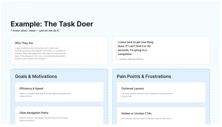
Example of an archetypes workshop template in FigJam with prompts for user goals and pain points.
Mapping what people are actually trying to do
Archetypes help identify your audience. Identifying top tasks, user needs, and goals helps you understand what they're actually there to do. It's easy for a site to organize around the wrong unit of analysis: pages, features, functionality, whatever the current structure produces. Top-tasks mapping forces the question back to the person's side of the screen: not "what do we need to publish," but "what is someone trying to accomplish when they land here."
In practice, this means identifying the few tasks that carry most of the traffic and matter most to users, like renewing a vehicle registration, applying for a benefit, or checking the status of an application, and mapping the paths people take from arrival to completion. The mapping diverges in what feeds it. With time and budget, that list gets built and validated with real inputs: analytics showing where people actually go and where they drop off, subject-matter experts who know the process cold, and direct interviews with the people doing the task. Without that runway, the same exercise still works. You just have to lean more heavily on analytics and knowledge from subject matter experts to stand in for what user interviews would otherwise surface.
Our team has found it helpful to workshop top tasks, user needs, and goals with stakeholders for projects that are on tight deadlines or budgets. Here’s a link to a FigJam workshop template for top tasks and user needs and goals.
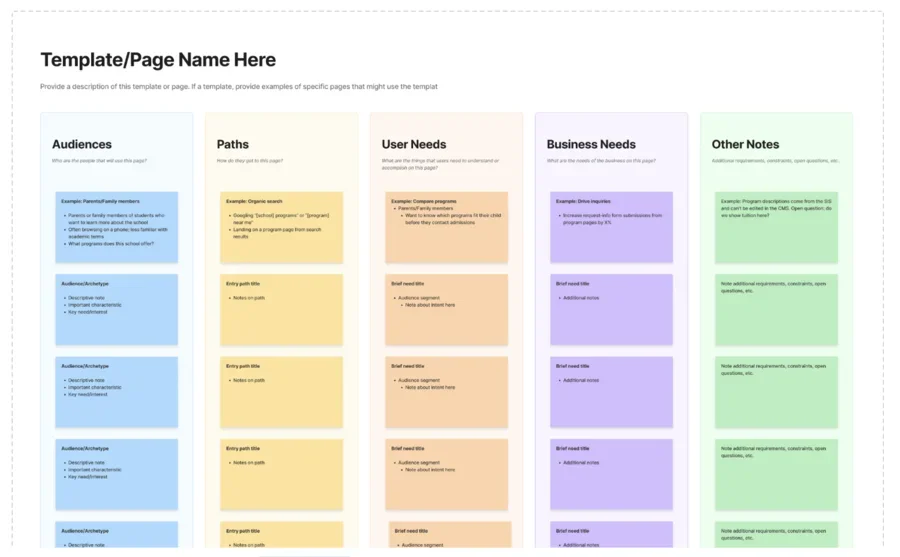
The user needs and goals template that the Lullabot team uses.
With both approaches, the output can reframe the project. A site organized around "what pages do we need" tends to mirror whatever structure produced it, which can include departments, programs, or whatever's easiest to hand off internally. A site organized around top tasks mirrors the person instead: the steps stay the same regardless of which office or department happens to be behind them. That small shift in framing has a big impact on the finished product. It's the difference between a site that reflects how an organization is arranged and one that reflects how a task actually gets done.
Let priority follow the tasks
Once you know what people are trying to do, the next question is where to spend your limited time solving the problems and improving the experience. Prioritization can look different depending on the resources available, but the user's top tasks, needs, and paths should still drive what gets the most attention.
On a tight budget, this often becomes a triage system that sorts templates or page types into tiers based on how much design attention they need. This triage system should also be informed by the user’s top tasks and the paths they need to take to complete their goal. The most-trafficked, highest-stakes tasks, informed by whatever analytics, user, and subject-matter input is available, get the deepest design attention. This includes full design exploration, multiple rounds of refinement, and the most feedback. Everything else gets a lighter touch, built from the same top-tasks and user-needs work but with a faster, more templated pass. It's not a compromise so much as a deliberate bet: put the rigor where the stakes and traffic actually are, rather than spreading it evenly and thinly across everything.
With a bigger budget, the same process holds, just fed by richer inputs. Ongoing analytics benchmarks, usability findings from actual testing, and constituent feedback that keeps arriving after launch shape prioritization. All of which feed a longer-running roadmap rather than a one-time triage decision. But it's still organized around the same top-tasks logic underneath: some pages and features matter more than others because of what people are actually trying to do with them, not because of who happens to be asking for them internally.
Either way, the effect is the same. Design investment gets tied directly to what people need, instead of treating every page as equally important. And that's ultimately what makes "no wrong door" real rather than aspirational: constituents get where they need to go without needing any insider knowledge of how the site or the work behind it is actually organized.
Focusing on user-centered flows helps eliminate the frustrations most people run into when engaging with government websites today. With larger budgets and longer timelines, that can mean building in more intensive, research-focused phases. For smaller projects, interviewing subject-matter experts can give you the understanding you need to design with users in mind. Either way, it comes down to the same steps: figure out who you're designing for, map what they're trying to do, and let those tasks decide where you focus your effort.
That's what makes this approach worth carrying into your own work. A "no wrong door" site isn't the product of a big budget or a perfect research plan. It comes from a habit of asking the same few questions at every stage, then using whatever inputs the project allows to answer them. It can be a round of usability testing or a few solid conversations with the people who know the work best. The inputs scale up or down. The discipline doesn't.
So if you're staring down a project with no time and no research budget, don't wait for better conditions. Start with the people. Find out what they're trying to do. Put your effort where it matters most. Do that, and no matter which door someone walks through, they'll have a better chance of completing what they came to do.
Whether you have months of runway or a deadline next quarter, you can start with the people. Reach out if you’d like a partner to help you figure out where your effort matters most.