After thirteen years and a lot of mileage, our beloved Lullabot robot has finally gone into the shop for a tune-up. Trust me, I recognize that our friendly robot has had adoring fans within the Drupal community since the very beginning. Changing it is something we’ve done with great care. What follows is a behind-the-scenes look at a slow and careful process that’s happened little by little over the past few years.
Why the change?
If you learn one thing in design school, it’s how to critique. It means we designers are a fun bunch at parties. It’s easy for designers to look at a logo (or a website, or a hotel check-in process, or almost anything for that matter) and tell you what’s wrong with it. The trickier part of the critique is identifying what’s working with something. That’s where I found myself nearly a decade ago when I joined Lullabot.
I was the first designer at Lullabot, and while I already had tremendous affection for Lullabot as a company, I was a bit baffled to find that many people actually liked our logo. I remember telling other designers about my new job, and hearing things like: “What’s with that logo? You’re gonna change that, right?!” But I quickly found that the open-source developers who comprised both Lullabot, and the Drupal community Lullabot grew up in, seemed to love our red robot. I remember attending my first few DrupalCons and seeing (to my horror) thousands of beautiful MacBooks marred with randomly-placed stickers, with most sporting our red robot loud and proud. I was forced to admit that, while I could point out several flaws with it, at least on one level our logo was actually working for us.
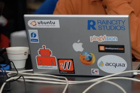
A photo by Dries Buytaert from a DrupalCamp in 2008
The Lullabot logo was originally created by our co-founder, Jeff Robbins. Jeff is multi-talented. He’s a musician slash rock band front-man, software developer, and entrepreneur. He’s not a designer, but he managed to create a logo that worked for us for a good while. His lengthy experience fronting a very popular rock band gave him an uncanny knack for creating fun t-shirts. I remember him telling me that, when he and Matt Westgate created Lullabot, he created the logo by simply trying to make something that would be fun on a t-shirt. Mission accomplished! Developers loved the t-shirts we gave away at DrupalCons, and Lullabot was off to the races.
If you’re creating a company where the people you need to recruit as employees and win over as stakeholders are all open-source developers, then having fun stickers and t-shirts is half the battle. That audience wasn’t particularly snooty about things like spacing, line weight, proportioning systems, and the like. They were more concerned with tabs versus spaces. In Lullabot’s early years, our target audience’s assessment of the visual representation of our brand went something like:
- Robots? Awesome!
- Stickers with robots? Yes Please!
- T-shirts with robots? You had me at t-shirts, and now you're just showing off!
Over the years, as Lullabot evolved beyond just Drupal development, providing services like content strategy and design, our audience grew as well. Both the talent we hoped to attract, and the clients we hoped to serve, began to consist of varied disciplines and backgrounds. It became clearer to even non-designers within Lullabot that our friendly red robot needed a makeover.
While I eventually overcame my fear of openly critiquing our logo, it was still with great trepidation that I began the conversation a few years ago about changing it. This reticence stemmed from a couple of things. One, nobody wants to tell a friend their baby is ugly. Two, even if I could remind myself that this was vector shapes on a canvas, and not human offspring, I couldn’t ignore that there were things that worked about our logo. Any successful redesign would need to somehow retain these things. Step one of planning for this design update was identifying what these things were.
Getting Started: Defining Success
One of graphic design’s greatest challenges is finding ways to objectively describe needs and desires, and then objectively measure solutions. In UX design, it’s more straightforward. We conduct interviews, surveys, and usability tests to identify problems and validate solutions. When you’re designing a logo, this process can be more challenging.
As we began trying to identify what worked about the Lullabot logo, I took inspiration from desirability studies. In this method pioneered at Microsoft in the early 2000s, users who have interacted with a product choose words from a list that best describe their experience or reactions to the product. The key to this approach is first establishing a baseline; a target word group you’re hoping people will choose.
To zero in on what might be working in our logo, I conducted a test within Lullabot. I wanted to uncover how actual Lullabots felt we should be portrayed. I gave them a list of descriptive words and asked our team to order them into "positive" and "negative" columns. They then had to stack order the words from most to least positive or negative. The test described a scenario in which a prospective employee or client—who is unfamiliar with Lullabot - sees our logo somewhere. If that prospect were given our word group to describe Lullabot based solely on our logo, which words would you want them to choose? What would you not want them to choose?
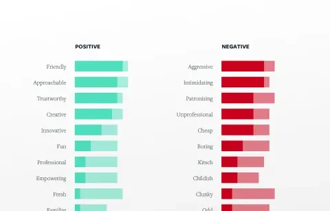
Results visualization from internal desirability study
I visualized the results by assigning color values based on which words made it into people’s top five positive or negative columns. The results were illuminating. What I discovered was that, ultimately, the real personality of our brand is best described with words like:
- Friendly
- Approachable
- Trustworthy
- Creative
- Innovative
- Fun
The things our team most wanted to avoid being perceived as were things like:
- Aggressive
- Intimidating
- Patronizing
- Unprofessional
- Cheap
- Boring
We took the results of this exercise to one of our directors’ retreats (see my article "Communication for Distributed Teams" for more on these). We did an exercise together aimed at evaluating and refining these words. Our initial word list for the test was an adaptation of the Microsoft reaction card words.
The exercise began with our leadership team each taking ten minutes to review the test result words and refine their own list of five to six words based on them. Each person then presented their words to the group and described their reasons for them. As each individual presented, we began calling out similar or synonymous words and deciding as a team which word best described our desired Lullabot brand. It was a really enlightening and fun exercise, and it gave us the following words that described how we wanted Lullabot to be perceived when people see our logo:
- Smart
- Kind
- Creative
- Honest
- Empowering
- Fun
Now that we had a great, short list of words that described how we want Lullabot to be perceived, we discussed which of these words had the greatest potential for visualizing within a logo. We called out "smart," "kind," "creative," and "fun" as words we could imagine, at least at some level, being able to convey within a small visual symbol.
One of the key benefits of all this initial research was that it helped me put my finger on what worked about our current logo. Ultimately, the reason our logo was loved by so many was that it communicated two of the most important aspects of our brand personality: "friendly" and "fun." A key to any successful design update would be maintaining that friendly, fun robot.
Identifying the Problems
Next, I took on the easier part: defining what was not working about our logo. I identified a few of the key design problems with our logo that we needed to solve in our update:
- Complexity: Great logos are iconic, stylized symbols that scale well. They look good and remain recognizable at all sizes (especially very small). Our existing logo was made up of multiple, disparate parts (e.g. floating robot ears, antenna, head, and torso). It was originally designed for t-shirts. The smaller you made it, the worse it looked.
- Fragility: Another reason our logo didn’t scale well was that it included very delicate parts. The eyes, ears, and smile were all rather fine lines or shapes that either disappear or generate visual noise at small sizes. This also led to ambiguity. There were numerous times over the years I was asked by clients and others what the deal was with the eyes.
- Shape: Great logos are versatile, often because their shape is designed to sit nicely within varied “lockups.” Many logos create a balanced shape like a circle, oval, square, or rectangle. While our logo was stable, with a wide base, it was awkward. The complex shape of our robot made it difficult to pair with a wordmark. Setting it next to something or within a simple shape created odd negative spaces.
To sum it up, we wanted a simple, iconic mark that was versatile and scalable.
Exploring Ideas
With problems identified and a description of what we wanted to achieve in hand, we were ready to begin creating ideas. At one company retreat, we engaged our developers and designers in a sketching exercise. It was a great way to quickly capture ideas; to explore ways to simplify our mark while keeping the friendly, fun feel. These exercises were a lot of fun and generated some common themes that made their way into our new logo.
Sketches by various Lullabot team members
After a fair amount of internal sketching and brainstorming, it was time to refine. Since one of the biggest drivers for this entire endeavor was a desire to have a beautifully designed, more iconic logo, we looked for great iconographers we could work with to help achieve that. Initially, we solicited the help of George Bokhua. George is a fantastic iconographer whose work we admired. We asked George to help generate a few ideas for us to consider. George did some amazing work, and that process helped us identify another key thing we were hoping to achieve in this update.
George Bokhua logo explorations
Evolution, not Revolution
The biggest insight we gained through our brief process with George was that we were aiming for evolution, not revolution. George produced some beautiful new marks that may work well for some companies, but they didn’t feel like the new version of our friendly robot. They felt like a completely different, new robot. We realized that we weren't looking for a brand new logo. We were looking for the new version of the one we already had. When an iconic car brand rolls out a new model year, they want it to look new, but they want you to recognize it as the new version of that same car model. This is what we needed to achieve.
“Evolution, not revolution” logo explorations by Lullabot’s design team
We went back to the drawing board. Our design team began creating more example ideas for what we meant by "evolution, not revolution." After a lot more exploration, we created an InVision board that captured these explorations, as well as a creative brief that better defined what we were hoping to achieve and why.
Our design team then created a list of some of our favorite logo designers. It was our dream list of who we thought would be most capable of evolving our robot in the way we’d described. Atop that list was Aaron Draplin. Aaron is a fantastic logo designer, a sought after speaker, a writer, a teacher, an entrepreneur, and an all-around great guy. Over the years, he’s done work for brands like Nike, Esquire, Ford, even the Obama administration. There are lots of great iconographers and logo designers out there, but something that Aaron particularly excels at is creating logos that are timeless, simple, and fun. These three things felt key to what we wanted to achieve.
I shot Aaron an email to see if he was interested in helping us, and was so excited to hear that he was. I shared our InVision board and creative brief with him, and then we hopped on the phone and talked about what we were hoping to do, and why. I knew he was the perfect fit when he followed up with a concise proposal for how he could help us that was entitled “Lullabot Robot Tune-up.”
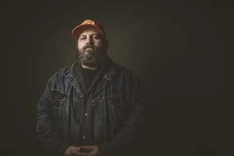
Aaron Draplin
Iterative Refinement
Logo explorations by Aaron Draplin
Over the next few months, we worked back and forth to create initial rough concepts, and then refine and refine some more. The very first concepts Aaron shared were intentionally a lot like our current logo. He focused on reductions that could help achieve that iconic simplification we needed while remaining as much like our current logo as possible. His early ideas felt familiar; like a tune-up to our beloved robot.
As we began honing in on the things that were working well, he then moved on to fine-tune things like proportion, spacing, weight, and shape to zero in on a mark that was refined, iconic and worked really well at small sizes. With each iteration, he would show how it might fit within a larger identity system, and also how it would look at a very small size (e.g. within a website header). With every new version, we were pushing a little further in terms of the amount of change to our existing logo, while holding onto something that felt fun, friendly, and familiar enough to be the new version of our robot.
When Aaron's work was done, we had an array of options. He produced several mark variations for us, as well as some lockup examples. We took it the rest of the way from there; creating the full identity package, defining clear space boundaries, and developing guidelines for usage. It's been a long but thoughtful - and fun - process, and we’re really pleased with our tuned-up robot! We hope you like it as well.
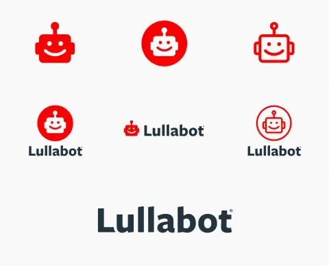
The new Lullabot identity system

Clear space guidelines
For a fun intro to Aaron and his logo design process, check out this viral video he made a few years back on designing a logo in 15 minutes.