Working in the front end of Drupal can be difficult and, at times, confusing. Template files, stylesheets, scripts, assets, and business logic are often scattered throughout big code bases. On top of that, Drupal requires you to know about several drupalisms, like attaching libraries to put CSS and JS on a page. For front-end developers to succeed in a system like this, they need to understand many of Drupal's internals and its render pipeline.
Looking at other stacks in our industry, we observed that many try to bring all the related code as close as possible. Many of them also work with the concept of components. The essence of components is to make UI elements self-contained and reusable, and while to some extent we can do that in Drupal, we think we can create a better solution.
That is why we wanted to bring that solution to Drupal Core. Recently, the merge request proposing this solution as an experimental module was merged. This article goes over why we think Drupal needs Single Directory Components and why we think this is so exciting.
The goals of SDC.
Our primary objective is to simplify the front-end development workflow and improve the maintainability of custom, Core, and contrib themes. In other words, we want to make life easier for Drupal front-end developers and lower the barrier of entry for front-end developers new to Drupal.
For that, we will:
- Reduce the steps required to output HTML, CSS, and JS in a Drupal page.
- Define explicit component APIs, and provide a way to replace a component that a module or a theme provides.
This is important because it will vastly improve the day-to-day of front-end developers. In particular, we aim for these secondary goals.
- HTML markup in base components can be changed without breaking backward compatibility (BC).
- CSS and JS for a component are scoped and automatically attached to the component and can be changed without breaking BC.
- Any module and theme can provide components and can be overridden within your theme.
- All the code necessary to render a component is in a single directory.
- Components declare their props and slots explicitly. Component props and slots are the API of the component. Most frameworks and standards also use this pattern, so it will be familiar.
- Rendering a component in Twig uses the familiar include/embed/extends syntax.
- Facilitate the implementation of component libraries and design systems.
- Provide an optional way to document components.
Note that all this is an addition to the current theme system. All of our work is encapsulated in a module by the name of sdc. You can choose not to use single directory components (either by uninstalling the module or just by not using its functionality). The theme system will continue to work exactly the same.
History
Whenever SDC (or CL Components) comes up, we get the same question: "Isn't that what UI Patterns has been doing since 2017?"
The answer is yes! UI Patterns paved the way for many of us. However, we did not start with UI Patterns for the proposal of SDC. The main reasons for that are:
- UI Patterns is much bigger than we can hope to get into Core. We share their vision and would love to see site builder integrations for components in Drupal Core one day. However, experience tells us that smaller modules are more likely to be accepted in Core.
- The UI Patterns concepts were spot on six years ago. Our understanding of components in other technologies and frameworks has changed what we think components should be.
In the end, we decided to start from scratch with a smaller scope, with the goal of creating something that UI Patterns can use someday.
We started this initiative because many of us have several custom implementations with the concept of Drupal components. See the comments in the Drupal.org issue in the vein of "We also do this!" Standardizing on the bare bones in Core will allow extending modules and themes to flourish. Most importantly, these modules and themes will be able to work together.
Architectural decisions
The initial team, which included Lauri Eskola, Mike Herchel, and Mateu Aguiló Bosch, met regularly to discuss the technical architecture, principles, and goals of SDC. Here are some of the fundamental architectural decisions we landed on:
Decision #1: All component code in one directory
As we have learned from other JavaScript and server-side frameworks, components must be self-contained. The concepts of reproducibility and portability are at their Core. We believe that putting components in a directory without any other ties to the site will help implement those concepts. You can take a component directory and copy and paste it to another project, tweaking it along the way without a problem. Additionally, once a developer has identified they need to work with a given component (bug fixes, new features, improvements, etc.), finding the source code to modify will be very easy.
Decision #2: Components are YML plugins
We decided that components should be plugins because Drupal needs to discover components, and we needed to cache the component definitions. Annotated classes were a non-starter because we wanted to lower the barrier for front-end developers new to Drupal. We believe that annotated PHP classes fall more in the realm of back-end developers. While there are many file formats for the component definition for us to choose from, we decided to stay as close as possible to existing Drupal patterns. For this reason, components will be discovered if they are in a directory (at any depth) inside of my_theme/components (or my_module/components) and if they contain a my-component.component.yml.
The alternative we considered more seriously was using Front Matter inside the component's Twig template. Ultimately we discarded the idea because we wanted to stay close to existing patterns. We also wanted to keep the possibility open for multiple variant templates with a single component definition.
Decision #3: Auto-generated libraries
We believe this is a significant perk of using SDC. We anticipate that most components will need to have CSS and JS associated. SDC will detect my-component.css and my-component.js to generate and attach a Drupal library on the fly. This means you can forget about writing and attaching libraries in Drupal. We do this to lower the barrier of entry for front-end developers new to Drupal. If you are not satisfied with the defaults, you can tweak the auto-generated library (inside of the component directory).
Decision #4: Descriptive component API
Early in the development cycle, we decided we wanted component definitions to contain the schema for their props. This is very common in other technology stacks. Some use TypeScript, other prop types, etc. We decided to use JSON Schema. Even though Drupal Core already contains a different language to declare schemas (a modified version of Kwalify), we went with JSON Schema instead. JSON Schema is the most popular choice to validate JSON and YAML data structures in the industry. At the same time, Kwalify dropped in popularity since it was chosen for Drupal 8 nearly 11 years ago. This is why we favor the latter in the trade-off of Drupal familiarity vs. industry familiarity. We did this to lower the barrier of entry for front-end developers new to Drupal.
The schemas for props and slots are optional in components provided by your themes. They can be made required by dropping enforce_sdc_schemas: true in your theme info file. If your components contain schema, the data Drupal passes to them will be validated in your development environment. Suppose the component receives unexpected data formats (a string is too short, a boolean was provided for a string, a null appears when it was not expected, ...). In that case, a descriptive error will tell you early on, so the bug does not make it to production.
Schemas are also the key to defining the component API and, therefore, assessing compatibility between components. As you'll see below, you can only replace an existing component with a compatible one. Moreover, we anticipate prop schemas will be instrumental in providing automatic component library integrations (like Storybook), auto-generating component examples, and facilitating automated visual regression testing.
Decision #5: Embedded with native Twig tools
To print a component, you use native Twig methods: the include function, the include tag, the embed tag, and the extends tag. SDC integrates deeply with Twig to ensure compatibility with potential other future methods as well.
In SDC, we make a distinction between Drupal templates and component templates. Drupal templates have filenames like field--node--title.html.twig and are the templates the theme system in Drupal uses to render all Drupal constructs (entities, blocks, theme functions, render elements, forms, etc.). By using name suggestions and applying specificity, you make Drupal use your template. After Drupal picks up your Drupal template, you start examining the variables available in the template to produce the HTML you want.
On the other hand, component templates have filenames like my-component.twig. You make Drupal use your component by including them in your Drupal templates. You can think of components as if you took part of field--node--title.html.twig with all of its JS and CSS and moved it to another reusable location, so you can document them, put them in a component library, develop them in isolation, etc.
In the end, you still need the specificity dance with Drupal templates. SDC does not replace Drupal templates. But, if you use SDC, your Drupal templates will be short and filled with embed and include.
Decision #6: Replaceable components
Imagine a Drupal module that renders a form element. It uses a Drupal template that includes several components. To theme and style this form element to match your needs, you can override its template or replace any of those components. The level of effort is similar in this case.
Consider now a base theme that declares a super-button component. Your theme, which extends the base theme, makes heavy use of this component in all of its Drupal templates, leveraging the code reuse that SDC brings. To theme the pages containing super-button to match your needs, you'll need to override many templates or replace a single component. The level of effort is nothing similar.
This is why we decided that components need to be replaceable. You cannot replace part of a component. Components need to be replaced atomically. In our example, you would copy&paste&tweak super-button from the base theme into your custom theme. The API of the replacing component needs to be compatible with the API of the replaced component. Otherwise, bugs might happen. Both components must define their props schema for a replacement to be possible.
Example of working with SDC
Let's imagine you are working on theming links for your project. Your requirements include styling the links, tracking clicks for an analytics platform, and an icon if the URL is external. You decide to use SDC. So you scaffold a component using drush (after installing CL Generator). You may end up with the following (you'll want to use your custom theme instead of Olivero):
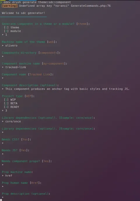
After the initial scaffold, you will work on the generated files to finalize the props schema, add documentation to the README.md, include the SVG icon, and implement the actual component. Once you are done, it might resemble something like this.
web/core/themes/olivero/components
└── tracked-link
    ├── img
    |   └── external.svg
    ├── README.md
    ├── thumbnail.png
    ├── tracked-link.component.yml
    ├── tracked-link.css
    ├── tracked-link.js
    └── tracked-link.twig
Below is an example implementation. Be aware that, since this is for example purposes only, it may contain bugs.
# tracked-link.component.yml
'$schema': 'https://git.drupalcode.org/project/drupal/-/raw/10.1.x/core/modules/sdc/src/metadata.schema.json'
name: Tracked Link
status: stable
description: This component produces an anchor tag with basic styles and tracking JS.
libraryDependencies:
  - core/once
props:
  type: object
  properties:
    attributes:
      type: Drupal\Core\Template\Attribute
      title: Attributes
    href:
      type: string
      title: Href
      examples:
        - https://example.org
    text:
      type: string
      title: Text
      examples:
        - Click me!
Note how we added an attributes prop. The type will also accept a class, an enhancement we had to make to the JSON Schema specification.
# tracked-link.twig
{# We compute if the URL is external in twig, so we can avoid passing a #}
{# parameter **every** time we use this component #}
{% if href matches '^/[^/]' %}
  {% set external = false %}
{% else %}
  {% set external = true %}
{% endif %}

<a {{ attributes.addClass('tracked-link') }} href="{{ href }}">
  {{ text }}
  {% if external %}
    {{ source(componentMeta.path ~ '/img/external.svg') }}
  {% endif %}
</a>
If a component receives an attributes prop of type Drupal\Core\Template\Attribute it will be augmented with component-specific attributes. If there is no attributes prop passed to the component, one will be created containing the component-specific attributes. Finally, if the attributes exists but not of that type, then the prop will be left alone.
/* tracked-link.css */

.tracked-link {
  color: #0a6eb4;
  text-decoration: none;
  padding: 0.2em 0.4em;
  transition: color .1s, background-color .1s;
}
.tracked-link:hover {
  color: white;
  background-color: #0a6eb4;
}
.tracked-link svg {
  margin-left: 0.4em;
}
Components that make use of attributes receive a default data attribute with the plugin ID. In this case data-component-id="olivero:tracked-link". We could leverage that to target our styles, but in this example, we preferred using a class of our choice.
// tracked-link.js
(function (Drupal, once) {
  const track = (event) => fetch(`https://example.org/tracker?href=${event.target.getAttribute('href')}`);

  Drupal.behaviors.tracked_link = {
    attach: function attach(context) {
      once('tracked-link-processed', '.tracked-link', context)
        .forEach(
          element => element.addEventListener('click', track)
        );
    },
    detach: function dettach(context) {
      once('untracked-link-processed', '.tracked-link', context)
        .forEach(element => element.removeEventListener('click', track));
    }
  };
})(Drupal, once);
With this, our component is done. Now we need to put it in a Drupal template. Let's inspect the HTML from a Drupal page to find a link, and there we'll find template suggestions to use. Let's say that our links can be themed with field--node--field-link.html.twig. To use our component, we can use include because our component does not have slots.
# field--node--field-link.html.twig
<div{{ attributes }}>
  {% for item in items %}
      {{ include('olivero:tracked-link', {
        attributes: item.attributes,
        href: item.content.url,
        text: item.content.label
      }, with_context = false) }}
  {% endfor %}
</div>
The future of SDC
Single Directory Components were merged into Drupal core 10.1.x. This means that they will be available for all Drupal sites running Drupal 10.1 as an experimental module.
However, we are not done yet. We have a roadmap to make SDC stable. We are also preparing a sprint in DrupalCon Pittsburgh 2023 for anyone to collaborate. And we have plans for exciting contributed modules that will make use of this new technology.
In the meantime, join the #components channel in Drupal Slack and get involved!
Note: This article has been updated to reflect the latest updates to the module leading to core inclusion.