As a recovering English major, I’d like to believe words alone are enough to tell a tale on the web. A text-only page is fast: even a long article can load nearly instantly. Add photos, and the web slows down. Yet great images bring emotion, a connection with others and the world around us. They’re often worth the tradeoff in time to load a page.
People don’t want to wait around longer than necessary, though. Any benefit you get from a great image vanishes once someone’s neck begins to tense up as the loading bar slowly creeps from one side of the URL bar to the other.
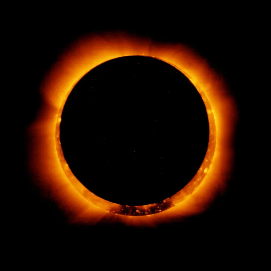
Eclipse photos are likely to stir up memories for those who have witnessed its majesty (Photo courtesy of NASA)
Images also lose their emotional impact if they’re blurry and someone has to squint to see the subject.
If you take an image that looks nice and crisp on a phone, then share that same file on a big desktop screen, it’s going to look fuzzy. Switch it around with a nice, big image that looks great on desktop, and somebody looking at the same file on a phone will grow impatient, waiting for the file to load.
We want the best of both worlds: images that look great no matter which screen they’re viewed on, while loading as quickly as possible.
Thankfully there’s a great solution to this problem due to the work of the Responsive Images Community Group. They worked with browser developers to develop new markup options such as the picture element and the sizes and srcset attributes. With these tools, we can provide a selection of image files so your browser can pick the right one depending on how someone is viewing it. This can help to make sure photos download as fast as possible while still being enjoyed in all their glory.
There are a lot of great resources that help explain the new responsive images specification. I highly recommend Jason Grigsby’s article series, Responsive Images 101, as well as Eric Portis’ Responsive Image Guide. You can read the actual specifications for the picture element or the srcset and sizes attributes, although specs can be pretty dry reading. Understanding the specifications and syntax are important, but you still need to make a number of key decisions on how you’ll use responsive images with a particular site.
I’ve set up responsive images on a number of large sites like NYU Langone, and I also help to maintain the Responsive Image and Breakpoint modules for Drupal 8, so I wanted to share some of my experiences in working with responsive images.
In this article, I’ll be explaining some of the key concepts for responsive images, as well as providing an overview of a few different responsive image tactics. The solutions used for any particular image will vary. Understanding those options will help you to set out on the right path.
I’ll dig into more technical detail in future articles focused on some of those individual tactics. Right now, let’s start looking at the various ways we can make sure our images look awesome and load fast.
Picking the right method to make your images responsive
The biggest difference in how you’ll handle making images responsive is what you’ll do for images that are photos, versus how you’ll handle logos and icons.
Photos—often referred to as raster images—do not scale so easily. The word raster comes from the Latin word rastrum, or rake. Old cathode ray tubes created images on screens by literally drawing one line at a time, raking each across the screen. These days raster images are created by hundreds of thousands to millions of individual dots, or pixels, on a screen. It takes a lot of data to tell a browser what color each of those dots should be in order to recreate an image.

A raster image is most appropriate for the Carina Nebula: recreating this using vectors would be a nightmare. (Photo courtesy of NASA)
Logos and icons on the other hand often use vector graphics. These images can be specified using mathematical vectors—a series of points on lines along with information that describes the curves connecting those points. The simpler shapes and colors in vector graphics can scale really easily to a wide variety of sizes, because math can easily calculate the color needed for each pixel.
For vector graphics, you’ll want to use SVG files. SVG means Scalable Vector Graphics, and the name really says it all. SVGs are text files which use XML to describe the vectors necessary to create an image. Use an SVG plus a little CSS, and your logos and icons will be responsive.
I would not recommend using an older technique to load icons through a webfont containing multiple icons. The goal of that was to avoid multiple requests to a server: with the advent of the http/2 protocol, that’s not as much of an issue. Icon fonts also have major accessibility issues, since they use a specific letter of a font for each icon. For people using a screen reader, that’s not so awesome.
For photos and other raster images, the techniques you use might vary a bit, depending on if the images are loaded through CSS or HTML.
There are ways to make background images added to a site through CSS responsive, but unfortunately browser support can be a bit shaky.
Thankfully, images used as content within a site, which are loaded through the HTML markup for a page, have great options that we can use. These sorts of images are generally what people are referring to when you hear the term responsive images.
So we’ll be focusing mostly on raster images that appear as content on your site. Even there, however, there a few important variations to keep in mind.
How do images vary across breakpoints?
When we’re talking about making images responsive, we mean that we want to provide some variation in how those images appear depending on how they’re viewed.
Sometimes we want an image to essentially look the same whether you’re on mobile or desktop. For example the image always appears as a square or a rectangle. It might only fill a sidebar column on desktop, while filling the full width of the screen on mobile. However, it retains the same aspect ratio—the relationship between the height and the width of the image.
We call this use case viewport sizing, and typically this ends up being the most common way that images are made responsive.
For viewport sizing, we typically just need a good ol’ img element with two new attributes: sizes and srcset. We’ll get into how those new attributes work, but the short version is that sizes tells a browser how much space an image takes up in a site’s layout at various screen sizes, while srcset provides some image file options the browser can choose between.
<img src="small.jpg"
     srcset="large.jpg 1024w, medium.jpg 640w, small.jpg 320w"
     sizes="(min-width: 36em) 33.3vw, 100vw"
     alt="A swirling nebula">
Sometimes we need images to change a bit more at various screen sizes. Maybe we need a square image on mobile but a rectangle on desktop. Sometimes we also need to change the cropping of an image across breakpoints, showing a close-up image on mobile, while using a wider shot on desktop. Changes to aspect ratio and cropping are often called art direction, and they require a more complicated solution.
For art direction, we’ll need to use the picture element, which serves as a wrapper around a series of source elements, along with an img element. Each source element has its own media attribute: the media query defines the viewport size range where that source should be used to select the particular file that will be used for the img element contained inside the picture element.
You can also provide a sizes and srcset attribute on a source element so the browser has a number of files it can choose between for a particular viewport range.
<picture>
  <source media="(min-width: 70em)"
          sizes="40vw"
          srcset="nebula-artsy-wide-2800.jpg 2800w,
                  nebula-artsy-wide-2240.jpg 2240w,
                  nebula-artsy-wide-1400.jpg 1400w,
                  nebula-artsy-wide-1120.jpg 1120w">
  <source media="(min-width: 35em)"
          sizes="36vw"
          srcset="nebula-artsy-square-1120.jpg 1120w,
                  nebula-artsy-square-900.jpg 900w,
                  nebula-artsy-square-560.jpg 560w,
                  nebula-artsy-square-450.jpg 450w">
  <img src="nebula-artsy-tight.jpg" alt="An artsy cat">
</picture>
Using the picture element is overkill when you’re just dealing with viewport sizing. Having separate source elements is great for art direction, though, because you can provide a set of files on one source element with a certain aspect ratio or cropping level, while using a different aspect ratio or cropping level on another source element.
There’s very good browser support for the picture element, as well as the sizes and srcset attributes. IE11 is the main browser that still needs a little help, and for that you will want to make sure you’re using the Picturefill polyfill. Doing so may change what you use as a fallback src on the img inside the picture element. See the example on the Picturefill site for details.
For either viewport sizing or art direction, you’ll likely want to use the sizes and srcset attributes, so let’s dig a little deeper into what purpose those attributes are serving. In short, it’s all about pixels versus percentages.
Responsive image grudge match: Pixels versus percentages
Responsive design typically specifies a site’s layout in percentages, while raster images like photos are defined in pixels. It’s a grudge match, and our job is to serve as referees.
In one corner, we have responsive web design, where percentages define layout. By using a percentage, we allow the browser to do the heavy lifting of figuring out for an element like a sidebar exactly how many pixels wide it should be for a particular screen size. This is great, since like vector images, a browser can easily calculate layout boxes through the power of mathematics.
In our other corner, we have photographic images. Photos are more difficult to resize, because we need to give a browser detailed instructions about every single pixel in the image. As a result, photos don’t flex so easily.

A photo of the Lagoon Nebula benefits from having sufficient resolution to show all the glorious details. (Photo courtesy of NASA)
Image files are essentially information with instructions detailed enough to create a photo at a particular size. A browser can figure out how to make an image smaller than its file size would suggest, because it has enough information to do so. Making an image bigger is much trickier, because if a browser doesn’t have enough detailed instructions for a larger size, it has to start guessing. And inevitably, it will guess wrong at least some of the time, which leads to images looking blurry.
However, that doesn’t mean we can just give a browser so much information that it can draw an image at any potential size. A high-res image file is going to be way bigger than necessary for a much smaller, low-res screen. More information, bigger file size, longer download time.
Because pixels matter so much, we also have to keep in mind screen resolution. Some displays use a larger number of pixels in the same amount of physical space in order to create a more detailed image. For a low-res display, a sidebar that has a layout width of 500px will use 500 physical pixels in a screen to create that width. For a high-res “retina” screen, there may be 1000 physical pixels in that same space. That means we need a higher resolution image to account for that difference.
So we want to figure out for one particular type of image how many pixels of information we need in the file for the amount of space it takes up in a percentage of the site’s layout at a certain screen size and resolution. It’s okay if the file has a few more pixels of info, although not too many more, but we definitely want to avoid having too few pixels of info, so we can avoid blurry images.
The sizes attribute helps us to tell the browser about the layout percentages for a particular image, while srcset provides information about the number of pixels in each image file. Why do we need to put this information into HTML markup, though?
Why browsers need a sizes attribute
We need sizes because of how browsers process a web page that is being loaded. Once a browser receives the HTML for a page from the server, it begins scanning the document to look for other resources it will need to load. It finds all the CSS and JS documents that need to be loaded, as well as any image files, then begins prioritizing how it will download those files.
CSS files are a top priority, because they provide so much critical information about how a page’s HTML should be styled, and because CSS files often contain links to other resources that need to also be downloaded, such as web fonts and background images. JS is also a big priority, as it can change around the order of DOM elements that will need to be styled based on CSS rules. What’s critical to understand is that browsers improve overall performance by starting to download images while the CSS and JS files are still being processed.
That’s been a big challenge for responsive images, because you can’t just use CSS and JS to select an image file with the right width for a particular image slot, as doing so would mean waiting until all of the CSS and JS has been processed to fully understand the final layout of a page and thus the width of an image slot.
We can solve this tricky problem by using a key part of the responsive images spec: the sizes attribute. This attribute on an img element (or on a source element within a picture element) tells the browser how large that element will be once layout rules are applied.
So, within our sizes attribute, we provide a set of widths and accompanying media conditions. A media condition is simpler than a media query and consists only of something like (min-width: 1000px). For our example, we could provide the following sizes attribute:
sizes="(min-width: 36em) 33.3vw, 100vw"The first thing to note is that we’re providing the media condition for the largest possible viewport first, as the browser will pick the first option that matches.
Next, note the units we’re using:
- Using em for widths in media conditions is a good practice, because it provides extra flexibility for people who change the settings in their browser to use larger than normal default font sizes. The typical default font size is 16px for 1em, so 36em is the equivalent of 576px. So we’re saying when the browser has a minimum width of 576px, this image takes up 33.3vw space in the layout.
- The vw unit stands for viewport width: 1vw is equal to 1% of the width of the viewport; 33.3vw is 33.3% of the viewport width. The
vwunit is used instead of percentages to make clear that this is a percentage of the viewport, not the width of the containing element.
Finally, the comma indicates the next set of media conditions and layout data. You can have as many commas as necessary within a sizes attribute. Here we just have one, so we’re saying that for viewports smaller than 576px wide, this image takes up 100% of the viewport space.
Let the browser choose with srcset
The sizes attribute needs to be paired with a srcset attribute on the same element (either an img element or a source element). This attribute will contain a comma-separated list of the URLs of image files: after each URL there is a space, then a number signifying the width of the image followed by the letter w. For example:
srcset="image235.jpg 235w,
        image290.jpg 290w,
        image365.jpg 365w,
        image470.jpg 470w,
        image580.jpg 580w,
        image730.jpg 730w,
        image940.jpg 940w,
image1160.jpg 1160w"- The browser will take a look at these image files and use the number with the w to calculate which image file will best fit within the amount of space we’ve defined in the sizes attribute.
- The browser knows the viewport size, so it can pick the right media condition and then use the width value next to the media condition to calculate how many pixels are needed to fill that space.
- The browser also knows the resolution density of the screen, so it can take that into account with its calculations as well.
The browser can also in theory take into account the bandwidth you have available, providing a lower-res source if you’re on a 3G connection perhaps.
You don’t need to worry about that, though. All you need to do is provide the layout information in the sizes attribute and the possible image sources that can fit within that space, and the browser will take care of matching up the right source file with the image slot.
Make images fluid with CSS
To make images responsive, we still need to write CSS rules that will make the image flexible. For example:
img {
  width: 100%;
  height: auto;
}
If you’ve provided a set of images in srcset with sufficient widths for the amount of space defined in sizes, this should be all you need. If you don’t have a way to guarantee that, you could use a rule of max-width: 100% (instead of width: 100%) to ensure images are never made larger in the layout than the number of pixels within the image. This can cause design discrepancies if your images are supposed to take up a certain amount of space in a grid design, so I tend to prefer width: 100%.
If I want to have an image take up a certain amount of space within its container, I find it works better to put a wrapper div around the img or picture element and then set layout rules on that wrapper. That way I can have one consistent CSS rule for all images, but then modify the width of the wrapper in the situations that need that.
Next steps
Hopefully you now have a better understanding of a few different types of images and how you might make each responsive.
The sizes and srcset attributes are often key to making images responsive. In an upcoming article, I’ll talk through how to look at a particular type of image for a site, and then determine what values to use for sizes and srcset. Creating that sort of plan is really key to a successful responsive images solution.
Once you have a plan, you still need to create all the image file variations, and if at all possible you should find a way to avoid creating those image files manually. In a separate article I’ll go over how to use Drupal 8’s built-in tools to automate this process. In a decoupled site, you may find a cloud-based tool works well for that part of the process: Kris Bulman will be going over how to do that in a future article.
Other articles in this series may go over topics like how to implement art direction for responsive images in Drupal 8.
The payoff for this effort is that your images look nice and crisp at all viewport sizes, while still downloading efficiently. No more super slow mobile sites that take forever to load images! That makes a huge difference for those visiting your site. Downloading image files tends to be a big chunk of the work that browsers do when visiting a new site. Speed that up and everybody wins.