If you've spent years building structured, component-driven sites in Drupal, you've developed strong instincts about how a design system should work. Components have templates, stylesheets, and defined data points. Editors fill in fields. The system enforces consistency. It's a model that scales well for universities, government agencies, and large organizations—the kind of projects we've focused on for most of our history at Lullabot.
WordPress and Gutenberg have fundamentally different philosophies on how editors and components interact. Understanding that difference is the key to building a design system that actually works in this ecosystem.
Starting from different places
In Drupal, the standard approach is to start with a minimal base theme—something with just enough scaffolding to build on—and then layer in exactly what the project needs. It's a bottom-up model that gives teams a lot of control.
Our WordPress project took the opposite approach. We started with Kadence, a full-featured commercial theme with a free and paid tier. Kadence ships with an extensive set of design variables exposed through the WordPress Customizer covering fonts, colors, spacing, and more. The workflow was to configure those variables first, establishing the visual foundation, and then build pages on top of that.
For someone used to the Drupal approach, this felt top-down and opinionated. But for the type of site most WordPress agencies build, such as corporate marketing sites, product pages, and campaign microsites, it's efficient. You get a polished starting point quickly without writing much code. The trade-off is that you're working within the constraints the theme exposes, and you need to understand those constraints before you start customizing.
Patterns vs. structured components
Here's where the real paradigm shift happens. In Drupal, a "card" component is well-defined. It has a Twig template, a CSS file, and a set of fields: an image, a heading, body text, maybe a link. The editor fills in those fields, and the component renders them. If the heading is required, you can't skip it. The design system enforces its own rules.
In Gutenberg, the equivalent concept is a pattern. But patterns work very differently. To build that same card, an editor or site builder might drag a Columns block onto the page, drop an Image block, a Heading block, and a Paragraph block inside each column, style them, and then save the whole group as a reusable pattern called "Cards." WordPress even auto-generates a screenshot for the pattern library.
The critical difference: patterns can't be locked down. An editor can take that carefully composed card pattern, remove the heading, add extra columns, swap out blocks, or rearrange the layout entirely. It's less like filling in a form and more like working in a visual HTML builder. In Drupal terms, imagine if every paragraph type allowed editors to freely add and remove fields.
For brochure-style sites, this flexibility is a feature, not a bug. Editors can adapt layouts without waiting for a developer. But for projects that require strict brand governance across dozens or hundreds of pages, it's a real concern.
Bringing structure to Gutenberg with custom blocks
The good news is that Gutenberg doesn't force you into the pattern-only model. You can build custom blocks that behave much more like Drupal components with defined fields, structured data, and controlled output. This is the approach we ended up taking, and it's where the real opportunity lives for teams that want design-system rigor in WordPress.
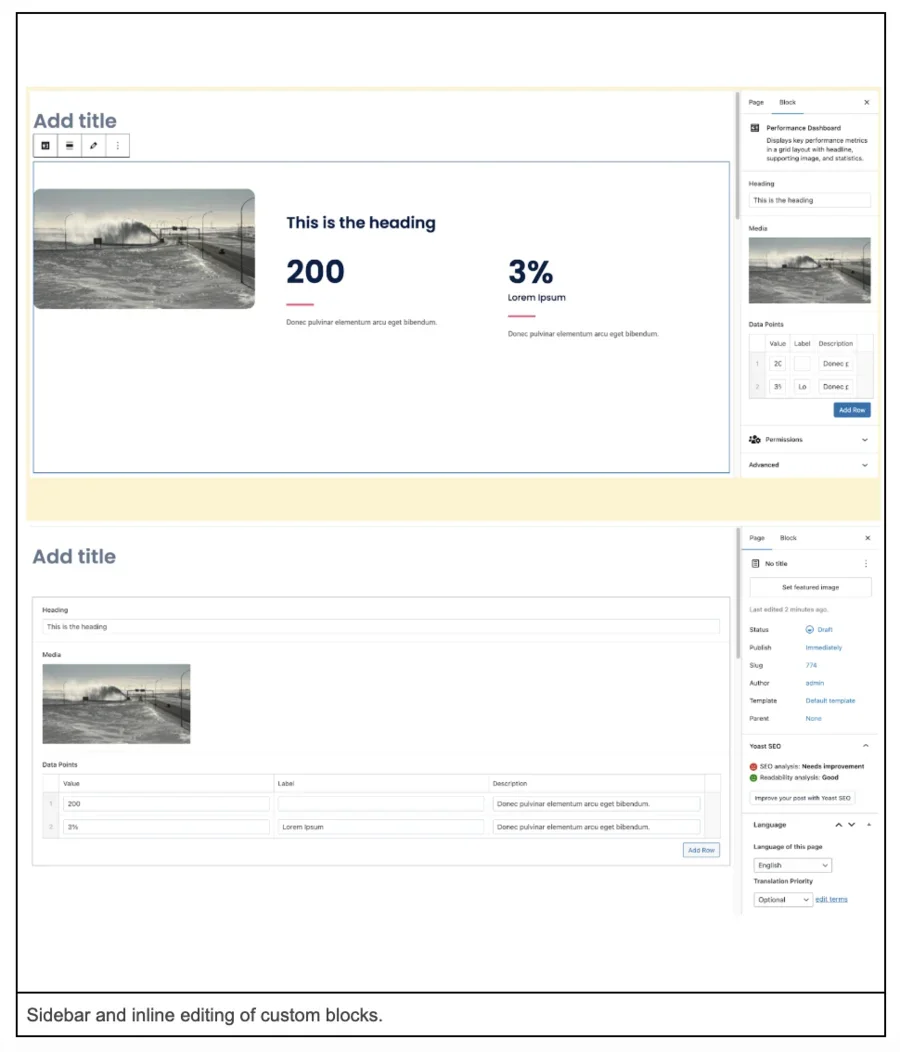
In Gutenberg, components are called blocks, and with the right setup, a block can have a Twig-like template (via a render.php callback or a Twig integration like Timber), its own CSS or PostCSS, JavaScript, and a structured set of attributes that editors fill in through a sidebar panel or inline editing.
Here's a simplified example of registering a custom block in block.json:
{
"$schema": "https://schemas.wp.org/trunk/block.json",
"apiVersion": 3,
"name": "my-theme/callout-decorative",
"title": "Callout - Decorative",
"category": "text",
"icon": "format-quote",
"description": "Callout block with decorative elements",
"style": [
"file:./callout-decorative.css"
],
}
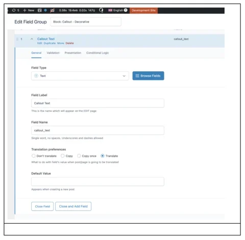
Fields can be added to custom blocks thanks to the ACF plugin.
With this approach, the editor experience is closer to what Drupal developers expect: a defined set of inputs, a controlled template, and predictable output. You can assign categories and icons to each block, attach preview screenshots, and Gutenberg's block inserter provides a clean, searchable library that handles large component sets impressively well.
Design tokens (exported from Figma with Figma Token Exporter) can also be scoped to blocks using CSS custom properties that align with the theme's variables:
.right-text {
background-color: var(--vh-background-light);
border-radius: var(--vh-radius-radius-md);
padding-block: var(--vh-spacing-component-default-min);
padding-inline: var(--vh-spacing-component-default-min);
@include screen-sm {
padding-block: var(--vh-spacing-section-default);
padding-inline: var(--vh-spacing-component-lg);
}
.heading {
color: var(--vh-text-heading-dark);
}
}
This keeps the design system's tokens flowing through both the theme and component layers. It feels immediately familiar to anyone coming from Drupal's single-directory component model.
What WordPress editors actually expect
One thing this project made clear is that WordPress editors often have very different expectations from Drupal editors. On Drupal projects, especially in higher education and government, editors typically work within guardrails intentionally set by the development team. They expect structure.
On our WordPress project, a new editor with prior WordPress experience usually expects admin access, the ability to install plugins directly in production, and the ability to inject custom CSS through the Customizer to tweak the site. This isn’t someone going rogue! These are team members whose past WordPress experience has trained them to expect that level of control.
The WordPress ecosystem has cultivated a culture where editors are accustomed to significant autonomy over layout and even styling. That means if you're going to introduce design-system constraints, such as disabling the CSS injector, limiting which default blocks are available, or requiring change requests for new components, you need to have that conversation early. On our project, the editor ultimately agreed that CSS changes and plugin installations should follow a proper development workflow using Git and environment management on Pantheon. But it required a discussion that you'd rarely need to have on a Drupal project.
The tension worth paying attention to is speed versus governance. The editor's instinct was understandable: why wait a week for a developer to build a card component when they could drag a few blocks together and have something that works in five minutes? If your design system is going to add friction, you need to be able to articulate why that friction is worth it and minimize the turnaround time for new component requests so the friction doesn't feel excessive.
What Gutenberg gets right
After a few months deep into this project, we came away genuinely impressed by several aspects of Gutenberg that Drupal could learn from. The block inserter's search and categorization are polished. Nesting blocks inside blocks, like dropping content into individual columns of a Columns block, is smooth and intuitive. The inline preview while editing, despite imperfections (JavaScript-dependent components don't always render correctly in the admin, and there are occasional visual discrepancies between the editor and the front end), still gives editors a much better sense of what they're building than a traditional form-based interface.
Gutenberg's patterns concept (the ability to group blocks and save them as reusable templates) is also compelling. It's a middle ground between total freedom and total structure that doesn't have a clean equivalent in Drupal yet. Drupal's Canvas initiative is moving in this direction, and it has real potential, but it's still early. Canvas doesn't yet support the equivalent of patterns, and the nesting and drag-and-drop flexibility that Gutenberg offers out of the box is further along than what Canvas provides today.
The bigger picture: editors want to see what they're building
If there's one lesson worth carrying back to every Drupal project, it's this: editors want to see what they're building. That sounds obvious, but it runs counter to a decade of momentum in the CMS world toward headless architectures and structured-data-first approaches. Editors are people who work in Google Docs and Word every day. They expect to drag an image somewhere and have it stay there. They expect to change the font size and see it change.
WordPress, with all its quirks, has been relentlessly focused on that visual editing experience. Gutenberg is the manifestation of that focus, and, despite the ways it differs from how a Drupal developer would naturally approach component architecture, it gets something fundamentally right about what content creators need. Whatever CMS you're working in, investing in the visual editing experience, whether through Canvas, Layout Builder, or custom tooling, is time well spent. The structured data still matters, but the interface editors see that every day matters just as much.