Imagine that you arrive at a website, but you cannot see the screen. How do you know what’s there? How do you navigate? This is normal for many people, and the accessibility of your site will make or break their experience. Accessibility is about including everyone. People with physical and cognitive disabilities have specific challenges online—and making your site accessible removes those barriers and opens the door to more users.
Severely disabled Americans constitute a population of 38.3 million people, and make up a huge swath of voters (see the #CripTheVote movement on Twitter). Some notable U.S. presidential elections have been decided by much less, and because of this, we’re auditing the US presidential election candidates’ websites.
During this audit, we’ll see what the candidates’ websites are doing right and wrong, and where the low-hanging fruit lies. This article won’t be a full top-to-bottom audit, but we will show some of the important things to look for and explain why they’re important.
Our Methods
Automated Testing
The first step in our a11y audit is to do a quick automated check. If you’re new to accessibility, the WAVE tool by WebAIM is a great place to start. It’ll check for standard accessibility features and errors in alt attributes, contrast, document outline, and form labels. For the features or errors it finds, it provides an info icon that you can click to learn what the issue is, why it’s important, and how to do it right. WAVE is free, and highlights both negative (errors, alerts, features, structural elements, ARIA attributes, contrast), and positive (features, structural elements, ARIA attributes).
Keyboard Testing
As great as WAVE is, an automated tool is never as good as a live person. This is because some accessibility requirements need human logic to apply them properly. For the next part, we’re going to navigate around each website using only the keyboard.
This is done by using the tab button to move to the next element, and shift-tab to move backwards. The spacebar (or return) is used to click or submit a form element. If everything is done right, a person will be able to navigate through your website without falling into tab rabbit-holes (tabbit-holes?). We should be able to tab through the whole page in a logical order without getting stuck or finding things that we can’t access or interact with.
Beyond that, we need to be able to see where the focus lies as we tab across the page. Just as interactive elements give a visual cue on hover, we should get an indication when we land on an interactive element while tabbing, too. That state is referred to as ‘having focus’. You can extend your hover state to focus, or you can make a whole new interaction for focus. It’s up to you!
.link--cta-button:hover,
.link--cta-button:focus { /* The :focus pseudo-class for a11y */
  background: #2284c0;
}
Screen Reader Audit
Screen readers are used by visually impaired and blind people to navigate websites. For this purpose we’ll use VoiceOver, which is the default pre-installed screen reader for OS X. We’re looking for things that read oddly (like an acronym), things that don’t get read that should get read (and vice-versa), and making sure all of the information is available.
Let’s start with Donald Trump’s website
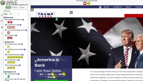
The first thing that we did while looking at Donald Trump’s website was audit it using the WAVE tool. Here’s what we found:
- 8 Errors
- 14 Alerts
- 15 Features
- 35 Structural Elements
- 5 HTML5 and ARIA
- 5 Contrast Errors (2 were false flags)
The Good
Bold Colors for a Bold Candidate
The color scheme is very accessible. On the front page, there were only two places where the contrast wasn’t sufficient. Outside of that, his color scheme provides text that stands out well from the background and is easy to read for low-vision users.
The Bad
Lacking Focus
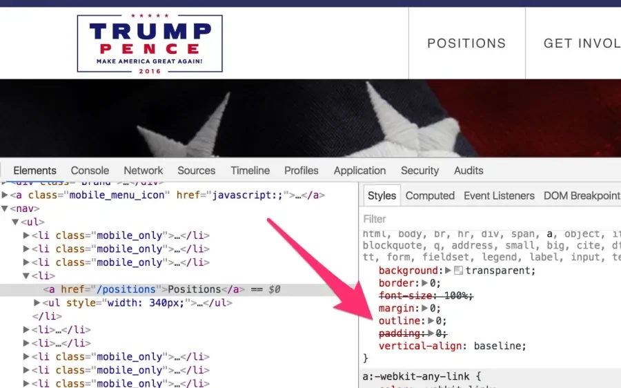
Remember how we talked about focus states? This site has almost none. Tabbing through the page is confusing because there are no visual indications of where you are.
This is especially egregious because the browser automatically applies focus states to focusable elements for you. In order for there not to be focus elements at all, the developer has to actively go out of their way to break them by applying outline: 0; to the element’s focus state. This is okay if you’re doing it to replace the focus state with something more decorative, but taking it off and not replacing it is a big accessibility no-no.
Skipped Skip Link
When tabbing through The Donald’s website, the first thing we notice is the absence of a skip link. Without a skip link, a keyboard user is forced to tab through each link in the navigation when arriving at each page before they can access the rest of the content. This repetitive task can become aggravating quickly, especially on sites with a lot of navigation links.
Unclear Link Text
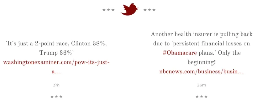
Links should always have text that clearly explains where the user is going. The link’s text is what a person using a screen reader will hear, so text like ‘Read More’ or text and icons that require visual context to understand their destination aren’t ideal.
In this area, the link text that goes out to the linked Twitter posts read ‘12h’ and ‘13h’. Without the visual context of a Twitter icon (that’s a background image, so there’s no alternative text to provide that), the user probably has no idea what ‘12h’ is referring to or where that link will lead.
The Ugly
Navigation Nightmares
The most important part of any website, in terms of access, is the navigation. An inaccessible navigation menu can block access to large portions of the website. Unfortunately, the navigation system of Trump’s website does just that, and prevents users with disabilities from directly accessing the sub-navigation items under the issues and media sections.
A more accessible way to do this is to use a click dropdown instead of a :hover. If that doesn’t work for the design, make sure that the :hover state of the menu applies to :focus as well, so that the menu will open the nested links when the parent menu item is tabbed to.
Disorganized Structure
Structural elements (h1, h2, h3, etc tags) are very helpful when used properly. In this case, they’re definitely not. Heading levels aren’t sequential, and nested information isn’t always relevant to its parent.
Audit of Hillary Clinton’s website
The Good
Overall, Clinton’s website is better than most when it comes to accessibility. It’s clear that her development team made it a purposeful consideration during the development process. While it’s not perfect, there was a lot of good done here. Let’s explore some examples of things done right.
Keyboard Accessibility
The keyboard accessibility on this site is very good. We found that we could access the elements and navigate to other pages easily without a mouse. It was easy to open and shut the drop-down ‘More’ area in the navigation, and access its nested links, which is a good example of how to implement what we were talking about when we covered the shortfalls of the navigation system on Trump’s website.
Skip Link
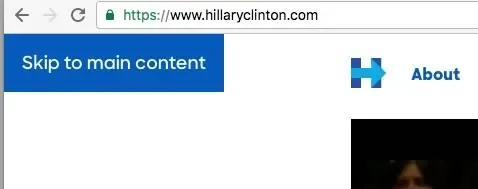
Hillary Clinton’s website includes a proper skip link, which allows users to skip the navigation and go directly to the content.
Great Focus States
The other thing we found when checking the keyboard accessibility was that everything has a focus state that makes it visually obvious where you are on the page. The light dotted border focus state is a bit subtle for low-vision users, but the fact that the focus state of the elements was styled independently from the hover state shows that the developer was aware of the need for focus indicators and made a conscious effort to implement them.
Translation
We usually think of accessibility in terms of people with disabilities because they often benefit from it the most, but accessibility is really just about including as many people as possible. A nice touch we found on Clinton’s site was a button at the top to translate the site into Spanish. With 41 million native Spanish speakers in the US, providing the option to experience the content in the user’s first language is a great accessibility move.
Video Captioning
Deaf people rely on captions to get the dialogue from videos, since it’s very difficult to lip-read in film. The videos on Hillary’s site are furnished with open captions, which means that they’re always on. Open captions are great for people with disabilities, but they’re also a smart move to capture your non-disabled audience as well. Often autoplay videos won’t play any sound unless they’re interacted with, but providing open captions on the video gives you another chance to capture the audience’s interest by displaying the words on the screen.
The Bad
No Transcripts for Video
While it was great that the videos were captioned, we couldn’t find a transcript provided. Many people erroneously believe that you only need one or the other, but captions and transcripts actually serve different purposes, so it’s ideal to provide both. Captions are great for the Deaf, who want to read the words in real-time with the video. Transcripts are more useful for the blind and the Deaf-blind, who benefit from a written summary of what’s visually happening onscreen in each scene before the written dialogue begins. A braille terminal, used by the Deaf-blind, can’t convert open captions inlaid into the video’s frames into braille for its users, so these users won’t benefit from that.
Low Contrast
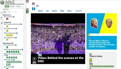
Contrast is important for low-vision users. We know that subtlety is all the rage, but design choices like putting blue text on a blue background makes it really difficult for some people to read. There are some great free tools like Das Plankton that will let you see if your contrast level is high enough to meet accessibility standards.
Schemes like this fail contrast testing on every level, so it’s best to avoid them. A better choice probably would have been white over a slightly darker blue.
The Ugly
The Horrible Modal
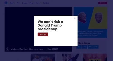
Despite the obvious hard work that went into making Hillary’s website accessible, much of the effort is lost due to a modal that appears when visiting the website for the first time (or in incognito mode). The problem is that the modal doesn’t receive focus when it pops up, and its close button has no focus indicator. While it technically can be closed via keyboard by navigating backwards (or tabbing through every single link on the page) once it pops up, it’s not obvious visually when that close button has focus, and navigating backwards isn’t exactly intuitive.
Conclusion
With one glaring exception, it’s obvious that lots of thought and work had been put into making Hillary Clinton’s website accessible to voters with disabilities. There is definitely room for improvement with small things like somewhat irrelevant alternative attributes on photos, but on the whole the site is better on accessibility than the vast majority of the sites that we see.
Unfortunately, it is also obvious that accessibility is deeply neglected within Donald Trump’s website, which leaves a large swath of potential voters unable to browse to his stance on issues and other content. Hopefully, this will be attended to shortly.
Hopefully these auditing case studies lead you to think about your own website from the point of view of a person with a disability. There are plenty of challenges online for the disability community, but lots of those can be fixed with a few easy tweaks like the ones we covered here. We hope you'll use what you've learned to make your website accessible, too.

