
Iowa's Department of Management Division of Information Technology (DoM DoIT) previously worked with us to launch the DX (Digital Experience) platform, consolidating over 80 state agency websites into a single, consistent system.
As more agencies joined the platform, it became clear that one size did not fit all. Marketing-driven sites, such as public health and safety campaigns, needed a stronger visual identity, more expressive components, and a tone that didn't feel like a standard government site.
Key outcomes
- 4 brand-forward agency sites launched on a shared platform
- 80+ agency ecosystem extended without fragmenting infrastructure
- Improved constituent experience with designs tailored for each agency's audience
- Consistent governance maintained across diverse site needs
- Faster onboarding and design workflows through systemized customization
Building on what already worked
We used the existing DX platform as our foundation, leveraging familiar authoring experiences for content editors while focusing on the visual flexibility that marketing agencies needed.
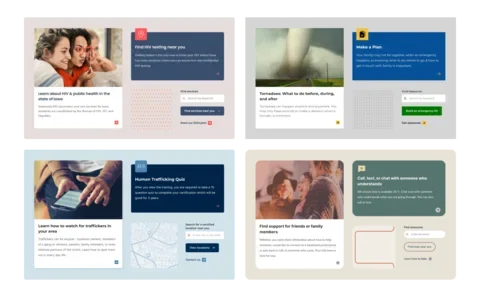
Through UI inventories and site tours with agencies, we identified where the DX platform needed enhancement. We added new components to support iconography and featured content, expanded display options for headers and heroes, and, most significantly, developed a system to support individual brand personalities.
Designing for flexibility within constraints
The biggest design challenge was determining where and how sites could differ within the constraints of our technical architecture. Each agency needed customization that was authentic but could still be implemented efficiently across multiple sites using the same system.
Using the system's available components, designers explored how multiple brands could be expressed through them, while consulting closely with a developer to gut-check feasibility. After several iterations, we created a list of constraints to work within:
What could change:
- CSS styling (colors, fonts, sizing, corner roundness, drop shadows)
- SVG graphics, like patterns or icons
- Showing or hiding certain design elements
What needed to stay consistent:
- Layout and positioning
- Content type capabilities
- Component structure
The switchboard approach
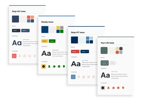
Using these constraints, we developed a "switchboard" of customizable, mix-and-match options. This à la carte approach gave us flexibility to curate the best combination for each brand:
- Fully swappable elements: Logos and custom brand accent patterns
- Custom design choices: color palettes and typography pairings
- Controlled style selections: Drop shadows (on/off), icon styles (fill or outline), button styles (fill or outline), corner styling (sharp, soft, or round), list styles (basic or bold)
The switchboard gave us wiggle room to explore brand expression for each site and to add personalization to the onboarding process, while keeping designs automated within the system.
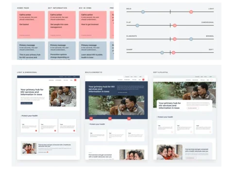
Understanding design preferences
We facilitated "style spectra" workshops in which agencies evaluated their current site and refreshed it using sliding scales to select between bold and light, flat and dimensional, and elaborate and minimal. Each attribute mapped directly to the style options in our system, translating subjective design preferences into technical decisions.
Iterative design reviews
After the style spectra workshop, we developed three distinct design directions based on its results. These were created by leveraging the component flexibility already in the DX system, the new components added for the marketing platform, and curated design decisions from the switchboard. This newly added flexibility created a design process tailored to each agency, allowing for feedback and adjustments.
Following agency approval, we demonstrated how those styling choices extended across primary and secondary page templates, highlighting the flexibility of components alongside the consistent visual design.
Automating brand customization
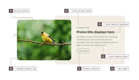
Creating a design system capable of efficiently maintaining multiple brand identities required a sophisticated technical architecture in Figma. We relied heavily on variables and component variants to automate styling across sites, eliminating human error and aligning our design workflow with how developers would implement on the frontend.
Variables for style, variants for structure
We used Figma variables for all style-related values: colors, typography, drop shadows, border radius, spacing, and grid. Each site became a "mode" within our variable collection, with primitive variables (like hex color values) mapped to semantic variables that powered the UI.
When a hex value changes, the change affects the entire system. This meant we could switch a component's "mode" in Figma and see every color, font, shadow, and border radius update instantly—a powerful demonstration of the system's flexibility and efficiency that could be mimicked in the codebase.
To account for structural differences, we relied on component variants for handling display options, brand accents, list styles, iconography, backgrounds, and responsive layouts. These were controlled through a properties panel designed to match the CMS, so editors and developers worked with the same logic.
This approach made it far easier to manage multiple site designs while keeping design and development tightly aligned, reducing handoff friction and eliminating guesswork.
The result
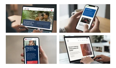
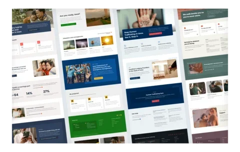
The Iowa Marketing Platform successfully launched four distinct, brand-forward sites, each with its own visual identity on a shared platform. We were able to create highly customized sites, reduce maintenance, and retain a familiar authoring experience by:
- Following an à la carte design approach
- Leveraging Figma variables for automation
- Providing flexible page layouts
Most importantly, constituents can now access critical health and safety information through sites that feel appropriate to their needs, rather than navigating generic government interfaces.
Services
We provided the following kinds of services to help this project succeed.
-
UX & Design