For our first sponsored contribution time, we will be focusing on efforts to improve the usability of Drupal’s administration UI. We chose this because there are some deliverables we beleive we can achieve within six months that will make Drupal better and benefit our existing clients.
The good news: we don’t need to start from scratch. Lots of work has already been done in the Admin UI & JavaScript Modernisation initiative, so together with Sascha Eggenberger and others, we defined some ideas to make Drupal’s administration more usable. A lot of those efforts focused on making Claro the default admin theme, but several ideas were implemented in the Gin admin theme, which allowed us to evaluate which should be included in Drupal core.
But for those ideas to land in core, they needed research and design, which could fill up an entire six months. We didn’t want to get to the end of this period and not have something concrete and usable. So, together with Lauri Eskola and Andrew Berry, we came up with a plan to improve Drupal’s administration UI experience.
The required research still needs to be done. So far, we’ve made efforts to define things like User Personas, User Journeys, and the main Information Architecture, along with creating prototypes that test new navigation patterns.
Several key projects to improve the admin UI have already kicked off or have been going on for a while, and we plan to coordinate our efforts. For example, several prototypes created for the Field UX have been reused to test the initial layout improvements. We also tested moving the Toolbar to the left and several new navigation patterns.
These were covered during the Initiative Leads Keynote at DrupalCon Pittsburgh, but let’s go deeper into each one.
Main navigation redesign
This is the first visually impactful thing we’ll be working on and will create the space for the rest of the improvements. The planning to make this happen started at DrupalCon Prague 2022. We designed a plan that would let us implement it in different phases and would let us isolate blockers that could keep this from moving forward. The Information Architecture refactor is one of those potential blockers because of the big efforts involved. Right now, we’re focused on three main sections:
Card sorting
A Card Sorting exercise helped us gather which Information Structure represents a better mental model for Drupal users. This will help us organize menu links into groups and labels that make the most sense. We hope to learn what each type of user expects from the menu structure and base future changes on that insight.
Prototype tests
We used the weeks before DrupalCon to assemble a prototype to test layout design changes with new navigation patterns and an initial design with the Toolbar moved to the left. During the contribution day, several people tested these prototypes, so now we’re iterating on them for further improvements.
Implementation into static HTML
The existing Toolbar has several issues ranging from accessibility, usability, and dated code. For example, it still uses jQuery. We’ve decided to start the code from scratch with static HTML prototypes. We’ll be able to more easily test design interactions and start work on improving the final code. Once this is ready, we’ll create a contrib project that we can test with other modules and eventually propose it for Drupal core to replace the existing Toolbar.
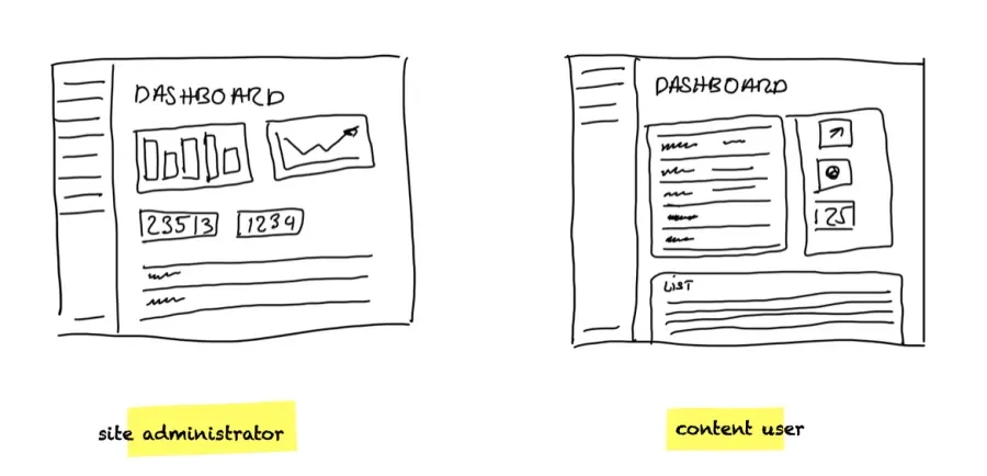
Dashboard
Some of our research showed the need to improve the starting point for user journeys, whether it’s a Site Builder or a content user. So we decided that a good way to improve the experience would be to provide customizable dashboards. A technical solution for these Dashboards is in the works, but we’re also working on the default content each should have. If you want to know more about this, you can attend our session with Christian López Espinola at Drupal Dev Days and DrupalCon Lille.
Field UX
The Field UX effort is something Acquia’s Drupal Acceleration Team has been working on already. They have done some development and research but needed some help with the design. This collaboration evolved at several levels and ended up helping us define several navigation patterns that would benefit the whole UI.
Beyond the existing efforts
We’ve covered only the more defined and advanced UX efforts, but several critical pieces of Drupal still need UX improvements, like Layout Builder and Paragraphs. We also want to glean what we can from projects like Gutenberg and Fieldable Fields. Overall, we need to improve how we deal with Drupal’s key structured content capabilities in a way that is easy to use and understand.
Thankfully, several of the winners of the Pitch-burgh innovation contest pitches are related to this, so hopefully, collaboration to improve Drupal’s UX will expand, and we’ll be able to make big changes in the following years.
Who is “we”
When discussing Drupal or Open-Source contributions, we tend to think about people, not companies. But we need to be realistic about sustainable contributions. Drupal has a great community of individual contributors that have helped make Drupal what it is today. But company sponsorships and collaborative efforts have helped push some of these larger, longer-term initiatives along. That is one of our motivations for our own sponsored contribution program.
So far, Lullabot, Acquia DAT, and 1xInternet have been collaborating to improve the admin UI, and if you think your company could help, contact us!
More sponsored contributions show the maturity of our community. It’s not sustainable to ask so many individuals to work for free to get big changes pushed through.
How to get involved
We’re organizing ourselves mainly on the #admin-ui Slack channel, mostly for the work on the main navigation and other research. For more specific initiatives, you can join the #dashboard channel for the Dashboard efforts and the #field-ux channel for the Field-UX changes. We need help from developers but also from people that can help us write documentation, help with the research, or help with the designs.